Ink bleeding slightly… how to ensure a crisp print?
Hi Friends!
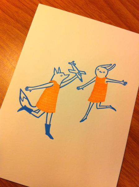
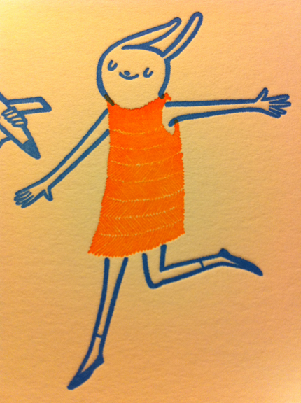
I am just getting started with letterpress; I’m an illustrator trying to produce small prints and stationery using my C&P Pilot old style press. Yesterday I printed my first two color prints. I am pretty happy with how they came out, but when you inspect the prints closely, the ink bled slightly. Though I thought I might experience some bleeding with the orange texture lines (see below), since the original illustration was scaled down quite a bit to create the photopolymer plate, I didn’t expect to see any bleeding of the thicker, blue lines, so I could use some help troubleshooting.
I printed these using Van Son rubber based ink (with no additives) on Crane Lettra 110 lb cover stock. I haven’t noticed this bleed before; the only factor that’s different with this print run is that I mixed colors for the first time (whereas before I was printing with ink straight out of the can). I also printed these plates on some French Speckletone stock (80 lb cover), and didn’t see the bleed. Is a slight bleed common with Lettra/cotton papers? How can I control this? Do you have any suggestions for ensuring a cripser print?
One other possible factor is, perhaps, humidity. I live in Sarasota, Florida and though my air conditioning runs all the time, it may be a bit humid in my studio. Perhaps I should run a dehumidifier? Just a thought!
Thanks!
Erica Sirotich
http://ericasirotich.com
Paperairplane print.jpg
Print ink bleeding.jpg
You are printing a deep impression, and are probably carrying ink down the sides of the plate, which makes it appear to be bleeding. You might check the sides of your plate and see if you have some irregularities which might accentuate this effect. Printing ink will rarely bleed, and the humidity should actually give you a better print on the paper you are using. You might try a little lighter ink on the press, with more repeated inking between impressions.
Paul
If a deep impression is what you’re wanting to print then you need to do some file prep before output to a plate.
When I have had a pattern this tight I usually start with a .01 rule of white on the image This will open it up to have more paper show through. However, the width of rule is very subjective in order to keep the integrity of the image. You’ll need to view this on the computer what is best for you. This may have opened up the hands a bit more also.
I look closely at all text and image before making film and plate to see if it needs t be adjusted.
Sometimes a kiss is better than a punch.
Casey
Inky Lips Letterpress
Kissing the paper with inky lips
Hi Erica,
I think Paul has the answer there. Too much ink usually creates squeeze. You also see it with thin ink, but van son rubber is not thin and you note that you didn’t thin it. The other thing you will want to check is to see if your rollers are running at type-high. You can do this with a roller gauge (AKA the “lollipop”). If your rollers are too low, they will put squeeze down on your type or down on your polymer plate and put ink on the sides of the form, and create something of a bleed appearance even with close to the proper amount of ink, especially with a deep impression.
One other thing, if you use transparent white to lighten a color, you’ll get to the color you want on the mixing plate, but then to get the right color in the actual print, you’ll sometimes end up putting more ink or pressure on to get a good color impression since the coverage isn’t absolute depending on the paper. If this happens, try mixing darker (e.g. less transparent white) than you think you’ll need, and then using less ink, and try printing with that.
Best,
Alan
I have to say, it definitely has the skeets (we call it The Skeets….others probably have a less colloquial name for it), but I think the print is pretty good for a Pilot.
You’ve got virtually no control of the ink density, so it’s kind of a miracle you printed anything at all.
If you can set it up tightly enough, you could run two light passes to achieve the ink density you want, without succumbing to The Skeets.
That said, eliminating the Transparent White may help. Another option is to poke in some Opaque White, but this will throw your Pantone guide way off.
Thank you everyone, I really appreciate all of your replies. I’m going to reprint this in the next few days, and will be more moderate with my inking and re-check my roller height. It’s wonderful to have a resource like this; almost as good as having a teacher with me in my studio. Thanks again.