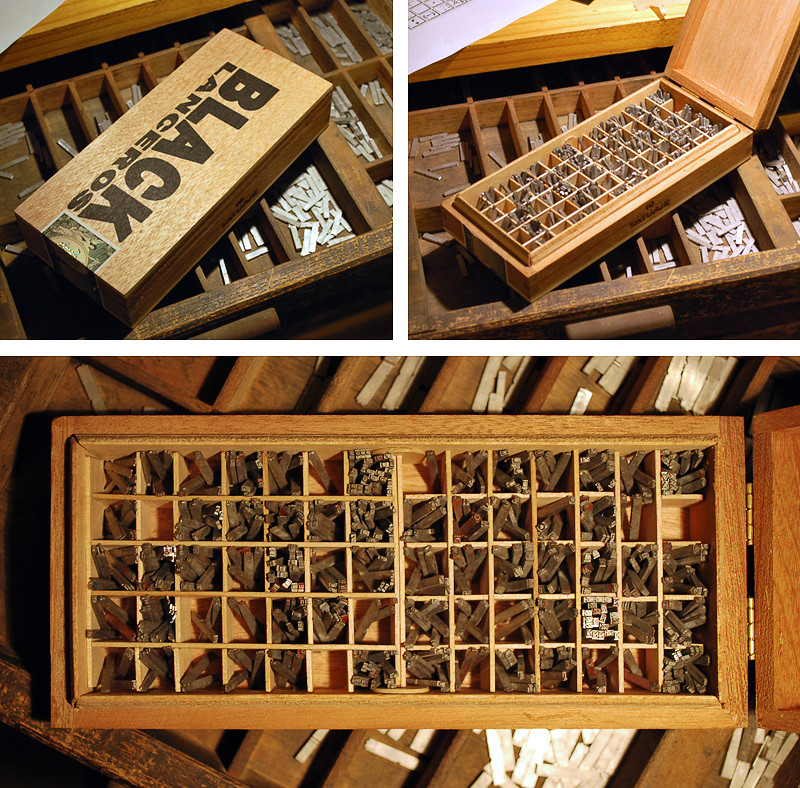
Tobacco typecase
After spending months looking for a suitable (that is compact and inexpensive) container for a font picked up at the Printer’s Fair, decided to join the DIY crowd and construct one myself. Surprisingly easy to do.
An empty cigar box, some popsicle sticks and an hour worth of work make for a rather handy typecase for small fonts.
http://farm9.staticflickr.com/8380/8484188882_3ca3f1085d_b.jpg
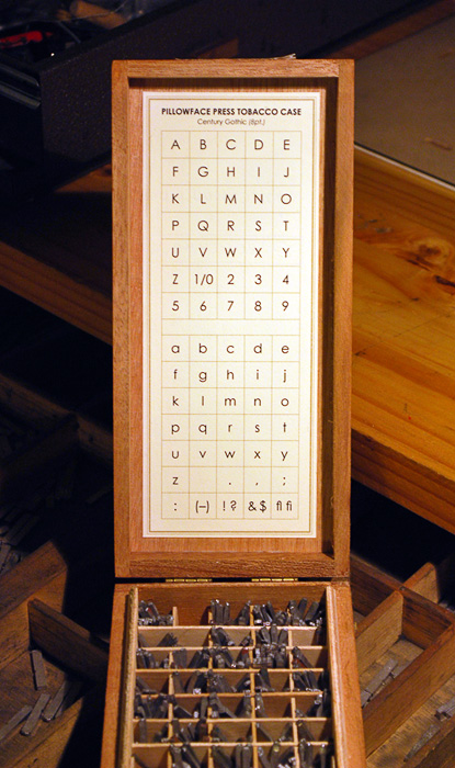
And the lay of the case:
http://farm9.staticflickr.com/8089/8532726357_0bf671caac_o.jpg
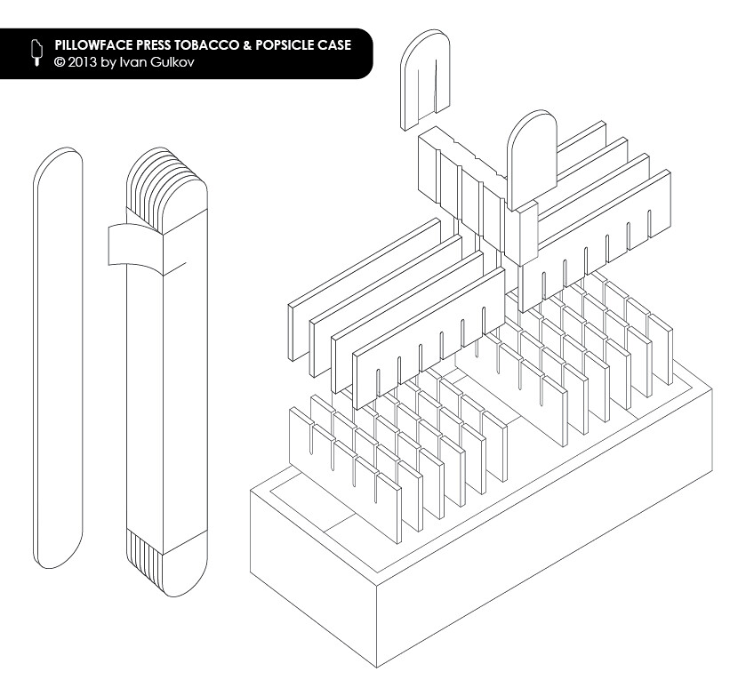
Here’s all I did:
1. Held a bunch of sticks together with masking tape.
2. Cut the gaps half-way though with a Dremel.
3. Cut off the ends to the desired length.
4. Unwound the tape and put together the grid.
5. Dropped the cells into the box and shimmed up with the offcuts.
6. Had another scotch.
Construction diagram: http://farm9.staticflickr.com/8099/8540726304_e04d0933b2_b.jpg
On the radar: punch-cutting carrots and chewing gum make-ready.
Nice! Thanks for sharing.
Its a good idea, but perhaps you should think about arranging the letters with your small case turned 90 degrees from the way you did it. Then you would have the left and right halves of your small case, each with seven compartments across, just like a regular cap case (or upper case). I imagine you already know the cap case layout, and that way you wouldn’t have to learn a new layout for your small case.
Good point. For some reason, I was thinking of the Garman/Russian case as inspiration with the uppercase traditionally arranged above (http://www.alembicpress.co.uk/Alembicprs/DLACASE.HTM). Also, imagining this as a tribute to the original meaning of upper and lower case terms.
In hindsight, it might’ve been better to go with a horizontal layout.