Creation of a New Typeface
Hot metal and typographic enthusiasts may enjoy this article on the creation of a new 60pt typeface by Wellington artist Sonya Lacey.
http://www.theprintingmuseum.org.nz/sonya-lacey.html
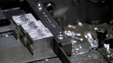
casting MMMLR.jpg
ffi |
fl |
5m |
4m |
’ |
k |
e |
1 |
2 |
3 |
4 |
5 |
6 |
7 |
8 |
$ |
@ |
# |
Æ |
Π|
æ |
œ |
|||||
j |
b |
c |
d |
i |
s |
f |
g |
ff |
9 |
A |
B |
C |
D |
E |
F |
G |
||||||||||
? |
fi |
0 |
||||||||||||||||||||||||
H |
I |
K |
L |
M |
N |
O |
||||||||||||||||||||
Hot metal and typographic enthusiasts may enjoy this article on the creation of a new 60pt typeface by Wellington artist Sonya Lacey.
http://www.theprintingmuseum.org.nz/sonya-lacey.html
casting MMMLR.jpg
WOW, awesome. Congrats!
Fascinating indeed - I’d love to learn more of the process of CNC-engraving the mats.
But if it’s new work, then it is not (as the Printing Museum page says) “the first new metal typeface of the century.” There have been a number of others - all insufficiently well known. Dan Carr’s “Parmenides” (cut by hand) spanned the turn of our century. Jim Rimmer produced several faces in the last decade of his life (Cartier Roman [not sure if he finished this], Cree Syllabic, Duensing Titling, Hannibal Oldstyle, Quill, Stern). Ed Rayher has cut (at least) the Cherokee syllabary and (in-process now, I think) “Baker.” And Stan Nelson’s series of ornaments, Ghost Ranch Horizon (cut by hand and cast by Skyline Type Foundry), deserves mention. The Rixing Type Foundry in Taipei (Taiwan) has been CNC-engraving matrices for some time (though I don’t have information on whether the faces cut are new). I think that there have also been 21st century types cut in Japan using the Tsugami clone of the Benton engraving machine, though I don’t have proper references at hand. I’m sure I’ve missed a number of others (and would be glad to learn of them - it would be good to put a list of new metal types of the 21st century online).
Regards,
David M.
www.CircuitousRoot.com
David- have you seen Russell Maret’s Baker typeface cut and cast by Ed Reyher? I think it is cast on a Thompson.
Russell’s newest project is Hungry Dutch for the Monotype comp caster. More info can be found at the following link.
http://russellmaret.com/books-in-print/hungry-dutch/
DGM
Just rambling here … best to press DELETE before reading :-)
The making of this type is interesting for at least three reasons which suggest some (not all, of course!) of the direction(s) that typefounding may go in our century.
First, the design is actually an old design for lettering (not type) by David Kindersley, submitted in 1952 as an unsuccessful proposal for lettering for traffic signs. (Google on “MoT Serif Kindersley” for background.) I’m not sure that this design was ever created as type (in metal or photons), though versions for digital lettering now exist. As matrix making rediscovers its roots in precision engineering, I would think that more and more of this may happen in the future.
Second, the artist whose work prompted this cutting and casting is not specifically involved in either the Graphic Arts (as traditionally conceived) or the Book Arts. Her media are “moving image, performance and installation” (the installation involving this type, “Dilutions and Infinitesimals,” consisted of video and sculpture). I’ve noticed that museums such as the Hamilton are reaching out, very successfully, to the academic and general artistic communities. The Printing Museum (NZ) is just going a bit further along this path.
Finally, the physical creation of this type’s matrices is interesting. The “JJ Frasers” mentioned is certainly the colloquial name for Fraser Engineering (formerly J. J. Fraser Engineering Group Ltd.) They’re a general engineering firm in, it would seem, the grand old tradition of “we can build anything.” They do, but they seem especially proud of their fire trucks. At first, this seems very distant from fine typography, but it can also be seen as a return to roots. The romantic view we inherited of matrix making from the 20th century is one either of unique genius (Benton, as portrayed by Bullen and ATF advertising) or lost arts (e.g., Victor Hammer, or Rudolf Koch as portrayed by Paul Koch). But really type-making has always been a matter of precision engineering. We’ve come full circle, and it’s 1882 all over again. It is interesting that the MoT Serif they chose is really (despite its name) more of an ornamental gothic. In much the same way Schraubstadter and Schroeder of the Central Type Foundry chose ornamental gothics when cutting the first types by machine in America using an imported German pantograph (Geometric, Geometric Italic, Morning Glory). Within a dozen years, Schroeder and Nicolas Werner left the Central to set up independent matrix engraving (they cut DeVinne), Benton was selling his patrix and punch engraving machines to electro matrix and composing machine companies, and Wiebking had started up. Making patrices, punches, and matrices by machine became a part of general precision engineering of the turn of the 20th century - it will be interesting to see what happens in the next dozen years of the 21st.
Anyway, I’m probably *way* overthinking this :-)
Regards,
David M.
I believe Arion Press in San Francisco has been creating new typefaces for a long time.
http://www.arionpress.com/mandh/
Billy
Interesting to see someone using CNC; but, as lots of others have commented, it’s far from unique at the moment.
I can envisage problems with those particular mats - there’s no bevel at all on the type, meaning that it’s harder for the type to be released from the mat once it’s cast. It’ll only take a tiny bit of wear on the mat, or a very minor inaccuracy on the caster, to block the mat. I don’t know enough about CNC to know if that’s an inherent problem of the process; it seems unlikely. And, as has been pointed out, this is the project of an artist and not a typefounder.
Well chronicled, Well recorded, & well known to those old enough to remember or used by (first time around) ? including Bona Fide Monotype users/apprentices, and examples, probably, still in existence in the Monotype Lending library follows:-
When a particular mat (matrix) from a display font, on loan from the Monotype Lending Library, out of Redhill Surrey, U.K. became damaged, whilst On Loan, (usually thin characters, l/c (i) (l) (t) full points, commas, etc) damaged, as in burnt out etc, replacements were re-manufactured as below..
If the whole font was to be returned to service, S.A.P. and the Massive Brake Presses, were tied up, and only one or two mats were required, it was standard practice for them to be re-manufactured from scratch, Via the SPARK EROSION process.??
Reproduction on the Supercaster, was indistinguishable from original(s) inc.depth of drive, alignment, and fitment into the Matrix Carrier, BUT as they were never intended as permanent replacements, we assume, were re-manufactured in Aluminium ONLY, unfortunately THE demise overtook us all.!!!
Implying that C.N.C. is an Eureka moment is possibly???
The author has several examples on sight and was posted on B.P. 3/4 years since, >with pictures on B.P.<
At Billy White, M&H type Foundry casts type that is new.
To my knowledge there a no new Faces in there inventory.
best james