notches in type
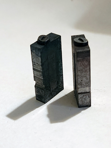
I was putting away a pile of type and noticed that, even though of the same letter, some had different notches in the base. Does that mean they were produced by different foundries? Were these notches ever meant to hold the type for alignment or are they only to signify the bottom of the letter? One even has a notch on the bottom and only one has a cavity in the side. Just curious.

type-recesses.jpg
A “notch” or groove on the bottom (foot) indicates foundry type. A flat bottom indicates either Monotype or a milled-down foreign face (not everyone uses 0.918” as type height). The different “nicks” on the side indicate different casting sources, and are useful for identifying mixed faces. A square nick usually means it was cast on a Monotype Super-caster. You may have two versions of the same face - it’s not a good idea to mix foundry and Monotype since there is no guarantee that their baselines will match exactly.
Thanks Bill, I did find some rogue “e”s in my Garamond case.