Identifying a monotype matrix for film
I have a monotype matrix I am hoping to identify. The mat frame indicates patents dated 1903 and 1905. The matrix is not in the standard ‘C’ arrangement. It has 6 or 9 and 12 stamped in the metal on the end of the frame. It appears to be a 6 pt. font with serifs. I suspect it might be a Bookman, but I don’t know enough to say. If anyone knows, I would greatly appreciate it.
In addition to the image at the bottom of this post (assuming I attached it correctly), I put a very large image of the mat on my S.O.’s website:
http://www.foliociii.com/MonotypeMat.jpg
For those that are curious, I have been helping my girlfriend print for the past few years, and am pursuing my MA in film. I’m in the very early stages of putting together a possible documentary on typefounding (15th century to hot metal composition, finishing with photopolymer), and the aforementioned matrix is to be used in a title sequence, mimicking the casting of type with CG. The title sequence will be part of my pitch to my thesis committee.
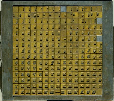
The matrix in question (Mat.jpg)
Extremely hard to say what this face might be. There are two roman cap “A”s and an italic cap “A” mat in this matrix. In looking at the enlarged image it appears that there is a tremendous amount of corrosion in the mats (they look very rough and pitted) and I doubt if any decent type could actually be cast from them. It would seem that this has corroded and perhaps the flat surface has been buffed-up and polished, but the working recesses look awful to me.
I don’t have the time to figure out if all the sorts are there.
It looks like a “Modern” roman face with a matching italic, plus an “Antique” boldface.
The cellular mats I’ve looked at had series numbers stamped in the side of each mat. I haven’t taken a matcase apart, so I can’t explain how to open it without making a big mess. But each row of mats is held in place by a comb.
parallel imp, against my better judgement, I took the first row apart. I found that the mats say 175 or 86. The McGrew book, American Typefaces of the 20th Century, identifies these as Bodoni and Cheltenham Bold, respectively. Your eye was good. I didn’t know the individual mats were stamped, but it gave me my answer.
Foolproof, I’m very glad I won’t ever be casting type with this set. I just need it for an effects sequence. Thanks for taking a look.
Now to put it back together….