Identifying an extended or wide typeface
I have not been able to identify the typeface shown below. As shown below, I have one set of wide and another more extended, both 18’ sets of caps only. I have some candidates but they are all too narrow. I wondered if anyone can id this? Perhaps it is an extended version of a common typeface such as Arial? Any ideas?
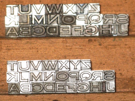
mystery typeface.jpg
It certainly looks like Copperplate Gothic Heavy Extended to me. Copperplate came in Light, Heavy, and Bold, Condensed, regular, and Extended, and typically two or four sizes per body size (i.e., 6 pt. #1, 2, 3, 4) so it could easily be used as caps with small caps. I think what you have are the two sizes of 18 pt, with the proportions of each actually the same (both are Extended). If from the same foundry, the baselines should align, but the bottom font in your photo is of course the smaller size (even though both are 18 pt. body)
Thank you Dave. I have researched the Copperplate fonts and I believe you are correct. Interesting I never saw it in the texts when I was searching initially. I think the extended nature threw me off. Thanks again for taking the time to check it out.