Painter & Co Typeface identification
We have what appears to be a 34 pt. font from Painter & Co. of San Francisco. Can anyone identify this typeface?
Thanks!
Laura
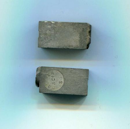
PainterNick.jpg
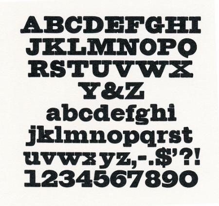
PainterUnidType.jpg
ffi |
fl |
5m |
4m |
’ |
k |
e |
1 |
2 |
3 |
4 |
5 |
6 |
7 |
8 |
$ |
@ |
# |
Æ |
Π|
æ |
œ |
|||||
j |
b |
c |
d |
i |
s |
f |
g |
ff |
9 |
A |
B |
C |
D |
E |
F |
G |
||||||||||
? |
fi |
0 |
||||||||||||||||||||||||
H |
I |
K |
L |
M |
N |
O |
||||||||||||||||||||
We have what appears to be a 34 pt. font from Painter & Co. of San Francisco. Can anyone identify this typeface?
Thanks!
Laura
PainterNick.jpg
PainterUnidType.jpg
Check the book “Type Foundries of America and their Catalogs”, pages 90-97. Jerome B. Painter owned a foundry called “Painter & Co.”. His was one of the first type foundries on the west coast, and he acquired California Type Foundry around 1873 and merged it with his own foundry. He died in 1883 “after seeing his plant become the largest on the west coast.” Competition from Palmer and Rey put them out of business and Palmer and Rey later was merged with ATF. Only a few rare copies of the CTF catalog which might have this face are known to exist, those are in the Kemble Collection of the California Historical Society.
The Historical Society Library is at:
California Historical Society
Schubert Hall Library
2099 Pacific Avenue
San Francisco, CA 94109
415-567-1848
The only fonts of type that I know if that contain the Painter & Co. pinmark are owned by Alan Stump in Hayward, CA. A few years ago he was seeking info about Painter & Co., which is why I recall this.
I don’t know if you will ever be lucky enough to discover a catalog that shows this particular font, but it is a Clarendon or Ionic design that originated in England in the 1840s. The name comes from the Clarendon Press in Oxford. Many foundries had their own versions and interpretations of this popular style.
For lack of a definitive name linked to Painter & Co., you would not be far off the mark by simply calling it Clarendon.
I have a copy of a short 4 page treatise that Alan Stump researched, type set and printed about the Painter & Co. It said basically the same thing Alan Dye mentioned. If I can find it, I will try to post it.
Mike
Rick,
Wouldn’t this more likely be classified as “Antique?” Clarendons, clearly, had bracketed serifs. See the notation at the bottom of page 26 in Nicolete Gray, where she shows a “Shaded” cut by Figgins, ca. 1815/17, considered to be the “first Clarendon in type.” Just curious as to why you think it should be a Clarendon.
Dave Greer
Dave,
You are absolutely correct!!!!! A momentary lapse on my part. While very close to Clarendon, this face does have serifs that are more squared-off than bracketed and should more accurately be classified as an Antique. The Clarendons, Dorics and Ionics of the nineteenth century all pretty much had this same general “flavor” to them. Thanks for catching that. I shot-from-the-hip too quickly on that one.
Rick
Are you sure it is 34 point type? That seems to be a bastard size, as 32 point would be called either Two-line Columbian or Four line Brevier, and 36pt would be called Double Great Primer. In the old catalogues of the period this slab serif would be called Antique, preceded by the name of the point size. It has similarities to types shown in the 1832 Boston Type Foundry Catalogue, which, thanks to Steve Saxe and Dover books, is readily available.
Paul
Paul,
Painter’s molds had to have been pre-standard. All of my Two-line Great Primer type, from that era, measures about 34 points.
Dave Greer
Hi Dave,
When is a point not a point? When you are measuring old type. Thanks for sharing that bit of info, I suspected that might be the case, but I have so little type from that era I couldn’t confirm or deny. Reading about Painter is interesting. They held out for a long time, while so many other foundries consolidated with ATF. Supposedly their molds and matrices eventually found their way to ATF, I suppose (hope) they are in the Smithsonian now.
Paul
Thanks everyone for your input! The type will remain simply “34 Antique” in the case. HOWEVER, we have taken the liberty of renaming the type “Pan Black” for our digital recreation of the type, which will soon be available for purchase from ascender.com. (named after one of our past student curators). Shameless self-promotion, I know.
Laura
Very distinctive cap “Q”, “5” and “6” in this font. They sure set it apart from an Clarendon or similar fonts I’ve seen.
The photos show what appear to be half-nicks on the body of the type. I’ve only seen this on European-cast fonts in the past. Is it possible - or likely - that Painter was using a European caster and European mats to cast this type, resulting in the odd 34-pt size?
Laura - BTW - are you at the Shakespeare Museum at Cal Poly, SLO?
- Alan
Alan,
I doubt that they used European casters or molds. Many pre-standard, large-sized, US cast-type, of that era, had half-nicks. I am not an authority on metal molds, but I have quite a number of fonts of old US metal type. Maybe someone can comment on why the nick only went part of the way, in some of those molds.
Dave Greer
Just a guess, the round nick in the body of the mould had to be perfectly fitted to a mould ‘blade’, if there is only half a nick, then it was half the work to fit the body to the blade. This was not the easiest job as the moulds were typically hardened steel.
However, when adjusting the set-width of the type to be cast, one could only go as narrow as the nick allowed.
English Monotype reduced some of this effort by going to a square nick in their moulds, it was easier to produce and easier to fit so the mould did not leak and seize up.
Dan