Need type ID “Lozenge”? Charm Bracelet style
I’ve this ‘different’ font that might not be digitized. Sure am having trouble finding it through any of the font sites anyway. SO I finally decided to bother you good folks with it.
A slip of paper and a proof (dated 1964) found in the job case with the type suggests “Lozenge Border” 24 point - Looks like a necklace or a chain for a charm bracelet. There are other pieces not pictured. Blank ‘diamonds’ without letters (perhaps for 2 color work), dotted lines without the hanging decoration, an obelisk and another Ben Franklin type character.
Any help or clues on naming this would be much appreciated.
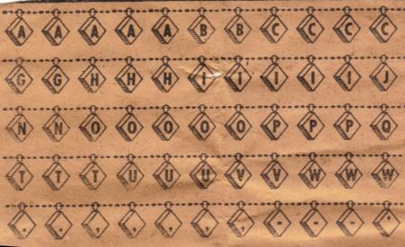
font proof Lozenge Border 1.jpg
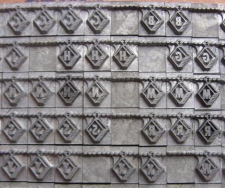
Chain lettersSM02.jpg
It was shown in the Los Angeles Type Founders Catalogue and was called Cordon. It also had an obelisk character at each end and the figure of a man to act as a word divider., as well as the spaces that you show.
Paul
Thanks Paul, Thanks a bunch. - I do have the 1963 LA Type Founders Specimens and Price list and it did not show it. If it did I missed it. Perhaps it was discontinued. - There was another silverfish damaged bit of paper in the job case. All I could read on it was ‘don’ and I dismissed it as being relevant.
I just wanted to say that is one of the most awesome fonts I’ve ever seen - wish it were in my collection!
Leslie
CORDON was offered by the New York Type Foundry of James Conner & Sons sometime in the late 1800’s;
it may have originated with the Bruce Type Foundry as early as 1869—-they called it Ornamented #18.
The font you have came, in part, from electro-plated mats
done by John Caroll (some he created himself as he did not have a complete original font)—on Caroll’s passing the
mats were acquired by Charles Broad of Phoenix—-upon his death the mats went to LA Type Founders and when
they closed they were purchased by F&S in Bensenville, IL
where fonts can be purchased today. About the paper slip found in the LA font saying “DON”—-maybe it was in reference to Don Winter the General Manager of LA Type.
An interesting story and an unusual type face. wta
I love this site! Thanks Gaslight-Daze! - I think the don was the tail end of the Cordon. It was the beginning part the silverfish ate. Quite a bit of great history. - Paul -
I believe F&S became Barco. Someone noted that Barco closed (http://www.briarpress.org/1299), but I called them and they are still in business, though not called Barco any more (now Group 3 Envelopes - specializing in printing envelopes). The gentleman I spoke to said they don’t cast type anymore (though they still have the mats), but there is a lot still sitting on the shelves they’d be willing to sell. Just a follow up FYI.