Name this font contest -Ornamental W
My father was a hobby printer/collector and after a 3 year break I am starting to sell some of the shop on Ebay. I would love some help with identifying some fonts so I may list the items better.
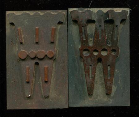
I found 3 orphans of W.
They look similar to what Kelly calls ” Celtic Ornamented ( Chromatic” by Page c.1870 (page 256 of my copy of Kelly).
But he shows the font with squares/rectangles in the letters, while this one has circles.
One of the 3 blocks is the one that you could use to print a second color, like Page’s font.
Maybe a Page variant or rip-off of Page?
Any information is more than welcome.
Thanks!
Christopher Levy
type mystery w.jpg
type mystery w kelly book.jpg
Not sure what size yours is, but if you check page 136 in Kelly’s book, third set down in the right hand column, you will see one color of a three color set of 60 line Chromatic Ionian. Introduced by Page in 1872, this large letter would have made quite an impact printed in three colors. I occasionally used a set of this type when I ran Hatch Show Print in the 1980s.
Paul
Hi, Christopher!
I agree with Paul that it is one of the chromatic Ionians, by Page. One, shown in Dave Peat’s 1888 Page reprint, shows open circles, on page 172 and is called Ionian No. 7. I have one chromatic style of Ionian, but have never identified its number, exactly. Paul mentioned Number 4, shown in Kelly, on page 136.
Thanks for the e-mail, by the way, and I have corresponded with both you and your dad in the past!
Dave Greer
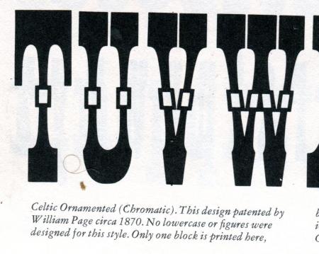
Here is an image from Page’s chromatic specimen (1874) showing 20- and 40-line Chromatic Ionian No. 2
The raised shoulder on the left-most block in your image supports a theory I discussed with Dave Greer about using the same pattern to cut multiple colors of a chromatic face
It would be impossible to cut the two parts shown from the same pattern, it is more likely that the raised shoulder on the left was designed and cut to identify which color block should go with which other color block. If you look at the two pictured above, and then at the drop shadow outline, you will realize that the ‘key’ block doesn’t even match the same outline. I was told, many years ago by Hamilton employees, that multiple colored types had to be cut at the same time, or they wouldn’t register properly.
Paul
In order to have the register, required, all the chromatics had to be cut from the same basic pattern and that is why Hamilton made the statement that the chromatic had to be cut at the same time as the basic letter. This is how it was done—-the same basic letterform was cut and then, what was not needed for the chromatic, was routed-away, at a shallower depth. This left some of the letter having an overlap and produced the third color. If you look at Celtic No.1, Open, which I have a font of, it is the same basic letterform as the chromatic. When you look at the pattern shown, by Nick Sherman, http://www.flickr.com/photos/nicksherman/3931102958
you can see where the stylus would run inside the central opening and it created the internal rectangle in the Celtic No. 1 Open. The raised area on the Ionian chromatic W is just the part that was routed-away, but is serves, too, to identify the basic block. That’s my observation from looking at chromatic fonts. Hamilton may confirm this, if any one there actually knows.
Dave Greer
Thanks all!
I have listed these on the Briar Press Classifieds if anyone wants them. Thought I would give printers a crack at ‘em before going the Ebay route.
I appreciate all the information that everyone has given. I will be back with more IDs.
If anyone sees anything they want please drop me a line- worst case scenario is I’ll let you know when it is up on Ebay, best case scenario is I’ll get made an offer I can’t refuse.
Thanks again.
Christopher
Hi Dave,
After looking at some photos of Hamilton patterns I agree with you. It never occurred to me that they could (or would) work on multiple planes, and the sheer size of the patterns made things possible that I didn’t believe before. I guess I have been routing letters and cutting by hand too long.
Paul
Just as a reference, of someone in the 19th-century actually viewing a chromatic border being cut, at the Page factory, Bill Soucy sent me an extract from a book titled, “The Great Industries of the United States, (1871)” It stated, “A difficulty is here experienced in making borders in two colors in wood. After one lot is made, and the machine altered or changed to a different size, it is almost impossible to reset it so that a continuation of the same border would match the first one cut.” This probably included chromatic type-fonts, as well, and would support the idea of constructing a pattern for cutting both the basic letter, or border, and the chromatic, in the same lockup, from the same basic pattern.
Dave Greer
Dave,
That accounting from 1871 makes me even more enamored by some of the 2- and even 3-color borders shown in Page’s chromatic type catalog from 1874.
Here are some examples of what I mean:
http://farm5.static.flickr.com/4041/4295780875_5745288e1b_b.jpg
http://farm5.static.flickr.com/4064/4296354312_153ffcccfd_b.jpg
http://farm3.static.flickr.com/2734/4295659501_0e898d93f1_b.jpg
http://farm5.static.flickr.com/4005/4295705647_6908aa2b14_b.jpg
When I first saw this book, I thought for sure that the borders had to have been die-cut using Page’s border stamping machine. But I don’t recall seeing anything in the book mentioning the process – certainly not the way they touted the concept in later catalogs.
Also, a while back you mentioned in a comment on one of my photos that the die-cut borders preceded the die-cut type by about 10 years. That would have put the earliest die-cut borders around 1877, right? … 3 years after the chromatic book was published.
Do you remember where you heard the 10 year number from?
If these borders were indeed produced with a pantograph router, then its an amazing example of not only type production, but also printing.
Hi, Nick!
Thanks for posting links to your photos of Page’s chromatic borders . They are really works of art! The only two-color border that I have is Page’s Chain Border (Patented 8/9/1870—see Ruffa, pg. 75) and it looks like it was done on a router. I have one part of another, but only a few pieces.
I, probably, was referring to Page’s “Specimens of New Process Wood Type!”, which is not dated. They said in that catalog, “Wood Borders and Ornaments have been made by this new method for nearly ten years, but it is only lately that the invention of machinery has made it possible to apply it to the making of Wood Type.” I estimated that the catalog was ca.1888, so that would mean that die-cut borders were started in the late 1870’s, since the type had a patent date of 1887.
Dave Greer
Dave,
Your estimate of 1888 matches with the date David Shields has listed on his list of specimens for Page’s Specimens of Machine Cut Wood Type. The book you mention – Page’s New Process Wood Type – wasn’t published until 1890. If the part you mention about the borders having been made for 10 years is in that book, it would put the earliest die-cut borders at about 1880, meaning these chromatic examples would have been cut with some other process, probably a router. Assuming that’s the case, they are all the more impressive!
Nick,
Thanks for the Shields’ reference; I just noticed that I did pencil-in (1890), for a date, in the New Process reprint-book. When they made the 10-year statement, it said “nearly ten years”, so that may have meant 9? I find in some other books, like Kelsey, that their rounded-off estimates are, sometimes, to the high side. Trying to pin-down exact dates is frustrating because of the terminology, but I agree that the timeline for die-cut borders should be moved forward, if the date of that book is actually 1890.
Dave
I am a bit late to the party, but thought I would try and add to the discussion if possible.
Page’s Ionian seems to be first introduced in Conner’s Sons /Typographic Messenger/ in September of 1867 and January of 1868. The Ionian series appears to all be 2 color chromatics. Oddly Ionian Condensed is a solid one color non-ornamental. Page appears to be the only manufacturer that showed Ionians.
Ionian, Ionian No 1, No 2, No 3, and Ionian Condensed were all listed in Pages’s 1870
/Specimens of Wood Type./
Ionian Condensed
http://www.flickr.com/photos/29136927@N03/5073776161/
Ionian & Ionian No 1
http://www.flickr.com/photos/29136927@N03/5074309562/
Chromatic Ionian No 2–5 (not to be confused with the regular Ionians which were also chromatic) were first listed in Page’s 1874 /Specimens of Chromatic Wood Type, Borders, Etc./
Chromatic Ionian No 2
http://www.flickr.com/photos/29136927@N03/5073710795/
Chromatic Ionian No 3
http://www.flickr.com/photos/29136927@N03/5073814875/
Chromatic Ionian No 4
http://www.flickr.com/photos/29136927@N03/5073711003/
Chromatic Ionian No 5
http://www.flickr.com/photos/29136927@N03/5074309316/
(a few of these specimens you guys have already shown in this thread, so I am just beating a dead horse…)
I could not find a specimen of Ionian No 2 or No 3 in any of Page’s specimen books in the 1870s or 1880s. Going out on a bit of a limb, I would bet that Mr Levy’s blocks are one of these two, though hard to say definitively which one. David Smith has posted images of his Page 1867 specimen book (which appears to be the only existing copy) here on Briar Press, and I would suspect that it may show samples of one or both of these types (pure conjecture on my part, having never seen the 1867 in person).
Would love to see prints of the complete character set of the blocks to help clarify the formal qualities of the design.
Last(ly), but not least(ly) I would also hazard to add to the die-cut portion of this thread as well. Nick and Mr Greer are right about Page developed a stamping process in the early 1880s that was used to produce border material. The precision inherent in this process allowed Page to offer a wide range of intricate geometric border styles. He would perfect and patent this process (in collaboration with George Setchell) later in the decade to also make die-cut or “New Process” wood type.
In 1828. T.L. DeVinne recorded the improvements to the tools used by Wells in conjunction with the router, including “cast-brass patterns, with elevated edges, which when pressed in the wood, both marked and engraved the outlines of each type.” This seems to clearly describe the basic components of the die-cut method. Seeing the Fancy Rule series in Page’s 1874 specimen, makes me think that die-cut was used to produce the fine pattern. There is a 5 line set of this border in the Kelly Collection and the incised lines are extremely shallow, making me think that it could not have been executed with a router. If true would seem to indicate that Page was using the die-cut method at least as early as the mid-1870s.
Fancy Rule No 51
http://www.flickr.com/photos/29136927@N03/5073710535/
David
David,
Thanks, so much, for posting those links to the Ionians. I have never pulled a proof of my specimen, which I suspect is only one-part of a 2-part set. That will be on my to-do list, now.
Having access to all that reference material, is a collector’s dream! I have at least one face that I have never identified,
http://www.flickr.com/photos/39182740@N04/3902829919/in/set-721576222684...
I believe that it may have been cut in the early 20th-century, at the M&W factory, after Hamilton’s take-over. Rick has a font of this, too. If you ever identify it, please let us know.
Dave Greer
P.S.You can call me Dave, since “Mr. Greer” makes me feel so old! ;-)
Dave
No 624
Though it originated with Page in 1890, No 624 was not shown in Page’s last specimen book and was only first shown as wood type by J.E. Hamilton in his 1896 Specimens of Wood Type.
This design was not shown or listed by Page in either the die-cut or end-cut catalog produced in 1890. Hamilton included a note about the face in the 1896 catalog that stated: “This series contains no lower case, the small caps taking their place. In ordering it should be plainly stated whether caps, caps and small caps, or caps, small caps and slanting letters are wanted.” The slanting letters were slanted small caps and were interchangeable with the small caps.
The only other manufacturer of this design was Tubbs, but he does not include slanted small caps of this design in his c.1904 catalog.
The Kelly website is being updated with new information, but here are links to the info that is posted currently. (The info above reflects my most current research).
http://bit.ly/bmx0gx
http://bit.ly/bWvKFh
David
David,
Thanks, so much, for the research of that face. I have Tubbs’ Catalogue No. 5, but I can’t recall ever seeing it there. Could you post Tubbs’ number for their cutting?
It has to be one of the strangest cuttings in my collection and was difficult to set, since some of the letters were on larger bodies than others. If you get a chance, some day, could you, also, post a photo of the printed page from Hamilton’s 1896 book. I am curious about the look of the small caps and the caps, together.
I hope that I am not asking you to do anything that you are not authorized to do; I am satisfied that you supplied so much information, in your last few posts, to keep me happy for a long time!
Dave Greer
Hello, fellow lovers of Wood Type:
I’ve been following this posting with great interest. I took a few snapshots of my 1867-1868 Page specimen book and would like to share them with you, along with a few observations. I found four different chromatic Ionians in nine sizes — the largest is 72-line.
This is listed as 25-line Ionian No. 1. It is a two-color chromatic with colors and fill alternating between the top and bottom halves of the characters. The important thing to note about Ionian No. 1 is that the circles in the middle are filled with a color.
Page's Ionian No. 1.JPG
Here is 30-line Ionian No. 2. The things to note about this specimen is that the dots are open — no color — in the middle of the type, and that the shading is made from the imprint of the first color on top of the second.
Page's Ionian No. 2.JPG
Here’s 30-line Ionian No. 3. The body is all one color, and the shading, fill and dots are all the second color.
Page's Ionian No. 3.JPG
Here is a specimen of what I think is the wood type in the photograph at the beginning of this post. It is listed simply as Ionian. This photo is of a 30-line specimen, although my book also has specimens of 20- and 40-line Ionian.
It is a 3-color chromatic, with the body, inset and shading all different colors. I think that the wood type shown at the top of this post is of the body and inset only, and that there is another piece (not shown) with which to print the shading. It’s plain to see the space at the bottom of the characters in Mr. Levy’s photo which would allow for the shading. And he notes that he had “3 orphans of W.”
So that’s my contribution for today! Enjoy, me hearties!
—David Smith
Smythe Productions, Ltd.
APA #605
Page's Ionian..JPG
Wow
David (Smith) thanks for sharing these, I had a hunch/hope your Page’s 1867-8 catalog might hold the answer.
The catalog looks amazing, and certainly pushes back the date on how early Page was offering complex Chromatic types. Now only about 10 years after he started the company rather than almost 20 that only seeing the 1874 Chromatic specimen would imply.
Would love to include info on your catalog in the bibliography of specimen books on the Kelly Collection website that i’m currently updating. http://www.utexas.edu/cofa/a_ah/rrk/lnl.php
and Dave (Greer) I do have link to
the Hamilton No 624
http://flic.kr/p/8JMhDs
and to the Tubbs 2197
http://flic.kr/p/8JJfmn
David
Dave and Dave,
Thanks for the info on No. 624. Have several fonts of both the roman and the slanted version (with small caps for each). I had never been able to nail down an identification on these fonts so this information is extremely useful to me. The dates of origin are also greatly appreciated.
Rick
David Shields, David Smith & Rick,
Thanks for all your inputs. It, always, makes my day when I find answers to questions that I have had for a long time!
I think that I have one-color, of Ionian No. 3, now that I look at it very closely. Since all the other chromatics that I have seen were printed using two blocks, some of the Ionians may have been unique, if three were used. I had assumed that the third W, in Christopher’s set, was just the first or second block, in another set. But, I would like to see how others interpret this.
David Shields,
The Hamilton specimen of 624 is great! Thank you!
I did find the 624 Roman on pg. 151 in my Tubbs 5th. I guess I was looking for the italic and it never caught my eye. http://www.flickr.com/photos/29136927@N03/5078033189/
I love it when inverted letters show-up, like the N in the first line, so I don’t feel so bad when I look at my printing!
This has been the most informative and interesting exchange, so far! Thanks, to all!
Dave Greer
For a real doozy of a miss-set letter, check out Parsons Swash Initials shown in both the 1925 BB&S catalog as well as the 1923 ATF catalog. The O in the BB&S catalog is set correctly. The O in the ATF catalog is set on its side! Rotated 90 degrees. This is on a square body and whoever set that specimen failed to put the nick to the bottom!
I too just love picking up all these little details.
Rick
I wish there was a registry of 19th century wood type fonts telling who had what in their collections, character counts, missing characters, etc. It would make it so much easier to study and to find homes for orphans.
Dan
Dan,
Trying to identify sorts, of unique faces, is fairly easy, but trying to match sorts, of a face which may have been cut by several different companies, is not easy! Another difficulty, that I have noticed, with duplicate wood type fonts, from my collection, is that no two cuttings were ever the same, unless they were cut at the same time. It is not like metal type, which was cast from the same molds & matrices, even though the same patterns may have been used.
This might be a project for some graduate student, after the collections reside at some University. David Shields’ pages, like http://bit.ly/bmx0gx show the missing letters to their font of Hamilton No. 624 italic, etc. On the index pages of the specimen books, that I have put on-line, the missing characters in my fonts are shown in parentheses, in the index. It took me several years to go through all my sorts and try to identify & match them, so it is no small project! I feel your concern for finding homes for orphans, though, since I have several hundred ampersands, that I have never matched, because full-specimen showings are so rare.
Dave Greer
thanks for the help on the latin antique typeface dave.
you think the reproduction in american metal typefaces is the best i’ll find? i’m working on a revival for my typeface design class and was hoping there was something a little larger out there.
thanks again.
The Latin Antique design was an extremely popular face in the late nineteenth century, and was offered by many different foundries. It was even cut in wood and was also one the the staples of the bookbinding industry as many fonts of it were cast in brass, to be heated and used for stamping book covers and spines.
I have this face in lead, brass and wood, but none of them would probably make a good clean repro for you. The brass is in the best shape, but the largest I have in brass is 22 pt. and it is uppercase only.
Rick
Ooops! I probably should have also mentioned that I have seen samples of printing from the 1870s that incorporate this face, so it is at least that old.
Rick