Can anyone help me identify this typeface?
18 pt., European height. No identifying marks whatsoever. Thanks in advance for any help.
font_1.jpg
ffi |
fl |
5m |
4m |
’ |
k |
e |
1 |
2 |
3 |
4 |
5 |
6 |
7 |
8 |
$ |
@ |
# |
Æ |
Π|
æ |
œ |
|||||
j |
b |
c |
d |
i |
s |
f |
g |
ff |
9 |
A |
B |
C |
D |
E |
F |
G |
||||||||||
? |
fi |
0 |
||||||||||||||||||||||||
H |
I |
K |
L |
M |
N |
O |
||||||||||||||||||||
18 pt., European height. No identifying marks whatsoever. Thanks in advance for any help.
font_1.jpg
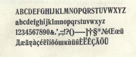
This appears to be modification of what would be called De Vinne Condensed here in the United States. The special characters in the bottom row and the modified K make this look like it might be used for some sort of Russian/Cyrillic/Eastern European language. I know very little about foriegn languages, so maybe someone else can nail down the specific use for this font.
Rick
Yes, indeed, it looks like De Vinne condensed. Sorry, I can’t say what European foundries might have produced this face or what it might have been called. The bottom rows contain sorts for many of the Western European languages, including French and German, although the German double “s” is missing. There are no letters specific to the Eastern European Latin alphabets here (Polish, Czech, Croatian). The “No” (= “number”) symbol in the third line is used in Russian and the 1st, 13th and 14th letters in the bottom row are the Cyrillic capital “D” and l.c. “sh” and “k” respectively. The Cyrillic set is far from complete, however, so it would not be very useful for printing, say, Russian, Ukrainian or Bulgarian.
It could be the ‘Romanisch’ by Schelter&Giesecke from Leipzig in Germany or the ‘Romaans’ by Lettergieterij Amsterdam/vh Tetterode in the Netherlands. More likely to be from Germany though.
Most foundries on the Continent would have a ‘De Vinne’ look alike.
Thank you! I also thought at first it might be Devinne but a “Devinne lookalike” makes more sense. Some of the upper case letters (G, R) are absolutely Devinne-like, as is the lower case f, but other letters—in particular the uppercase Q, the lower case n, and the & symbol—are quite different from Devinne (at least as it appears in the H&M catalog). Although my daughter is engaged to a Russian guy, I doubt I will be printing Cyrillic any time soon so the missing letters don’t bother me too much. The origin is most likely Germany as I bought it in Tel Aviv and most of the foundry type here comes from there. Thomas, do you know where I can find a sample of “Romanisch” just to look at and compare? I didn’t realize that European foundries would have a Devinne lookalike, so thanks very much for that interesting info.
If you can’t get hold of a specimen from Schelter&Giesecke, you can try the Klingspor museum in Offenbach am Main, a good source is also the Encyclopaedia of Typefaces, published in 1953 and in 1970 by Blandford in the UK. I could scan a sample of the Romanisch and e-mail it to you. But as already mentioned, nearly every foundry on the Continent had its version of De Vinne (as with the Cheltenham).
Thomas mentions that most European foundries would have a De Vinne look alike. To be historically accurate, the Romanisch and other faces mentioned actually predate De Vinne. De Vinne is really modelled after them!
Rick
In a catalogue of a French foundry I have a look-a-like dated 1899.
Following Thomas’s advice, I searched for and found a flickr stream of the Schelter & Giesecke specimen book ; though incomplete, it does show something called Anker Romanisch Nr. 20 (http://www.flickr.com/photos/n1ke/5264216611/in/set-72157624519443005/). Although it’s an almost-perfect match, the lower case n and u are different. In my font, they slant upwards at the foot whereas in the specimen book they sit politely on the baseline. I thought maybe I’d inadvertently switched the n and the u when I printed my proof but I just checked and the nicks are in the right direction. It’s strange, because upside-down they would indeed match the Romanisch. And the lower case u’s with the diacritical marks in my set also differ from the English one. Any ideas? The odd-looking upper case K in my proof is actually supposed to go with the Cyrillic lower case one (on the bottom line); I have other K’s in my set that do match the Romanisch perfectly and have the same curved foot as the upper case R. The S&G specimen book does not show the upper case Q (which also differs from Devinne in my font). Makes sense that the European versions predate Devinne; thanks Rick for pointing that out.