Mystery italic
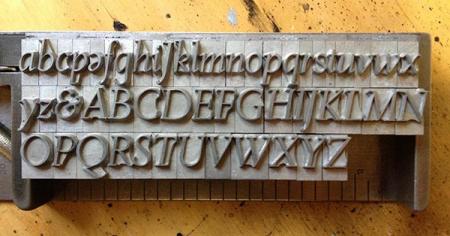
Any help in identifying this 36-pt italic would be much appreciated. No pin mark; looks like monotype casting (i.e. definitely not foundry). A couple of us are thinking something in the De Roos family, but have found no matches yet. Came from the shop of a man who bought most of his type in the early 1970s (and which included a lovey font of 60-pt De Roos semi-bold). I’ve reversed the image to make it right-reading (forgive the upside-downers).
Italic2a.jpg
It’s De Roos Italic.
Thanx DTP.
This font shows some differences from ATF’s DeRoos Italic #698. Mainly the tail on the lower case “g” is almost closed on the ATF version. Could this possibly be the import cast from English Monotype mats?
McGrew states this face was originally imported from Amsterdam, then recut by ATF about 1952.
Also see A.T.A. Type Comparison Book, p. 93-12.
Jaspert, Berry and Johnson (_Encyclopedia of Typefaces_) show two versions. One they just call “De Roos,” and I guess one must assume that since they’re European this is the Amsterdam version. It has a nearly-closed ‘g’. JBJ also show a version specifically identified as Intertype De Roos. It, too, has a nearly-closed ‘g’. The two specimens I have which show the Amsterdam type as it was imported (Castcraft, Amsterdam Continental) regrettably only set the name (“De Roos Italic”) in the face; they don’t even have a complete one-line showing.
http://www.circuitousroot.com/artifice/letters/press/noncomptype/typogra...
http://www.circuitousroot.com/artifice/letters/press/noncomptype/typogra...
ATF’s showing of it also has a nearly-closed ‘g’. See for example their 1960 Handy Type Index (on p. 10):
http://archive.org/details/ATFHandyTypeIndexTY138
I can find nothing *named* “De Roos” in my 1970 English Monotype specimen.
So some mystery would appear to remain. If anyone had a specimen known to be from Typefoundry Amsterdam that would resolve the (perhaps unlikely) possibility that JB&J show the ATF version.
Regards,
David M.
www.CircuitousRoot.com
Cheloniidae et al, this might help out. I found it on the Typophile website. It’s a scan of the De Roos announcement specimen book from Typefoundry Amsterdam. It clearly shows the italic miniscule “g” as having an open descender bowl. You also appear to have a majuscule “J” in place of your miniscule “j”.
http://www.typophile.com/node/85197
Michael Hurley
Titivilus Press
Memphis, TN
The Turtle Moves!