Design too dense on photopolymer?
I’m curious if anyone has had an issue where the design on their photopolymer is too dense to get a good impression.
I’m working on my Christmas cards with a blind impression of snowflakes. Last year’s card had a similar blind impression, but with less snowflakes. Printing them side by side, last years design gives a great impression. This years card doesn’t.
I have an image of the photopolymer for this years design and will post the end product it’s producing as soon as I can.
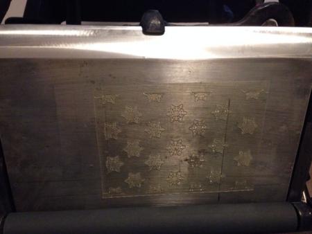
image.jpg
That should print - describe your makeready!
What kind of base is that? Same as last year’s?
Gerald
The base is a custom made chase manufactured from a solid piece of 7/8 inch aluminum.
I’ve attached an image of the 2 designs. Yesterday I just printed last years card again. Nothing has changed between the 2 prints - except for the photopolymer plate, obviously.
Last year’s design is 5.5x4.25. This year’s is 5x7.
Under my tympan, I have 2 or 3 sheets of onion skin paper, 2 of standard print paper and a piece of press board.
The position of the photopolymer on the press shouldn’t matter much, should it?
image.jpg
I suspect what is making the difference is that last year’s design was all linear — no solids — while this year’s design is heavy on the solids. If you could calculate the actual square inches of printing surface in the two designs I’ll guess there would be something like a 4:1 ratio, with the new design the heavy one. That it’s 50% larger in edge-to-edge size isn’t helping you. You may be pushing the envelope with an 8x12 press.
Bob
These snowflakes are not actually solid. They are linear.
Close up image
image.jpg
Hey, what kind of press are you using?
With debossing, my rule of thumb is always HARD PACKING. All tympan/pressboard, all the time, with small amounts of tissue added to the mix, but I don’t usually use the same paper I’m attempting to emboss- or anything compressible- behind the draw sheet.
Get rid of the printing paper behind the draw-sheet; replace it with hard packing, whether red pressboard or oiled manilla tympan; strike another impression, and let us know how that went. I suspect you should need a slight amount more packing, and that you may tax the press slightly, but the fact is you’re taking 1/4 of the chase area up- not 3/4- so you shouldn’t see so much of an issue if it’s a decent piece of equipment. Depends on the press, though, thus my first question!
It’s a Chandler and Price 8x12.
I will try replacing some of the packing. But don’t you think I would have had a similar issue with the other photopolymer plate?
Definitely too much “content” for that press to give a heavy impression. You might try hitting it a few times push it a bit each time.
I had a similar issue on my 10x15 - when I put it through my proof press it was significantly better. Maybe try cutting out one of the snow flakes and seeing how that prints. Looks like you used a different paper stock this year as well.
I had considered cutting it apart and seeing how it printed. I will also try punching it a couple times.
Ill try it through my proof press as well.
Same paper stock for both images. Just different lighting.
I’ll keep everyone posted! Thanks for all your advice!
Bill- the other plate has linear elements.
This one has bold flat shapes.
It’s like the difference between trying to push a sharp knife halfway through a loaf of bread and trying to push a shoe halfway through it. The shoe is going to take a lot more force while the knife will wedge into the bread and cut it.
Anyhow, I am no expert on 8x12’s and what they can/cannot achieve (as far as C&P’s go, I’ve only printed with New Style 10x15 N and old style 10x15), but I really think hard packing will improve the situation.
And there is your answer! The photopolymer was designed with too much going on and it was taxing my C&P 8x12. We’ll see what it looks like on my proof press. Thanks for all your thoughts, friends. It was great figuring this out with you.
Single snowflake printed with a great impression
image.jpg
:—)
If you can see the white halo, it’s not great impression.
Gerald
Gerald, sorry for this beginner question, but which part is the white halo?
Thanks,
Jay
Jay
Um, the white. If your impression is such that it creates this effect, or even breakage, it reveals that there is little concern for the substrate itself. Paper is part of the printing equation is it not? It’s a beautiful thing and process, always has been, well, until the 21st century. Why disrespect it? Especially for fleeting fashion.
Gerald
I think it is sad that deep impression is seeming to replace embossing. Perhaps I should say that there is the attempt to replace embossing with it’s cheaper cousin, which needs no special set-up or skill set. The same fad of extra heavy impression will extra wear and damage the machinery for future generations, so enjoy it while you can.
I find it interesting that only the “old school” folks (as infamously identified on this list) are the only ones concerned about the future of letterpress.
Gerald