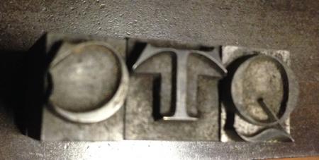
this is a hard type ID
You can see it here:
I looked through every face in Mac McGrew and there are a few that are close but nothing that is a match for that ‘Q’.
any ideas?
many thanks,
patrick

photo3.jpg
ffi |
fl |
5m |
4m |
’ |
k |
e |
1 |
2 |
3 |
4 |
5 |
6 |
7 |
8 |
$ |
@ |
# |
Æ |
Π|
æ |
œ |
|||||
j |
b |
c |
d |
i |
s |
f |
g |
ff |
9 |
A |
B |
C |
D |
E |
F |
G |
||||||||||
? |
fi |
0 |
||||||||||||||||||||||||
H |
I |
K |
L |
M |
N |
O |
||||||||||||||||||||
You can see it here:
I looked through every face in Mac McGrew and there are a few that are close but nothing that is a match for that ‘Q’.
any ideas?
many thanks,
patrick

photo3.jpg
Yes - its a very distinctive ‘Q’.
Are you certain that the ‘Q’ is from the same font as the ‘C’ and the ‘T’? It is less extended and is positioned rather lower on the body of the type; also the stress is vertical whereas the stress is very inclined on the ‘C’.
The serrifs match between the ‘C’ and the ‘T’; they have every appearance of being from a single font. But the ‘Q’…
What do other folk think?
It is the same font, I’ll take a picture if it. Foundry type too, it’s pretty hard.
P
Any other clues,? i.e. how many nicks at the front, 1,2,3, 1/4 round, or square,? how many (if any) milled in grooves, on the foot,? Founders *Pin Marks* on one side, Founders usually had, Pin Marks.???
One more possible extra clue to be investigated, maybe, as the pictured pieces, look quite old, could they be the North American standard prior to the adoption of .918, i.e. .9166,? is it possible to check with Micrometer, Caliper Vernier or finger nail test against a known modern piece of type, Block, Plate, etc, or even European, (French) possibly, at even higher than .918… Apologies for no answers, extra clues may help.!!!
The reason that you won’t find this one in McGrew’s book is that it is a 19th century face. Many foundries had variations of this design, so you will need to tell us what the pinmark says (or looks like) to specifically nail it down. A very popular design in the late 19th century.
I have a font of 34 pt. Old Style Extended from the Central Type Foundry in St. Louis. The verticle stress difference between the C and the Q are the same in my font as what you show in your picture. Your three characters are pretty much identicle to mine, BUT the stroke on the tail of the Q does not extend into the interior of the bowl in mine, so I assume your font is from a different foundry. My font includes a lowercase, as well as small caps AND both regular and small figures. A real gem!
Tell me about the pin mark and I can probably give you an exact name of your font.
Rick
More pictures:
http://tinyurl.com/mkelqe7
http://tinyurl.com/n3ln8xe
http://tinyurl.com/mvppqtu
http://tinyurl.com/jwyz868
http://tinyurl.com/kyxwe9g
http://tinyurl.com/nyj5urj
photo4.jpg
Forgive me, forgot to write something. The last URL is the full font, no lowercase unfortunately. Thanks to everyone above for the astute comments.
p
It looks like Ronaldson Extended, by MS&J, except for the lining figures. I have only seen it with old-style and lower-case. My 1906 ATF specimen shows the lining figures and the ‘Q’ as Lining Ronaldson Extended No. 2, on Page 472.
Dave Greer
The pinmark you show in the photo, a straight horizontal line across the center, is one used by ATF for about 10 years during the early 1900s starting about 1903. At the time they were promoting “the American Line” or the standard alignment of the various typefaces being offered. Other type foundries, especially Inland, also advertised the standard lining system.
As Dave and Bob have indicated, this is indeed Lining Ronaldson Extended No. 2 cast by the American Type Founders Co. The No.2 generally indicated that a lowercase was also included. You photo does show some lowercase ligatures so at one time they were included. ATF did not offer small caps with this face.
Rick
You da man! All of you! Steve Saxe off Letpress got it right too. I acquired it in Chicago in 2010 from an old gentleman whose name I should remember, his shop was being sold for him by a young lady whose name I also should remember. She drove a hard bargain. The type prints like a dream, I feel lucky to have gotten it.
Thanks again to all,
patrick