HELP WANTED: FONT IDENTIFICATION (2)
hey guys, font experts needed to help identify these old fonts.
thanks
Screen Shot 2015-08-12 at 1.03.17 PM.png
Screen Shot 2015-08-12 at 1.02.48 PM.png
Screen Shot 2015-08-12 at 1.02.41 PM.png
Screen Shot 2015-08-12 at 1.02.36 PM.png
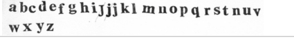
Screen Shot 2015-08-12 at 1.02.30 PM.png
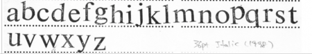
Well, the bottom four could be versions of Times Roman but without capital letters you are not giving us enough information.
Speaking of the original Times New Roman, it was NOT designed by Stanley Morison in the 1930s, and it was not NEW!!!
This may come as a shock to many,but the face actually originated right here in the USA by Lanston Monotype as No. 54. Somehow Stanley Morison and English Monotype conveniently never mentioned a peep about this.
Maybe sometime this winter I will have the time to draft an article about Lynn Boyd Benton NOT being the designer of the original Century face. It too should be an eye-opener.
And I will also be working on more information about why I do not believe that Morris Fuller Benton should be credited with most, if not all, the ATF designs credited to him. The fact that so many people are crediting him as the greatest type designer of the Twentieth Century sent me over the edge last year.
Rick
A very interesting story indeed. I found a good article in the Financial Times about it, but it appears to be impossible to extract a link that is good for more than one use.
I have no dog in this fight, but the ‘Morison stole Times New Roman’ *seems* to be a little light on evidence …
http://www.simonloxley.com/ar_02_stan.html
I don’t have the text of the Mike Parker article, or the rebuttal of his points, to hand, but Harold Berliner, Nicolas Barker, John Dreyfus and Jim Rimmer are a pretty formidably knowledgeable group of people: if they’re rebutting it, I would assume that it’s worth rebutting.
The Loxley article contains this statement:
“… Gerald Giampa, who had bought ‘the remnants of the Lanston Monotype Machine Company’. He had shown Parker a set of metal patterns that looked identical to Times then, excusing himself for claimed contractual reasons related to the purchase, kept a putative store of evidence hidden.”
The inference is that Giampa purchased the Lanston assets from Lanston, and Loxley doesn’t question that assertion. Giampa purchased all the Lanston material from M&H Type in San Francisco, who had purchased the material from Hartsel Machine who had purchased it all from American Type Founders. Giampa was far removed from any connection with the defunct Lanston Monotype Company by the time he took control of the dregs of the company.
Giampa removed the material from M&H and as Lewis Mitchel, the main casterman at M&H related to me, Giampa was drunk during the removal of the Lanston material and made quite a mess of the physical move out of M&H’s building on Bryant Street. Many of these articles written by people like Loxley are somewhat shallow in some of the supposed facts.
I don’t have the original article at hand either but as I recall, Parker had been fed the premise by Gerald Giampa who acquired some of the remaining original Lanston Monotype materials (but was still two or three owners removed from Lanston despite his promotion of a Lanston identity). English Monotype must have been aware of No. 54, but that doesn’t mean that any partial typographic inspiration is a theft and a conspiracy. The rebuttals were more convincing to me than the thesis. Rimmer in particular had worked closely with Giampa and was in a unique position to confirm Giampa’s tendency to go beyond the facts.
Beat me by a minute Fritz! But I wouldn’t say Giampa just got the dregs of the company. What he actually accomplished with the remains, and with Rimmer’s hard work, was a good digitization of select faces from master patterns and drawings. Very worthwhile project, and I have some PostScript versions digitized early on, and later OpenType versions sold through P22. The shame was that he promised much more to users of Monotype in particular and handset type in general and never delivered.
My only direct contact was responding to his ad in Type & Press offering foundry type and ornaments cast at his Northland Letterpress. What I got in response was material promoting his digital type and photopolymer plates. Classic bait-and-switch.
Considering how large an operation Lanston once was, a tiny fraction of the equipment reached M&H. And even Lewis at M&H held back stuff from Giampa, like the punches for Janson that still reside at M&H in the matrix vault. On one of my visits, Lewis was busily driving new display mats from those punches. Giampa’s digital work was pretty good what he did of it, but he sure missed the mark on what he could have done if he wasn’t so messed up as an individual—and this has been attested to me privately by a number of people who have dealt with him. The only significant pieces of Lanston mat making equipment that survived the scrapping of the operation were at M&H in this picture I took before Giampa got there:
https://www.flickr.com/photos/53177163@N00/260218440/in/photolist-5QFsvC...
And I certainly defer to Eric’s insider knowledge as a former employee at M&H, plus his interest in and work with digital type that I do not have. As an aside, Eric and I usually pay an annual visit to M&H when I’m in San Francisco.