Type ID?
I am trying to identify these two typefaces.
Any help would be appreciated.
BTY it is 28 point.
04E0F7FB-953C-4F1A-9E5D-D63A6D4434AC.jpeg
85AD4744-9EBD-4B1F-BFA3-79E539AAE789.jpeg
ffi |
fl |
5m |
4m |
’ |
k |
e |
1 |
2 |
3 |
4 |
5 |
6 |
7 |
8 |
$ |
@ |
# |
Æ |
Π|
æ |
œ |
|||||
j |
b |
c |
d |
i |
s |
f |
g |
ff |
9 |
A |
B |
C |
D |
E |
F |
G |
||||||||||
? |
fi |
0 |
||||||||||||||||||||||||
H |
I |
K |
L |
M |
N |
O |
||||||||||||||||||||
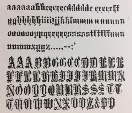
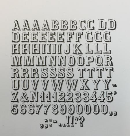
I am trying to identify these two typefaces.
Any help would be appreciated.
BTY it is 28 point.
04E0F7FB-953C-4F1A-9E5D-D63A6D4434AC.jpeg
85AD4744-9EBD-4B1F-BFA3-79E539AAE789.jpeg
The outline typeface looks like Orleans.
Michael
Michael, I don’t see Orleans in my McGrew book or William Loy book.
What else can you tell me about it?
Designer-Foundry?
The name “Orleans” is more modern than the type you have. I found it shown in two of Peat’s reprints of specimen books. The Cincinnati Type Foundry has it in their 1857 catalog as Ornamented No. 8. James Conner’s Sons foundry still offered it in their 1888 catalog as Ornamented No. 18. The design is likely of European origin and was copied by U.S. typefounders.
I believe the other type is called Engravers Text—not to be confused with Morris Benton’s 1930 design of the same name. Your version of Engravers Text probably dates to the 1870s or even late 1860s. I don’t know the origins of this typeface—maybe someone else does.
Look at the pin mark on the side of the type. At 28-point, called Double English in those days, it should be big enough to have a maker’s mark. For more obscure faces like this it helps to know the foundry it was made in.
-Bob
I agree with Bob’s analysis. The name “Orleans” is associated with Dan Solo’s rendition of proofs, of T.J. Lyons’ font, which Solo called, “Orleans Open,” in his Victorian Display Alphabets book. While I don’t have the actual type, any more, to examine any pin- mark, I believe that his type just had a typical pivotal round mark.
I have not actually found a showing of the Engravers Text, but I found one fairly close, called Engravers Text No. 2, by Farmer, which is just a condensed version. If I find an actual showing, I will post a photo on my Flickr site.
Dave Greer
Dan Solo gave me a 2” film font of that typeface. That’s probably where I got the Orleans name.
Those are both nice finds.
Regarding your text typeface, if you’ve arranged the alphabetical order on that proof, you’ve got several of the capital characters out of place.
Michael
Here is the pin mark.
Not very exciting but it may give Bob or TJ a hint of the foundry?
4485867B-AABF-48AC-9986-C55E6029FB29.jpeg
Another photo
260FE8C1-96D9-4D98-92E1-B33EF1A17F7C.jpeg
That’s a perfect image of the two crossed lines pin mark, the mark used by Farmer, Little & Co. of New York. Here is a showing of it in their 1885 catalog, fourth line down:
https://babel.hathitrust.org/cgi/pt?id=uiug.30112042846573;view=1up;seq=...
The typeface was already a bit dated by this time, and they only showed one size in 1885. As you can see, it is patented. A little more research revealed that it was patented by Andrew Little on July 1, 1873, design patent 6735. Here is a terrible copy of the original patent:
http://pdfpiw.uspto.gov/.piw?Docid=D0006735&homeurl=http%3A%2F%2Fpatft.u...
I wish Dan Solo - and T.J. Lyons, too - hadn’t invented names for types they couldn’t identify. It really muddies the water.