Metal type ID
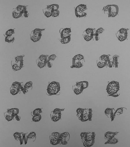
Some many years ago I acquired a batch of metal type which included the image depicted. It was labeled on the case as “Raffia Initials”. I do not know if this is the correct name for this set of type, which varies from 72 pt. to 80 pt. Does anyone know If this is the correct name, and does anyone have any information on it? One of the other fonts in the batch was an import called “Virtuosa”. Thank you for your time and consideration!
Jim
tjypeinitials.jpg
The ATA Type Comparison Book shows Raffia initials in 42 point with the note (F) indicating foundry type. Since I expect their naming standards were pretty high, I would accept that as the correct name. Do you have the type or just the proof? 80 point sounds like it could be European, but that’s just a guess.
Bob
I have two sizes of Rafia Initials but they are photoengravings.
Yes, Raffia Initials, Amsterdam Typefoundry 1952. Designed by Henk Krijger.
Jan Middendorp writes in his excellent book ‘Dutch Type’, published in 2004: ’ “Raffia Initialen” was an impressive tour de force. Each of the capitals and figures is made of three parallel strokes, whose extremities are bent and curled in the way that real raffia, or package ribbon, may behave.’ Raffia has never been ‘cast’, it was as John Horn already said, a photoengraving, mounted on a lead base. Three sizes were issued by the Amsterdam Typefoundry in 1952, 36/42; 54/60 and 72/84 pt.
raffia_light.jpg
And Virtuosa is a typeface designed by the late Hermann Zapf. It was issued by the Stempel Foundry in 1952. Two different versions exist, Virtuosa I and Virtuosa II. Still available from: http://rainer-gerstenberg.de/schriften.php?lang=en
Screen Shot 2018-04-28 at 15.25.15.png
Thank you all for such accurate and quick information: much appreciated. I do have the type (and figures), but mine appear to be cast in about 14 gauge metal, faced with brass or maybe copper — the color of the metal on the face of the type is sometimes different that the traces remaining on the shoulder — I think, then mounted onto solid lead metal bases which clearly show the milling (saw?) marks that true them up and set that at .918. Very heavy pieces, with no nicks or foundry ID marks. Thank you again!
Jim
No matrices were ever made for the Raffia Initials, it was made using the galvano method. Thus, no nicks and no pin marks.
I believe Galvano is a European expression and reckon that in the UK/USA you would call it Electrotype.
“Electrotype” was the word I thought of to describe what I have here. Thank you, Thomas, and others, for the quick replies and useful information. Very helpful!!
Jim
Electrotypes make a lot more sense than reproducing photo engravings for each font. But if the alphabet were available in metal, electrotyped mats could be made from the characters and then real type could be cast from those. However, it would require a fairly extensive pre-order list to justify the work of making type that way. But they are pretty initials.
Bob