L. Johnson & Co, Philadelphia
Does anyone have an idea of the name/age of this face? The pin mark says “L Johnson & C Phila”. 24 point.
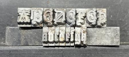
13F10185-464E-450C-8ED0-58B5369AAD7E.jpeg
ffi |
fl |
5m |
4m |
’ |
k |
e |
1 |
2 |
3 |
4 |
5 |
6 |
7 |
8 |
$ |
@ |
# |
Æ |
Π|
æ |
œ |
|||||
j |
b |
c |
d |
i |
s |
f |
g |
ff |
9 |
A |
B |
C |
D |
E |
F |
G |
||||||||||
? |
fi |
0 |
||||||||||||||||||||||||
H |
I |
K |
L |
M |
N |
O |
||||||||||||||||||||
Does anyone have an idea of the name/age of this face? The pin mark says “L Johnson & C Phila”. 24 point.
13F10185-464E-450C-8ED0-58B5369AAD7E.jpeg
The first place I jump to for pin mark information is:
https://www.circuitousroot.com/artifice/letters/press/noncomptype/identi...
search
“9.19. Franklin Type Foundry (Allison & Smith)” and read that entry…might get you on the right track
good luck!
Your type is called Medieval. The Johnson type foundry was the predecessor to MacKellar, Smiths & Jordan of Philadelphia. MS&J continued to use the Johnson pinmark for a number of years after Lawrence Johnson died in 1860.
There is some confusion to its origins, possibly dating back to the English foundry of Figgins in 1847. The Bruce type foundry of New York showed it in its 1869 catalog:
https://babel.hathitrust.org/cgi/pt?id=nyp.33433000823298&view=1up&seq=1...
Obviously, Johnson, and later Mackellar also made this face. MacKellar shows three sizes in their 1888 specimen book. There is an interesting discussion of Medieval on The Type Heritage Project site (scroll to the bottom of the page):
http://forums.typeheritage.com/designers/ihlenburg-h/
-Bob
Bob - thank you so very much - I coincidentally just found it on page 303 digital (p367 physical) of the 1892 MS&J “Specimens of Printing Types” catalog (which I also just found online at circuitousroot.
Bob - thank you so very much - I coincidentally just found it on page 303 digital (p367 physical) of the 1892 MS&J “Specimens of Printing Types” catalog (which I also just found online at circuitousroot.
For what it’s worth, from my card file, the near-complete font that I have:
https://www.flickr.com/photos/39182740@N04/49423340431/in/photostream/
I do have the zero which is lightly shown at the end of the figures. I’m not sure of having all of the duplicate capital letters and I am not sure of the last three characters shown.
Please comment, if you can identify them.
Dave Greer
Dave:
Not sure of the first two, but the last character seems to be a terminal “t” as it is shown used that way in the Bruce specimen linked above by Bob M.
John Henry
Cedar Creek Press
Thank you, John! I can see from that sample that they only show that lowercase ‘t’ character. I will have to check other partial showings for the other two characters. I believe that I have seen the first character used in another face, as a terminal letter.
My 1869 Bruce only shows a 24-point size and uses that alternate ‘t’ as a terminal, yet my 1881 MS&J shows it being used throughout the text.
Dave
Dave,
The one character may be an alternative “f”. Here is a specimen of Medieval from the Boston Type Foundry in 1880. Notice the word “for” in the top line. It also looks like there are some additional fanciful upper case letters in the four-line size. Some other differences in the other sizes, too.—Bob
https://babel.hathitrust.org/cgi/pt?id=nyp.33433006350783&view=1up&seq=1...
Thank you, Bob!
I agree with that character being an alternate lower-case ‘f,’ so we have identified two of the questionable characters. Now, if I can find a showing of that strange first one in my card file, I will be satisfied.
Also, in my observation of the actual type, yesterday, I discovered an alternate exclamation mark. Now, I am wondering, since a regular question mark seems to be missing, if that first character is actually one of those? I think that I will make another card, now. Sorry for the spelling of Medieval on the card, it has been changed and I will make a clearer print.
Dave
I have uploaded a new card located at:
https://www.flickr.com/photos/39182740@N04/49434204471/in/dateposted/
with the alternate characters inserted. What I thought was an alternate exclamation mark may be the question mark. The other character is still in question.
I left the previous card on file, so that more magnification might be available, if needed.
Dave Greer
I believe the other character is an ampersand - based on the ‘tironian et’. Also, the alternate ‘W’ looks suspiciously like a ligature or diphthong.
You don’t have to agree with me
a swiss Masterdegree Typesetter and Letterpress Printer with extensive knowledge in Typesetting Fraktur, Punchcutting, Mat Cutting and Typefounding.
Screenshot_2020-01-24 DSCN1740 (2).gif
Thank you, typenut, and all others for your input. Everything is now identified and I can rest.
From the Loy Book, the Design Patent date for Ihlenburg’s design is Jan. 11, 1870
.
Dave