Futura or 20th Century ?
Hello there,
I know that there are members here that are very knowledgeable about metal types.
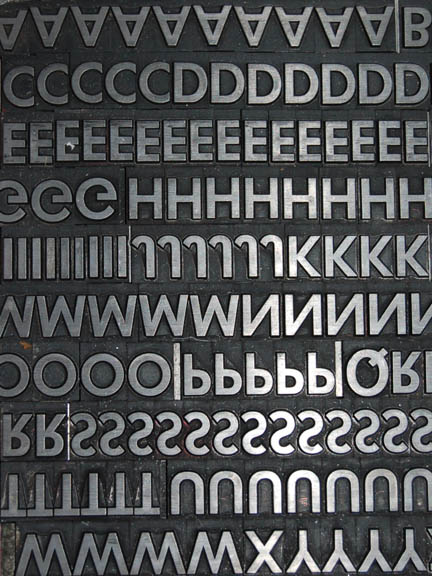
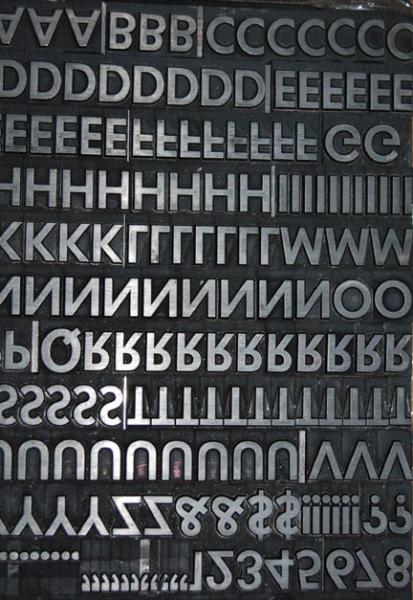
I bought this font couple of weeks ago. For me it looks just like Futura. It could be also 20th Century. It is a 48 pt. with no pin.
Any suggestions ?
André
futura 1.jpg
futura 2.jpg
futura 3.jpg
futura 4.jpg
I see Futura Medium.
It could also be a variant of Spartan. Same face; different foundry or distributor.
It is a pretty good typeface though, no matter what it is called. Bit of strength to it, if that is what is required. Worked well for Bush and Kennedy.
Gerald
Spartan was copied from Futura by Mergenthaler Linotype; the Lanston Monotype cut was called Twentieth Century. It’s a classic 20th century typeface which I think has suffered from being copied and produced in a bland form in the 70’s as ITC Avant Garde and subsequently overused as a children’s book typeface. In it’s original form however you have a cool typeface there.
Do my eyes deceive me or is the cap Q a wrong sort - it looks heavier and more condensed in the photo - should be like the O, but with a tail.
Spartan was copied from Futura by Mergenthaler Linotype; the Lanston Monotype cut was called Twentieth Century. It’s a classic 20th century typeface which I think has suffered from being copied and produced in a bland form in the 70’s as ITC Avant Garde and subsequently overused as a children’s book typeface. However in its original form you have a classic modernist typeface there.
Do my eyes deceive me or is the cap Q a wrong sort - it looks heavier and more condensed in the photo - should be like the O, but with a tail.
Oh yes, I forgot about Spartan, actually I have never seen it either. You are right John, the “Q” seems to be a bolder face and that is not Futura. I guess the typefounder included it with the font from another matrice. I hope I will not be using many “Q”s. I do also have a 48 pt Futura which has 3 “a”s, no “g” and no “j”, so I got this face to complement it. Both actually match the x-hight and the baseline.
I have some other fonts that when I can I will post here as I want to name them right. I could look at digital faces to compare and name it, but hey, that ain’t right.
Thank you guys :)
” Worked well for Bush and Kennedy “
And Volkswagen …
Are you in Europe or the States André?
Surely it would be cast of Futura if you obtained it in Europe - just by historical connection. I’m in the UK and the residual metal type being bought and sold these days seems to be almost all of UK or European origin - Gill Sans, Helvetica and Univers in the sans serif department…; we don’t seem to have a lot of Futura here, I assume because of Monotype’s strong marketing of Gill Sans…
Spartan in the UK was made by Stephenson Blake & Co of Sheffield, and was an Engraver’s Gothic type face with as far as I can remember three sizes (Caps & Small Caps) to each point size (there was no lower case). Widely used in my day for business cards
John,
I am in Florida. Actually I do have a little 6 pt Modern No. 20 from Stephenson Black. Are they still in business? I would like to get a Gill, it doesn’t show for sale often. I did find a typefounder in Germany with very good brand new type. The thing is the price is too right, as the dollar plunged down.
By the way, there is a height difference? I did acquired some brass rules from Germany and it seems the same height as the other materials I have.
Since there is no pinmark, I assume that you have 20th Century which is the Monotype copy of Futura (and hence the non-existent pinmark). If it were the true Futura, you would likely have a European pinmark on it.
I will have to speak up and say that Avant Garde is in no way a bland copy of Futura, but a very distinct face with lots of strickingly divergent characters, designed by master typographer Herb Lubalin.
André - Stephenson Blake closed several years ago, I managed to get some Perpetua foundry type in the sell off before closure but unfortunately the business in no more:
http://www.britishletterpress.co.uk/type/stephenson-blake/
You should be able to get Monotype Gill Sans in the UK - again as a type founder Monotype
closed but does exist in it’s digital form. I believe Gloucester Typesetting does hold a substantial range of Monotype mats, you might be able to get Gill Sans cast there (it would be .918):
http://www.briarpress.org/yellowpages/browse?page=1&t=58
Foolproof546
Hmmmm - Futura and Avant Garde - I believe one is a timeless classic, the other a classic of it’s time - there is a difference. As used by Lubalin in its cap form with all those striking ligatures, yes I concede the point, it’s very distinct but I still think in its 70’s ITC form it has been overused and abused.
And also I think the x-height is way too high…
BTW this is an interesting read:
http://www.graphic-design.com/Type/Avant/Avant2.html
I thought more or less the same, no pin, no mark. So that is the famous 20th Century. It look to be a sturdy one. Even maybe someone has the mats and just cast it, who knows, 10 years ago.
Avant Garde, it seems that Avant Garde was made with a eye in Futura, cause it was out there before Avant Garde comes out? I did use a lot of Avant Garde but is was transfer sheets, you know, to compose a short line of text in a big size, for past-up. I have never seen the metal version.
Alright folks, 20th Century it will be then, from Monotype. Just confirming as I will have have to talk about it when I try to sell a print piece with it.
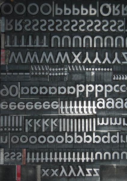
I have some other ones that I will post here as time permit. Cheers!
-André
John Christopher -
Yes, the biggest “complaint” with the faces that ITC brought out or “revived” in the 70s was the overpowering x-height. They went way too far in the opinion of many traditionilists at that time. They seemed to be absolutely committed to increasing x-height at the cost of the ascenders and descenders. I guess it was “a 70s thing”?
That phototype technology that rang the death-knoll for commercial hot-type is now obsolete itself in the digital age.
I think so - large x-height in proportion to length of ascender and descender - the flared trouser of typography…
Good luck with your 20th Century André…
It is hard to look at this backwards onscreen (in hand is a little different). If you flip the image it might be easier to tell. The striking letters I am looking at here are the B and E. Spartan has a less even proportion in between the center crossbar and the top and bottom ones than Futura does. The width of the crossbar of the Spartan is closer in proportion as well. The bottom bowl of the B sticks out a little more in a futura type face. I am sure you can find more specifics in the anatomy and compare them and end up with your answer.
SeaWolf
I am adding these pictures, they are the same as before, just flipped to read.
futura 4.jpg
futura 3.jpg
futura 2.jpg
futura 1.jpg