Critique my design
I’m not sure if I’m posting this in the right place or not. But I would really appreciate it if you could critique my design. Will this work well?
I will be having a photopolymer plate made.
ffi |
fl |
5m |
4m |
’ |
k |
e |
1 |
2 |
3 |
4 |
5 |
6 |
7 |
8 |
$ |
@ |
# |
Æ |
Π|
æ |
œ |
|||||
j |
b |
c |
d |
i |
s |
f |
g |
ff |
9 |
A |
B |
C |
D |
E |
F |
G |
||||||||||
? |
fi |
0 |
||||||||||||||||||||||||
H |
I |
K |
L |
M |
N |
O |
||||||||||||||||||||
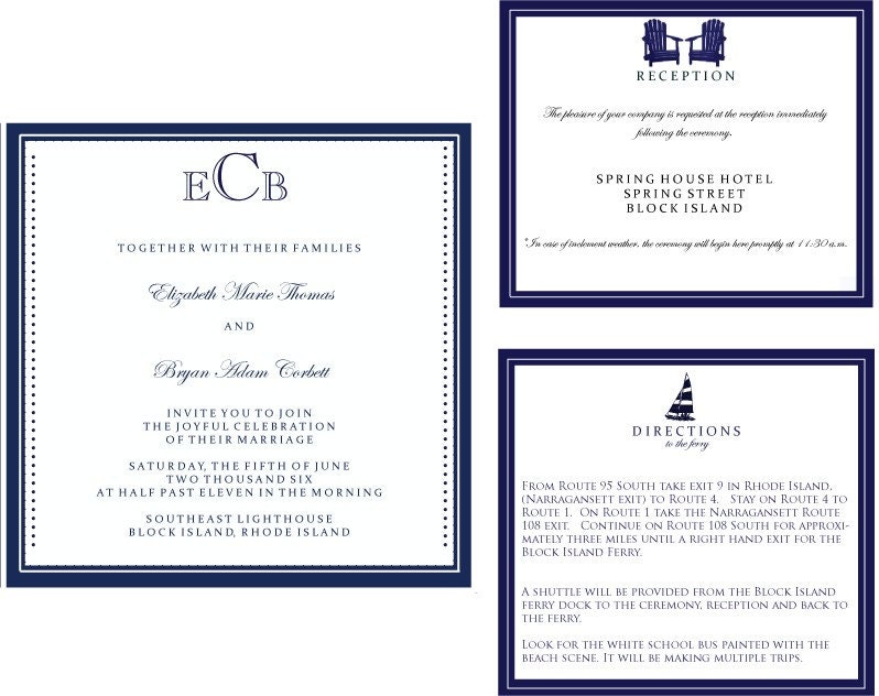
I’m not sure if I’m posting this in the right place or not. But I would really appreciate it if you could critique my design. Will this work well?
I will be having a photopolymer plate made.
You ask if your design will work well. My answer: Maybe
You show a date of 2006. This makes me curious.
It appears that all pieces will bleed at all edges. This will involve lots of cutting.
Consider leaving the monogram off the invitation
The vertical dots add nothing and detract from the simplicity and elegance, in my view.
Enjoy. Sounds like a fun venue for a wedding.
inky
n/a
The initials should be centered horizontally, not on the baseline, in other words a baseline shift up.
The type on the invitation and reception is centered and then you flush left rag right for the directions card. It’s not consistent.
The computer allows for a space after a period, you do not need to put in extra spaces like on the Directions card.
The kerning of you type is way too much, the letters start to appear on there own which makes the words not have enough separation, words looks like they are running together.
I would consider small caps. However, on a lot of text like the Directions card, it will be too heavy.
The long script lines on the Reception card is too much to read in a small area. Break the line with a return so becomes smaller in the space. The top script line in three lines and the bottom script in two lines.
Make all your type consistent from piece to piece, in other words type size, color, kearning, and leading if possible.
The heavy border distracts from the design. I would suggest a 1 pt rule and a 3 pt rule. However, just a 1 pt rule would work nicely.
The symbols are too close to the top edge, give it some breathing room.
The dots and dashes don’t appear on the other pieces. Are you implying it a nautical concept? Choose the dashes and get rid of the dots. be consistent on all pieces with the dashes. Make sure they are at least .5 for photopolymer.
Pull in your kearning on all pieces, be consistent with type alignment, break long lines of text, reduce border widths, consider small caps.
You have a start of a great piece, good luck.
Casey McGarr
Inky Lips Letterpress
Texas
First of all, thank you to everyone for the constructive criticism! It is very much appreciated.
Inky:
I changed our names and the date of the wedding because there could be weirdos out there in cyber space. The actual invitation will have the correct information.
The edges will not be a full bleed. There will be white… I should have outlined them somehow to show this.
Just out of curiosity, why do you dislike the monogram?
Devils Tail:
I would like to avoid my wedding invitations looking like death notices lol. Will white around the edges help with this? How much should the weight be reduced by in your opinion?
Thanks for the book recommendation I will certainly look for it.
Is it a general rule to not mix italic with all capitals? I thought letterspacing was “okay” if it was used with capitals?
Cmcgarr:
Small caps are a great idea. I will make this change. What would you recommend for the directions card?
I see what you mean about the centering of the monogram and the consistency. I will work on this.
Elizabeth
You asked for critical comment and you got it. There are some old standards of style and composition. We oldsters are comfortable with them. They are not written on stone and handed down to Moses. They are just the things we were taught.
It is your wedding and your printed piece. You may and will do as you please, not which may please us. You will no doubt consider the comments we have made and make your final decision.
I thought the borders a bit heavy but didn’t comment.
I think a wedding invitation should be simple and elegant. In the alternative today when the bride and groom put on their own show, it could be wild and whacky, if they choose.
I have never seen an invitation with the new monogram of the couple. That does not mean you can’t start a new trend.
Will your guests know to leave their car in Galilee and come over as foot passengers? It is obvious to you and to me. I assume the Galilee boat takes cars.
inky
n/a
Elizabeth- I am in agreement with Inky regarding the monogram. The ECM should be reserved until after the couple is united in marriage and the bride shares her groom’s last name. Should you decide to keep the monogram, a “C” would suffice, or the initials of your first names.
Regarding your border, you could experiment with a dot border (thinner) if you wanted to keep the dots- it might lighten it up… but I would try to avoid taking away from the charming chair and boat elements (cute!)
Good luck!
Wow, this is why I am not, nor desire to be a designer. LOL. I looked at the samples and said “oh those are nice, the boarders will be hard to print though.” I took no thought to all the things everyone mentioned in regard to the aesthetics of design, nor do I think I would have known if pressed about them. Just proves to me I am a printer at heart with the desire to put ink to paper as well as I can. What it is I’m putting on said paper though, matters not much to me. LOL!
The monogram being reserved for after the ceremony makes sense. I will change this, it had not occurred to me. I’m going to work on these tonight and post a revision.
I want to follow most of the “rules” and look forward to creating a good piece. My copy of General Printing arrived today and I’m eager to learn.
I do want the invitation in small caps. What would you guys recommend for the enclosure cards? I agree with Devils Tails that it will take away from the design on those.
Hi Elizabeth,
Have you looked through the examples on the Crane site? Here’s one with a mix of caps and script:
http://www.crane.com/prdAltView.aspx?Name=SW9561_pinkedgedweddinginvitat...
and here’s one with small caps throughout:
http://www.crane.com/prdAltView.aspx?Name=RDCD587_WasabiLeafPersonalized...
By the way, thanks for your post. It has elicited some thoughtful and instructive replies.
Barbara
ElizabethD,
The links for examples of small caps and all uppercase works well since there is little text to read.
Devils Tail Press was correct that too much caps or small caps will be weary on the eyes.
The symbols look really great and the border should be taken off. It would simplify the design and the piece would look better.
Here is my first revision.
I outlined them in orange to show where they will be cut. I removed the border on all but the invite. I like it this way, but think it looks inconsistent and will probably remove it from the invitation later.
I think the spacing still looks odd between paragraphs.
http://ny-image0.etsy.com/il_fullxfull.62702328.jpg
Much improved!
Some little suggestions:
On the invitation:
— Shift everything down.
— The monogram seems too staid. A closed typeface would better complement the graphics on the other cards. Maybe play with the script, which must have a lovely ampersand.
— The R in “request” should be lowercase.
On the reply card:
— Put the “Kindly respond” under the graphic, like the title on the other cards. The R in “respond” should be lowercase.
— The seahorse seems out of place with the sailboat and Adirondack chairs. Maybe another inanimate object, like an anchor or ship’s wheel?
On the directions card, the text might look better full-justified instead of centered.
On the reception card, break the lines with attention to the meaning:
The pleasure of your company
is requested at the reception
immediately following the ceremony.
In case of inclement weather,
the ceremony wil begin here
promptly at 11:30 A.M.
I hope the weather is NOT inclement!
Barbara
A few things-
-I agree with Barbara on the invitation spacing and would say the same about the response card.
-I see also that you brought in a new typeface for the “M” on the response card- i would keep it consistent with your other fonts instead.
-The T in “two” on the year line should be capitalized.
-Consider keeping the spacing between the motifs and wording consistent- i.e. the space between the sail boat and “Directions” would be the same as the space between the chairs and “Reception”
All in all, a huge improvement and it’s looking really sharp!
if possible, try out using small caps instead of normal caps. They have a way about them them really makes serif type setting pop of the page with elegance and style.
I agree, get rid of the dots. Does nothing for it.
Line spacing is critical, let it breathe.
I rekon if you can find a nice pic of a house, use that instead of the chairs for reception. It seems like an old age home.
Personally i don’t use script font at too small a size due to legibility, but that’s at your disgression.
Love blue, oh and keep to one style of paragraphing and turn off hypenating! haha
I gues it’s just a matter of being consistant.
Hope this helps. I am getting married in Feb next year, so am looking forward to this design task ;)
Warm regards
Ryan
ignore that. didn’t read all the posts as i commented on first image at top.
Wow, looks much better. Another personal taste thing on your new draft, the capitals with the small caps… i think they look clumsy, and with a nice boldness, the small caps should hold their own. What font are you using? i reccomend garamond pro bold for small caps… tasty!
Ryan
Barb- Thank you! I was wondering where the most appropriate place to cut the line was.
Littlemisspress- The grammar help is always welcome!
Ryan- Congrats on the upcoming wedding. I agree with you about the capitals in the small caps, I thought it looked strange. I’m using “LTC Caslon Small Caps”.