Help with this type
Hello, I need help with the identification of these fonts
Thanks
Humberto
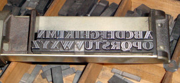
01.JPG
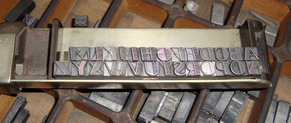
02.JPG
ffi |
fl |
5m |
4m |
’ |
k |
e |
1 |
2 |
3 |
4 |
5 |
6 |
7 |
8 |
$ |
@ |
# |
Æ |
Π|
æ |
œ |
|||||
j |
b |
c |
d |
i |
s |
f |
g |
ff |
9 |
A |
B |
C |
D |
E |
F |
G |
||||||||||
? |
fi |
0 |
||||||||||||||||||||||||
H |
I |
K |
L |
M |
N |
O |
||||||||||||||||||||
Hello, I need help with the identification of these fonts
Thanks
Humberto
01.JPG
02.JPG
The first (01.jpg) is Homewood. It looks like the second one is shaded in the wide strokes — It looks a lot like Broadway but there are differences. It may be a European version.
Homewood (from Baltotype) is a recutting of Metropolis Lined (which is actually Metropolis Bold with some white lines cut into it) from Germany.
The second face remains a mystery. It does look remarkably like Broadway, but the A, M and other characters are wrong.
Second font looks like ATF’s Boul Mich, (1934, p. 160; 1941, p. 41) except not inlined and R has a different tail.
One of the great mysteries of life…do you set the type in the stick this way by starting with Z and setting the alphabet backwards or do you stand on your head?
A curiosity is that this looks very much like an upright “roman’ version of the inclined face “Ondina” designed by K. Kranke for the foundry Shriftguss in 1935. Is there a pinmark on this type??????
Yes, but it is not Fatima from Schriftguss.
Gott grüß die Kunst
Jens
HPIM3474a.jpg
Thanks for the replies. Once again thanks Jens. It really looks a lot like the Ondina. Here in Argentina, Foolproof546, it is very difficult to find markings on the type of manufacturer. But undoubtedly, the letters were copies of German and American catalogs. Sorry for the assembly of the sentences, but no English and I handle the online translation.
Humberto
No need to apologize for the sentence structure skewed by translation. You are perfectly understandable.