Please ID old type
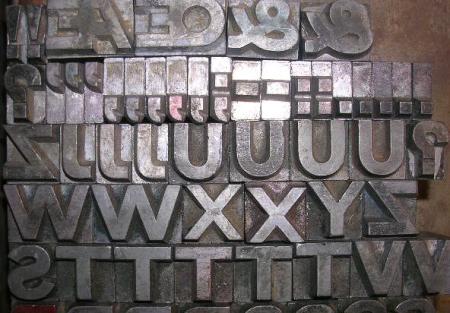
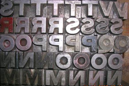
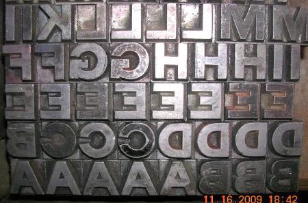
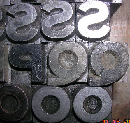
I’ve uncovered an old group of upper case letters with the “Boston Type Foundry” pinmark. The type appears to be a plain Gothic face with an unusual “Q” and the “AE” and “OE” pieces. Any suggestions? Thank you.
DSCN0509.JPG
DSCN0508.JPG
DSCN0507.JPG
DSCN0510.JPG
I thought I might be able to quickly identify this for you, but that turns out not to be the case. The first book I checked was my 1898 ATF catalog issued in Boston. It was not there, nor was it found in any of the dozen or so other reference books I looked through last night.
It is definitely OLD. The Q is fairly unique, but there are other quirky bits to it as well. The G looks very awkward and check out the weight of the strokes in the X as compared to the strokes in the W next to it. The X looks way too light in comparison to the W.
My guess is that this face was not too popular or offerred for too long because of this crudeness. You’ll probably need to find someone with access to an earlier Boston T.F. catalog to slueth out its original name. And then, don’t be surprised if it turns out to be something mundane like “Gothic No. 7”.
Good luck.
Huey,
I tried to respond to your off-line query, but it bounced back as undeliverable. The odd body size of your font definitely indicates that it was cast prior to the standardization of sizes. Back in the day, many foundries simply listed their sizes by names: Minion, Brevier, Pica, 2-line Pica, etc, etc. But they did not necessarily conform to any set standard and there are many baffling sizes of old type out there. You did exactly the right thing by measuring ten stacked pieces and then dividing by ten to find the actual point size.
I have a few very odd body sizes floating around in my shop as well. Based on the odd size and the general design of you font, I would not be surprised at all if it turned out to have an originating date as early as the 1850s or 1860s.
You’ll need to find someone with a very OLD Boston T.F. specimen catalog to track this puppy down.
Good luck.
I think I found it!!!!!!!! Many thanks to Greg Walters for guiding me to a sight that displays the 1860 Boston Type Foundry catalog. For those interested in this intriguing look at this book, the site is: http://www.archive.org/details/condensedspecimen00bost
On page 88 there is a showing of Gothic No.2 (I was afraid it was going to have a rather disappointing name) and the sizes are listed as names. Your font, I believe, is Two-Line Great Primer Gothic No.2. Note that each size is NOT an exact enlargement/reduction of the other sizes because the punches for this face were cut by hand for each individual size. Just look at the difference between the “A” in the first specimen line and the “A” on the second line. Subtle, but different. Therefore you can not go by the design of the “G” in the other sizes when comparing them to the “G” in your size.
I feel fairly confident that this is your font. Set and proof the word MACEDON and see how it compasred to the specimen shown.
Rick von Holdt
(Holed-up for a few days to ride out the biggest storm/blizzard to hit here in several years)
Rick:
Close, but no cigar. What about the “G”? (Not that I have any better ideas at this point.)
We’re hoping for a bit less snow up here in the northern territories of Iowa. This makes one long for the Southland.
John Henry
Read your post a bit closer — yes, you are right, there is some variation in the sizes. It certainly does look like a close match otherwise.
Still cold & white.
John Henry
Hi John,
I wussied-out and came home mid-day to avoid the worst (so far) of the storm. Lots of cars littering the ditches of central Iowa on my way home. There is actually one car in the ditch right across the road from the farm. The driver never came up to the house so I suspect he/she was picked up by someone else. It is so bad that they have even issued a no-tow directive for the next few days, so those unfortunate enough to slide into the ditches will not get pulled out for a while.
How is this printing related?????? Just about my favorite time of year is winter when I am “forced” indoors and no longer have to sneak down to the basement print shop! The wood-burning stove down there becomes my best friend at such times.
Huey:
Wasn’t able to reach you on your e-mail address. I am interested in your offer for the type. Please call me at 828 277-5792 or leave a message for me at [email protected]
Thanks,
Bodoni
Huey:
Like others here, I have found it impossible to contact you through your e-mail address. I get a bounce-back. You wrote to me asking about the type I have for sale. I have posted on this website in the classified section a photo of the three cabinets of type I have available. There are 67, not 72 cases. (I counted one case of 24 and multipliedby three. But the wooden cabinet has fewer cases.) I also have Stymie face fonts in assorted sizes in original wrappers which I will throw in. Please contact me if you are interested. I have 8 other prospects who are interested and I can’t sit on this too much longer.
Yrs.,
Bodoni