Typeface ID Request
Here is a 24pt. font I came into possession of recently and am unable to identify. It is old (blackened) foundry type with two nicks, no pinmark or number, and a rather unspectacular face in general. It seems to be a 20th century design, but I can’t find it in MacGrew’s book.
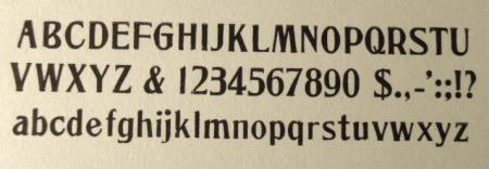
Note the angled leg on the lower case ‘h’ and ‘m’. The numbers seem awkwardly designed, particularly the ‘3’. The cap ‘B’ shares the same characteristic as the Hobo ‘B’. Also note the different crossbar heights of the cap ‘E’ and ‘F’.
Any help would be appreciated.
Unknown 24 Pt. Face.jpg
Hi Dave,
This is definitely a 19th century face, which is why it will not be shown in McGrew’s book. I’ll have to start looking through my old catalogs and see if I can find this puppy for you.
It is indeed fairly bizarre. The “F” doesn’t look like it belongs in this font and look at the size difference in the “u” and “w.”
Give me some time to try to track this down.
Rick
Hi Dave,
This didn’t take as long as I thought it might.
Your face is Trenton from Barnhart Bros. & Splindler in Chicago. I found it in their 1898 Pony Specimen Book and it is noted that they patented this face by then. It is shown 6 through 72 point and each size is a little different from the next because the punches for each size were cut by hand. The 72 pt. specimen, for instance, is much more condensed than your 24 pt. specimen.
Rick
Thank you Rick!
It’s been a mystery for a while now. I have a 1907 BB&S catalog and I’m not seeing it in there, so maybe it was discontinued by that time. I’m used to seeing the BB&S pin mark, but this font lacks one, so I have to assume BB&S didn’t always include them.
I used TRENTON for the cover on a card for my wife. It’s really not that bad.
The inside was done in ATF 24pt. Tabard, which is a goofy looking face. I love it.
I really appreciate your help, and thanks again.
Dave
24pt. Trenton.JPG
24 pt. Tabard.JPG
Rick,
On further investigation I found in the 1907 BB&S catalog this font ‘Merit’ which is very utterly close. It is found on page 388. I must have overlooked this by thinking that it was not BB&S type by the lack of the pin mark. What is lacking is the slight angle on the legs of the ‘h’ and the ‘m’.
[EDIT] Further, further investigation reveals that the ‘h’ & ‘m’ has alternate characters. See photo.
And according to David Tribby’s .pdf chart on BB&S’s alternate names, it was indeed called Trenton in ‘97-‘98 and later changed to Merit.
http://www.aapainfo.org/atf/BBS.pdf
You certainly steered me in the right direction, Rick, and you are correct, the 72 pt. is very much more condensed and the other sizes all look different as well.
Dave
24 pt. Merit.jpg
Trenton-Merit Alt. Characters.JPG
Dave,
Very nice card! Love the Tabbard too.
Thank you so much for pointing me to Dave Tribby’s list of alternate BB&S face names. I don’t ever recall running across that before. And kudos to Dave Tribby for putting that together!
Merry Christmas.
Rick