Vatican Missal Typeface ID
The Typis Polyglottis Vaticanis came out this year with a very nice reprint edition of the 1962 altar missal (the Missale Romanum). Can anyone identify the body type here for me? Thanks. And Buon natale!
— Denis
MissRom1.jpg
MissRom2.jpg
MissRom3.jpg
MissRom4.jpg
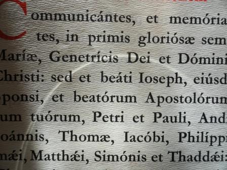
The text seems to be set in some variant of Garamond or a similar oldstyle face.
There are lots of flavours of this font out there, so you’ll have to do some work if you want an exact match, but any font branded Minister/Administer will have the same feel.
http://www.fonts.com/FindFonts/Detail.htm?productid=12933&/cgi-bin/MsmGo...
Minister may well be the titling face, but as jhenry says, the body text is clearly in the Garamond family, from the cap T and the serifs on m, n, p, and r, and at least a semibold version.
I am not a Garamond expert, but the Linotype Minister Book I’ve linked to above seems to me to match all the glyphs you mentioned in the body text better than Adobe or Stempel’s Garamonds.
The text page shown above has caps A and T that are entirely different from the digital Minister, and consistant with many versions of Garamond (the Minister g differs too). And there are dozens of versions of Garamond by different foundries. It is likely a version from a European foundry; there were still many active in 1962, and many had their own Garamond.
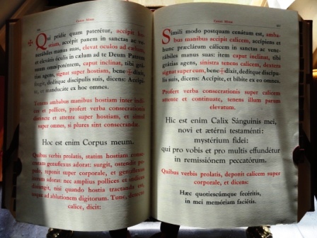
Thanks for the discussion, folks. I see that the titling font could be Minister, but the body text cap A doesn’t seem to match the cap A of Minister in the link modernman provides. (Note especially the serif on the cap A in Minister lacking in the A in the body text). I will have to sleuth out which brand of Garamond this might be. It is, after all, a European production. I’m also a bit intrigued by the “extensive” Q of the cap in the second picture (“Qui pridie”). The Minister has quite less flourish.
@ parallel imp
You beat me to it. I’ll keep looking!
Very unlikely to find Minister in Italy, more chance that the text was set using Italian or other continental fonts. Check out some Nebiolo specimen. Nearly every foundry had a version of Garamond.
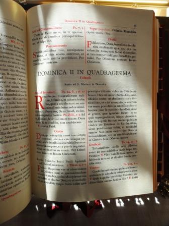
I doubt if the book is printed letterpress — looks like offset at least in the first photo, on that textured paper. There are so many variants of standard typefaces available for photo composition that tracking this one down will be challenging. The closest I could get is to Goudy Catalog, but the cap T doesn’t match that. All the Garamonds I found have a higher-waisted “e” and straight-legged M — note the spread of the M in the specimen. There are too many differences with Minister and similar faces. I also would say that several faces are in use here, at least the titling seems different and may have been hand drawn. The photos of the other pages with different sizes are too fuzzy to analyze.
Not much help — sorry!
Bob
Well, the question is whether this is a straight reprint of the 1962 edition, or a re-setting. If a reprint, then metal composition is more likely than phototype, even if the original edition was printed by offset.
I was in all too much of a rush, too. Undoubtedly this edition was offset, but I missed the mention of facsimile in the original posting, I just skipped to the photographs and assumed it would have been digitally set from type now available in ones and zeros.
Thanks, Bob, for the hint on the Nebiolo. I’ll see if I can scare up anything.
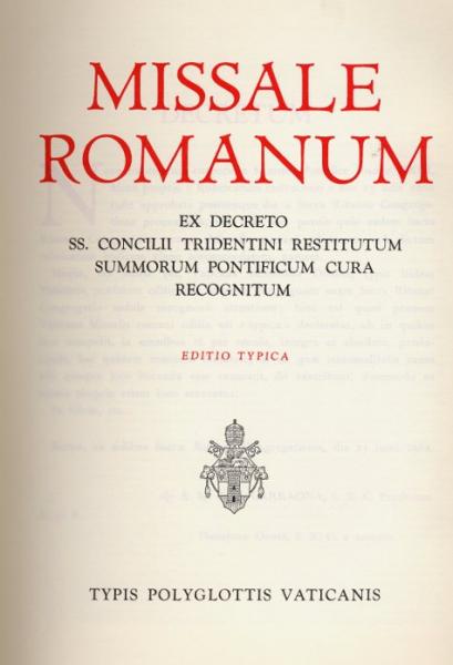
Certainly there are two faces here: one for titling/caps and the body text in some sort of Garamond. After a second look I realized that the title page is new, i.e post 2008,since it makes a reference to the papal encyclical “Summorum pontificum” which was published in 2008. I hadn’t considered that the title page might have been hand written, but it’s possible. It is more likely digital 1s and 0s, though. As for the rest of the book, it is a reprint, offset from an orginal metal setting. That said, the titling and drop caps (in the body, not on the title page) are certainly not Garamond, are they? I’m not sure about Minister. That dang Q keeps me guessing and the serifs are quirky enough.
Sorry, I meant “Thanks, Tom”. By which I don’t mean to slight Bob, either. Or anyone else for that matter….
The initial letters, without better resolution, have a hint of Goudy to them, especially the Q. When you look at the bottom of the title page,, the LY and VAT combinations are not what you’d expect from phototype or digital composition
Traditionally Bembo should be the font used for Vatican printing but this isn’t Bembo. I downloaded the 1962 version to study. I agree with the Goudy look to the initials but haven’t looked at all of Goudy’s typefaces. I find it hard to accept the use of digital fonts for a book such as this but it would depend on the publisher-church or a commercail printer.
A good sleuth this time of year is welcome.
dcrnkovic,
Good to see this question being asked. I too had the same question about the typeface from the 1962 Missale Romanum. (I had photocopied the first 10 pages of the Missale, but never got around to asking about the typeface).
If you are unable to find an answer, may I suggest posting the same question/photos on www.typophile.com. There’s bound to be someone there who may be able to answer.
newbee: Thanks for the hint to contact typophile.com. Which of the 1962 Missale have you copied? There are a number of editions printed in various countries. In the US the most popular printing was from Benzinger Bros., but that is not the same as the Vatican’s 1962 and reprint. I have been doing research on the early printed Missals from the Vatican’s Propaganda Press, but this latest one intrigues me. As longday mentions, the Vatican press often used Bembo for liturgical publications, which is why I find this edition intriguing.
The initials certainly look a lot like Goudy’s Old Style (including the Q). But the body type, on closer inspection of the downloaded pdf ( http://www.sanctamissa.org/en/resources/books-1962/missale-romanum-1962-... - I’m not sure which edition it is or which printer) has decided Garamond-style descender on the cap Q. Perhaps it is so-called Italian Garamond?
Also, the title page might be from the 1962 edition as well, since I now realize that the phrase “Summorum pontificum” was in use then as well, replacing the phrase “aliorum pontificum” of some early editions.
I checked into the Tipografia Vaticana website and, although they are proud of their 1991 switch to digital typeseeting and composition, they really have nothing to say about their house typefaces.
-Denis
dcrnkovic,
I have the 10 page photocopy somewhere (lost among my junk:) I believe it was the US version printed the US. I do remember flipping through the front pages and back pages, but could not find any info on the typeface used.
If you are looking for the digital typeface/font, then the typophile site would be a good place to ask.
Denis,
It appears to be the English Monotype version of Garamond used for the body text, pattern #156.
Alan
Alan,
Looks like you’re right about this. Thanks! -Denis