typeface with unusual ‘e’
Hello everyone, I am new to the forum and to letterpress…
A friend has been helping me to learn to print over the past couple of months. I even got given my very own tray o’ type!
The tray of type came from a guy who used to run a commercial printer. Neither he nor my friend know the name of the typeset but I would love to know, and wondered whether anyone on here can help. It has quite an unusual and distinctive ‘e’ (slanting slightly upwards). I’m attaching a pic.
Hoping someone can identify it from the pic, or make some suggestions. (Also please ignore the mistake where I printed one line of print directly over the next. I’m still learning!)
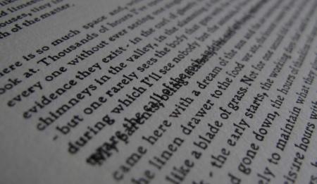
Here’s the pic. And thanks in advance. Cheers.
TYPEFACE.jpg
It would help a lot to have a straight-on shot in focus — it’s the small details in the letters that make identification possible.
Bob
Ok. Sorry. Second try.
TYPEFACE2.jpg
Sure looks like Morris’s Golden type. Same medium weight page with even weighted strokes. Or it could be Morris Jensonian type. I have a book from 1929 set it that. Same feel and color of the overall page. Your font is wider though. much closer to Golden type.
It does look a lot like Morris Jensonian or Jenson. The one thing that has me puzzled is the overall heavyness of the comma and apostrophe. They don’t quite look right at all.
Rick
Wow, that was quick - thanks!
I’m pretty sure the commas & apostrophes do belong with this typeset. All of the leads have a distinctive double-notch on them, including the punctuation. (The full stops / periods that you see here are subs from another typeset, because mine came without any.)
And there was me thinking that ‘as if by magic’ someone else in the world had the same question about this typeface…but no, it’s our very own inky_fingers. Hello Sarah ;)
The full stops are Univers Medium 8pt, typographical heresy it maybe but needs must when the devil drives.
So could we date this from about 1929?
You can date it positively if you look on the face of the Cap ‘H” or lower case “m”. Both were ATF faces and may have been numbered. 276 for Jenson Old Stlye, 1790 for Morris Jensonian . These were done in 1897 & 1912. It also was produced in Mono but that won’t have a number. Either way you have an old, Historic font that influenced book typography design and printing starting in the early 20th century.
That’s incredible. The mind boggles as to how many hands this has passed through…
longdaypress - do you think you could post up a scan of the book you have from 1929?
Thanks.
American Metal Typefaces of the Twentieth Century, Mac McGrew author. Published by Oak Knoll. Reprinted as second addition. I don’t have a scanner. Sorry.
Thanks, everyone, for the help. I’m dead chuffed that I’ve ended up with an old typeface with an interesting history - and completely by accident, too…!
There are quite a few books on typeface / typography in my local library, as I discovered yesterday - so I’m going to do a bit more research now that I know what I’ve got.
Ouch. Pricey book. Xmas 2011 list maybe.
A few of the ATF catalogs are online. Jensen Old Style has a nice showing in the 1897 “Specimens of Printing Types” put out by the NY branch, online at:
http://www.archive.org/details/specimensofprint00amerrich
or see Lining Jenson Old Style No. 2 in the 1912 ATF “American Specimen Book of Type Styles” online at:
http://www.archive.org/details/americanspecimen00amerrich
Monotype’s version of Jenson Oldstyle was given the series number 58 (sometimes shown with a suffix, as in 58J; the suffix indicates the classification of the series). This is shown in the 1922 Lanston Monotype “Specimen Book of Type Faces,” which is online at:
http://www.archive.org/details/monotypespecimen00lansrich
It is on pages 229-231 of the digitization (at this point in time Lanston was for the most part just numbering their faces, not naming them - and the numbers in this Specimen aren’t always in a logical order).
Quite a number of metal type specimen books are online now, actually. One good place to start is archive.org (The Internet Archive). Search there, for example, on “American Type Founders”. (But ignore their scan of the otherwise classic 1923 edition - it was done for a project which emphasized OCR and has very poor images).
Try also Google Books’ advanced search:
http://books.google.com/advanced_book_search
and check off the “Full View Only” button.
But you’re going to have to save your pennies and buy a copy of McGrew’s _American Metal Type Faces_. It’s the essential daily reference. It’s back in print (Oak Knoll), and you can get it either from the publisher or from Fritz Klinke at NA Graphics:
http://www.nagraph.com/
Anyway, I hope this helps. You’re in for quite a lot of fun here.
Regards,
David M. MacMillan
OK. I think I have a fairly definitive answer. Inkyfingers indicated that this is an 8pt. font. In looking at ATF’s Jenson and BB&S’s Morris Jensonian (their 8pt. specimens) the punctuation is noticably heavier looking than in larger sized fonts. A very noticeable difference between the two faces at that size is the width of the N. The N in Morris Jensonian more closely resembles your specimen above, so my money is on Morris Jensonian. Also the double nicks strongly indicate that it was cast by BB&S.
To add a new twist for you, when BB&S introduced Morris Jensonian in 1912, they were simply renaming and recasting Inland’s Kelmscott, first shown in 1897.
This really is an exciting find, but the 8pt.size really limits its usability.
Rick