Metal & Wood type ID help needed!
Hello-We have resurrected our old letterpress equipment at our University and have identified some type, but need help with the rest. We’ve made a metal and wood type specimen poster to get started. Please help with any of the type in the colored boxes. If you want to see the Q of a certain one I can get that, but any help is appreciated!
Also-if you think one is wrong, let me know.
This type is all from a magnetic sign press made by Dick Blick.
Thanks!
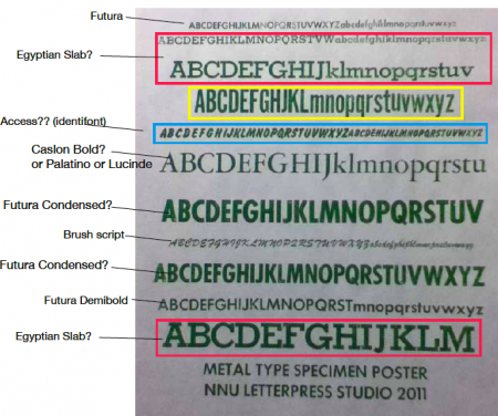
Metal type
detail of metal type
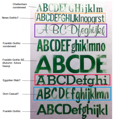
Wood type
Purple box is Murray Hill. Red box looks like Stymie but maybe that’s just the name for the metal version of that face. And I believe Dom Casual is correct for the Blue.
Blue could be Flash or Okay.
How tall is your Stymie/Slab? I have some similar type, and would appreciate a proof of your complete font so I could replicate a few missing letters.
Thanks
You may also appreciate this Signpress manual I posted on Flickr.
http://www.flickr.com/photos/boundstaffpress/sets/72157623331909131/
Thanks, that helps. We’ve got 3 sizes of the Stymie/Slab, I’ll check the sizes. I think we’ve got some missing ones also, but I’d be happy to get you a proof of the whole font set.
Thanks, I did look at your Signpress manual a few months ago when I was getting our studio space up and running, it was a huge help!
To clear up some of the typeface i.d.s:
Your English slab in the red box is Stymie Bold
Your wood in the purple box is Murray Hill Bold
Your Caslon Bold?or Palatino or Lucinde(Sp?) is neither, it is Garamond
Your Futura Condensed is Futura Bold Condensed
Your yellow box contains Alternate Gothic No. 1
Your wood in the blue box is indeed Dom Casual - not Flash or Okay(????)
Hope this helps
Rick
Isn’t it nice to have a wizard like Rick at Foolproof who has educated himself on type faces and is generous with his time to check his references and respond. Thanks also to others who respond.
This willingness to respond to the questions of others makes this forum a great place, and printing a great hobby.
If you have received, give some back when you have the opportunity.
Hey Rick,
Thank you, it does help a lot! I just went back and looked at my old typography book and yes, that one is Garamond. I thought it was at first, but the ‘J’ is tricky, and doesn’t even match up with Garamond’s cap ‘J’, do they sometimes change them? Everything else does match. Caslon was a slant on the ‘A’ now that I look closer.
thanks, again, hadn’t heard of Alternate Gothic!
Many students and future students will be thankful for your help as well!
Jamie
The wood face listed as Franklin Gothic Condensed is called Poster Gothic. The others listed as Franklin Gothic are a variant of Futura, sometimes called 20th Century, the lowercase ‘g’ in both do not belong.
An interesting point on the Garamond. I hadn’t really noticed the J. The J that you display actually looks like a wrong font character. There are lots of versions of Garamond/Garamont, but none of them have a J like that.
Taking a hard look at your specimen, the J appears to be much heavier (thicker) in the main stroke than the “I” right next to it. The longer you stare at the specimen the more the J starts to stand out.
Sorry I didn’t pay much attention to the Poster Gothic and Futura wood fonts. Sans serifs are my weak point as I never have been much turned on by them.
My favorites are the Bernhard Gothics (they definitely have style) and probably the best overall sans serif ever - Franklin Gothic (named in honor of Ben Franklin).
Rick
Thanks Devils Tail Press for the Sans Serif help.
Also, thanks Rick, yes, the J does look out of place, however, it’s the only one we’ve got, so I’ll think we’ll call it Garamond, and just live with the J!
I am a fan of serifs also. I didn’t know Franklin Gothic was named after Ben Franklin! That’s a fun fact. I know he was super important in the printing industry, so that makes sense.
Thanks again for your help!
Hey Justin of Boundstaffpress,
fyi, you were right on the blue box metal type of mine. I got my hands on a typeface catalog and they it’s ‘Okay’ I believe, funny name for a typeface. Same designer as Flash and they are very similar. The blue box of wood type is Dom Casual, that was confusing, my fault.
I think we have the same press? what typefaces do you have? Do you still want to see all the Stymie type? I have 24pt, 48pt, 72pt, in metal and 10 line wood type of that typeface! Let me know which one so I just do one complete set.
Thanks!
I believe we do have the same brand of press. I have lead Futura Bold Condensed in 72pt, 60pt, 36pt, and Futura Bold in 36pt. In wood, I have the Murray Hill and Stymie both 10 line. All of these have the groove in the back that is specific to signpress fonts.
My Murray Hill is very full, but the Stymie is only one cut of each letter. I am missing all of the lower case letters that have descenders. I have no g, j, p, q, or y. If you would be so kind as to proof your font, I would gladly pay for you to send me a copy. I am going to begin carving replacement characters first in linoleum, but eventually in wood.
Is your typeface catalog specific to Signpress brand presses? If so, I would love to post scans with my owner’s manual.
When I acquired my press, I also managed to end up with a compositors table that is shown in the catalog. Here is a picture.
http://www.flickr.com/photos/boundstaffpress/6167655370/
Thanks.
Hi, I think we do have the same press, and yes, I have a type cabinet/composing table just like yours. I’m not sure of the history, but it’s been at our university long before I came (I’ve been there 6 yrs). It appears that all the type is specific to the Signpress brand, they all have the groove in the back, wood and lead. Some of the lead type is the hollow kind, and some has the traditional sliver thing on the bottom or side of the type.
I’d be happy to proof the font for you. What exactly does that entail, lower/upper + # and symbols? Do you want all sizes? In lead I have 24, 48 & 72pt, and 10 line.
I love the wood cut you did of the bird!
Thanks, Jamie
If you would simply print your 10 line Stymie includeing one of each letter upper and lower case. I have the numbers and symbols. I just want to be able to compare placement of the letter on the block.
My press came with some cuts that say something about association of educational clubs. I think the signpress brand must have marketed themselves to schools. No surprise then that we would each have found them in schools.
I’d be glad to trade you out a copy of my bird print for the proof of your font. I’ll e-mail you my address.