Wood type id
Really interested in cutting some additional letters to expand on this small collection. Does anyone id where the classification falls? Thanks in advance.
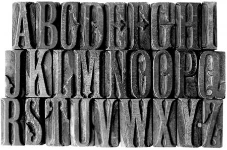
wood letters.jpg
ffi |
fl |
5m |
4m |
’ |
k |
e |
1 |
2 |
3 |
4 |
5 |
6 |
7 |
8 |
$ |
@ |
# |
Æ |
Π|
æ |
œ |
|||||
j |
b |
c |
d |
i |
s |
f |
g |
ff |
9 |
A |
B |
C |
D |
E |
F |
G |
||||||||||
? |
fi |
0 |
||||||||||||||||||||||||
H |
I |
K |
L |
M |
N |
O |
||||||||||||||||||||
Really interested in cutting some additional letters to expand on this small collection. Does anyone id where the classification falls? Thanks in advance.
wood letters.jpg
We’ve got some sorts of this - totally useless for the most part but beautiful to look at. Interested to know what it is also.
Is there a maker’s mark on the side of the ‘A’ that might tell us what manufacturer cut this font?
I can tell you that the basic design is Latin, but the addition of the unusual flairs and serifs indicate that this had a very specific name. Very likely pre-1900.
Rick
On second look, it is not based on Latin, but on a roman face. The proportions are very similar to Latin Condensed, but the serifs are rounded (not triangular like Latin)
An indication of a mark on the side of the ‘A’ and what it says or looks like would go a long ways into identifying this font if the specific manufacturer can be nailed-down.
Rick
I’m wondering whether this might have been hand cut rather than machine cut with a pantographic router. Look at the non-printing areas - they look to me like they have chisel marks rather than router marks. Also, looking at the only letter that has a duplicate, the “O” - it looks like the florishes in these letters are slightly different, which would point to a hand cut font.
In addition, the faces of the type (the printing surfaces) look quite rough compared with normal wood type. Is this cut on side grain wood, rather than end grain? By any chance, are the letters die cut and glued to these blocks, as some later wood type was?
Thanks for your interesting and enlightening comments. There are no signs of a manufacture’s mark on any character. From what I gather, each wood block – hornbeam aka beech or even sycamore (from what I was told) – was cut bulk end-grain, hence, there are no tell tail veneer sandwich giveaways. I agree that there is an obvious hand tooled finish to the body of most blocks and the inconsistencies point away from the more popular mechanised method of cutting of wood that William Leavenworth adopted to his own pantograph, using Darius Wells’ router.
So… is this fancy roman any way unique to the designer / cutter / letterpress printer? I’d be interested to know what ‘theprintproject’ makes of his. Thanks again.
It looks like a mix of styles:
- Campanile, with the little median decoration on the D O Q
- fishtail tuscan serifs on C E F G J L etc
- a sort of latin on others
- looks English - Campanile was only cut as wood type in England, (although the original design was MacKellar, Smiths & Jordan in 1879 - see eg in Rob Roy Kelly p.203, example 26) see pic
- looks hand cut , and sidegrain
- do you know if it was English or US, in origin?
Philip
Campanile.jpg
I have found something much closer than Campanile. I’m looking at a metal typeface offered by MacKellar, Smiths & Jordan in 1888 (it could have originated earlier). The metal face’s name is Crosier. It is definitely the ‘model’ for your wood font. The little flourish inside the O curls the other way in Crosier, but other than that everything else appears to be a dead-nuts pattern for your font. I don’t have the technical savvy to scan and send an image for you, but if anyone has access to a McK,S&J catalog perhaps they might be able to post an image of Crosier.
Rick
The 1892 MSJ specimen book is already online, at The Internet Archive (archive.org). See:
http://www.archive.org/details/specimensofprint00mackrich
Crosier is shown on p. 295 of this book (which is page 255 of the PDF version if you download that).
Regards,
David M.
www.CircuitousRoot.com
Rick and David - well done!
Philip