Wood type id2
Can anyone help id this lightly modified / ornamented wedge-serif 8-liner by name or date / domicile? Caps, figs, etc. No mark on letter A that I can detect. Had a look through the printing types spec. book of miller & richardson foundary, Mackellar Smiths & Jordan Co. and a 1950’s printing types from the Caslon letter foundry, Sheffield, UK. Much appreciate helpful comments.
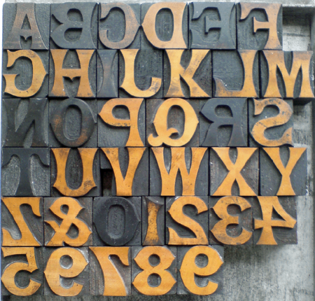
DSC00043.png
Came across this near Bath, UK last year… the words TABLE and TOLLS come very close.
Screen shot 2012-03-09 at 22.56.53.png
Looks hand carved…
Looks very close to the metal antique revival face called “Concave”. That is available from Skyline Type Foundry.
I’m sure it’s called something else in wood, but it’s very close.
Your face is named Concave in the United States. The earliest specimen that I have found of it is from Marder, Luse & Co., a Chicago typefoundry, as shown in the Inland Printer in their February 1884 issue. Concave Condensed (1883) was also offered by this foundry.
I have not found Concave offered in any wood type catalogs that I have, but I did find Concave Condensed offered in 6-line and 10-line sizes in the Morgan & Wilcox Wood Type Catalog dated 1890.
Now for the interesting part! The specimen page of Concave shown by Marder, Luse & Co. display all the numerals, with the exception of the “7”. Could it be that whoever cut your font simply copied the ML specimens and had to contrive their own “7” - which may be why it looks absolutely out-of-place??????? Look at the thickness of that character compared to all the others. It simply jumps out as being wrong.
Rick
Just to double-check my observation. I went down into the shop and checked the one font on Concave that I have. It is 6 pt. in size but I could see that the “7” is of normal weight and NOT abnormally thick like the one shown in the wood font.
Rick
Concave, Concave Extended, and Concave Condensed are all shown in the 1889 Marder, Luse specimen. To see them in it, either check Google Books or go to:
http://www.circuitousroot.com/artifice/letters/press/noncomptype/typogra...
then go down to the entry for the 1889 specimen. At this point, you can either click on the icon to see a local copy of the Google Books digitization as presented by Google Books (which is smaller in file size but lower resolution) or click on the link in the text to the full-available-resolution version that I’ve assembled from the page images available via The Hathi Trust. (Same scan by Google, just slightly better resolution.) The specimens are on pp. 40-42 (citing page numbers from the original, not page counts in the PDF).
A ‘7’ is shown in Brevier/8pt for Concave (p. 40) and in Double Great Primer / 36pt for Concave Extended. The Concave Extended is clearly different in form. The Concave ‘7’ is hard to make out, but is closer (not identical) to the one shown in wood.
Concave is also shown in their 1890 catalog (same instructions as above), in a different showing with, frustratingly, no ‘7’.
Regards,
David M.
www.CircuitousRoot.com
Hi There,
Over here in the UK, this is usually seen in woodtype catalogues as a Tuscan. Slightly more decorative ones are called, well ornamented tuscan.
I can check my type books when I get home from working abroad.
Best Wishes,
Jeremy
Foolproof546 – totally agree, the seven (quantity of three in this scheme) are sore thumbs with a very heavy stroke thickness!
Albion_press – I look foreword to your follow up.
David M. – Thanks for the links. Comparing closely to the Concave versions shown in Marder, Luse Chicago foundry’s specimen books (page 289 of the 1890 edition) I am noticing the main earmarks, indifferent or otherwise:
1) All of the figures finials are plainly cropped, not horizontally sliced, with a subtle nib serifs.
2) The moderate wedge serif of fig. five, is gradually tapered in ML’s spec.
3) There is a heavy bowing ti the diagonal stroke on fig. four. More prominent than all letterforms with the ‘concave’ element.
I am wondering whether these letterform characteristics are due to realising a design (revived or original) mainly with hand-tools in the manufacturing stages or down to a poorly realised design from the outset. Although I do think the maker could better-fit the blunt and chiseled humanist nature!
Anyhoo, I am attempting to revive the figs myself, based on the very helpful sources of reference material previously mentioned. To be cut and composed for a church flower fund raiser / fate-poster. One to seven in development below.
Screen shot 2012-03-11 at 14.13.16.png
I doubt if your font was “hand cut”. What was probably hand-cut were the original master patterns used on the pantograph router to create your type. The person who made the patterns was most likely using proofs of the metal fonts as a design guide. The pattern maker also had a lot of discretion at this stage so there are usually a lot of little nuances that don’t exactly match the original design. The bowing horizontal stroke in the 4 for instance.
The goes right back to my original guess that the person who cut the patterns did not have a “7” for a model.
Rick
I agree with those that have posted, from the U.S., that this face is known, here, as Concave, in metal. I am assuming that the original poster is from Great Britain, from the example shown, and that the wood was cut there.
Nicolete Gray shows this face on page 89 of the 1976 copy of “Nineteenth Century Ornamented Typefaces” and calls the face “Grecian”, which is very confusing, since that name had already been used for many years for a different design. It says that the face was shown in Miller & Richard’s specimens, in 1876, and in Stephenson, Blake, a year earlier. It would be interesting to find a metal font cast by them to compare to the wood.
It would not surprise me that the wood type was copied from their metal and the pattern cutter just cut the 6, 7 & 8 a bit on the “broad” side, compared to the other letters and figures.
I have a 34 pt. font of Concave, which appears to have been cast in a pivotal caster, in the US, so the face is as old as Gray states, in my opinion. Which country cast it first is up for debate. It was not patented in the U.S.
Steve Saxe just posted an advertisement for the Model Press, from Great Britain, showing its use, in that time period, as a metal type. See:
http://play.google.com/books/reader?id=qPUBAAAAQAAJ&printsec=frontcover&...
Dave Greer
I just purchased this Wood type lot from the UK which appears to be ‘Concave’ as well. Interesting to compare the pictures with that posted by Briar Press member Lane Press. I really like the two ornaments that came with this set although they are, more than likely, random. My Concave foundry type from Sky Shipley has the original ornaments that look like a Maltese Cross.
Concave Woodtype.JPG