Type ID Part II
Again, thanks for ID’ the type i posted earlier
I have more mystery type that I would like to ID. I did not print as much of it, but below sampling of each.
thanks

Type Page 2a March 16 2013.gif

Type Page 2B.gif

72PtBold.gif
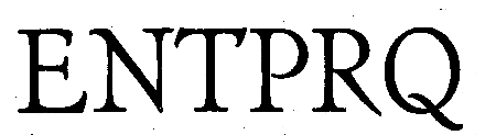
72ptReg.gif
If you have McGrew’s book, why aren’t you trying to identify this type yourself? One would think that it is the way you would actually learn about type identification, by comparing similar types and learning the subtle differences.
Your final example would seem to be a version of Artcraft. This originated with Robert Wiebking, and a scan of the first published showing of it is online at:
http://www.circuitousroot.com/artifice/letters/press/noncomptype/typogra...
It has a relatively complicated history, as Wiebking’s Advance Type Foundry was acquired by Western (not Great Western), but they in turn were acquired by BBS/Great Western and thence ATF. Copies also by Ludlow, Monotype, and Hansen.
It would be interesting to know more of the physical details of your type (e.g., pinmarks, if any). I rather like it, but then I’m becoming quite a fan of Robert Wiebking.
Regards,
David M.
www.CircuitousRoot.com
Devils Tail Press is absolutely right. You have all the information that you need to find these in McGrew’s book - and it would do you a world of good to carefully study the subtle differences in faces and learn more about typefaces in the process. An invaluable education.
That being said, your faces are:
Franklin Gothic
Condensed Foster
Cheltenham Bold Extra Condensed
Artcraft
Rick
Rick
Thanks for ID’ing the type.
The font book is 350 +/- pages with 2000 +/- fonts. My wife has another book with 5000 fonts.
As a relatively newbie to all of this, I felt overwhelmed trying to “guess” what I have. Getting help from some of the seasoned pros seemed like a good idea and time-cost effective.
I appreciate the assistance they i have rec’d on Briarpress and on the Vanderblog.info
I have another book that I use sometimes to identify type: How To Recognize Type Faces by R. Randolph Karch. It has some nice introductory material about type anatomy, followed by tables showing 1693 faces. Here’s a photo of a typical page. It’s out of print but there are plenty of copies on abebooks.com and alibris.com.
Barbara
Karch.jpg
I’d happily take the McGrew book off your hands if you don’t want it. ;)
Anchor
its not a question of “not wanting” the book - its a question of finding a “needle in a hay stack” approach to ID’ing type with the McGrew book. Its really a history book. Barb Hauser’s book looks interesting and I will look for it.
BTW - the McGrew book is available used on Amazon for less that $50, shipped, tipped, and delivered, if you want a copy.
Thanks Barb for mentioning Karch’s How to Recognize Type Faces. A very nice and useful tool.
Along the same lines as that book (but with a more representative sampling of each face) is the A.T.A. Type Comparison Book by Frank Merriman.
This book was published by the Advertising Typographers Association of America, Inc. in 1965.
LetterpressDad - your wife’s book with 5,000 faces in it will probably be more frustrating than useful simply because of the large number of post-metal (digital, etc.) faces that it probably contains. I also suspect that a lot of original metal faces have been digitized and given different names.
Merriman’s book is a little better than Karch’s, but either of them are really well worth having for anyone interested in metal typefaces.
Rick
Rick
Thanks for the tip on another book that will help ID type. I ordered the Karch book yesterday - I think I will wait to see what it looks like before ordering the Merriman book, but I will likely order it as well.
I appreciate all the assistance that I have received from Briarpress.
For those with an iGadget this is slightly more intellectual than Tetris or Bubbles, more educational than Angry Birds and good for long car journeys (as long as you are not driving)
http://fontgameapp.com/
Love this site. I’ve ordered the Merriman book (thanks, Rick), and downloaded the Font Game app (thanks, etinink). Though I’m mostly interested in metal types, the game is fun and I’m always curious to see what type designers are up to these days.
Barbara
A very useful finding aid to McGrew is J.B.Lieberman’s “Type and Typefaces” (New Rochelle, NY, USA, 1978), previously published in 1967 as “Types of Typefaces”. It has a 28-page showing of faces that very helpfully lists “very similar” and “less similar” faces and gives alternative names given by different foundries. Obviously its far from comprehensive but it is very useful in suggesting which faces to look up in Mc Grew and in Jaspert, Berry & Johnson - and those big books, in turn, list some alternative names and very similar faces which lead you to most of the alternatives. There are currently two dozen copies of Lieberman on abebooks, with prices as low as USD7.00.
Thanks for that reminder. Yes, “Type and Typefaces” is an outstanding book and an ABSOLUTE STEAL in the $7 range. I have a copy and I guess I just never coinsidered that there may be more of them floating around out there.
Anything you can find by J. Ben Lieberman is well worth having. He was absolutely devoted to the private press movement and supplying basic information for anyone getting into letterpress printing. He also created the Log of Private Press Names and was the instigator who established the “Prop. Card” for printers, just to name a few things.
Rick