trying to identify typeface Heron Press 1918-9
Any ideas on how to identify this typeface, used by Arthur &John Middleton Murry at the Heron Press in England in 1917-1919?
Sorry for the fuzzy digital image.
Thanks, leslie
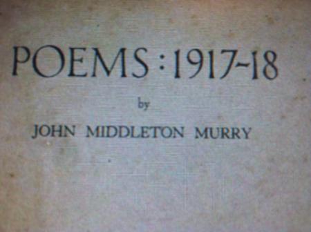
POEMScoverrev.jpg
ffi |
fl |
5m |
4m |
’ |
k |
e |
1 |
2 |
3 |
4 |
5 |
6 |
7 |
8 |
$ |
@ |
# |
Æ |
Π|
æ |
œ |
|||||
j |
b |
c |
d |
i |
s |
f |
g |
ff |
9 |
A |
B |
C |
D |
E |
F |
G |
||||||||||
? |
fi |
0 |
||||||||||||||||||||||||
H |
I |
K |
L |
M |
N |
O |
||||||||||||||||||||
Any ideas on how to identify this typeface, used by Arthur &John Middleton Murry at the Heron Press in England in 1917-1919?
Sorry for the fuzzy digital image.
Thanks, leslie
POEMScoverrev.jpg
A greater variety of letters, and lower case as well if available, would make identification more likely.
Often the most distinctive letter forms are amongst the lowe case - e.g. letter “g” or “y”.
Which font are you inquiring about — the titling or the smaller?
Bob
The first line is most likely not type at all. Note the dash tucked-in into the 7.
Rick
Murray (the printer, along with his brother) and later associates were familiar with the Arts & Crafts Movement and William Morris so this is likely a UK foundry typeface of a “resurrection” nature associated with the initial Typographic Revival (before Monotype and Linotype got involved).
I would have said Munder Venetian but that was a later issue.
Gerald
Rick
Anyone with a printers’ saw or similar could easily tuck that dash in there. Not all that uncommon a practice. Moxon mentions it way back in the late 17th century, and since he is the first to even write about the printing arts, likely a practice that went back much further. Plus, I kind of suspect a calligrapher would not have left that kind of spacing around the colon.
Gerald
Me thinks the First Line is Type, eg, Koch Antiqua (Klingspor) was based on earlier designs, and in and around the 1900 plenty of type matching that was floating around in the european market. The Problem is exactly identifying it, unlike the USA and ATF absorbing every Foundry, there were a myriad of Foundries which went out of business oh so quietly.
As Bielerpress pointed out, any decent Typesetter would have manipulated the dash to fit optical spacing. It was a skilled craft back than.
One characteristic of that first line that bothers me a little is the oversize “O”. It seems to me that any punchcutter worth his salt would not have let such a “discrepancy” get through. But it would be easy to overlook in hand-lettered titling.
Bob
Actually it looks more like Perpetua than Koch Antique. The 7 is very unique and few had the bottom curl to the left. I would look to English fonts rather then German. Nothing against Koch’s work, of course, which was exemplary.
Pepetua wasn’t available in 1918 neither was Koch Antiqua.
The upper one maybe being some Garamond/Granjon based, maybe even Goudy (Old Style). The lower one looks like a Caslon.
AdLib
I agree the cap O looks odd but I wonder if this was an alignment issue, it should not align so severely at the baseline.
Most well-drawn serif typefaces do have an “o” that is slightly larger than its brethren. A cap “O” can extend on average 2% both above the capline AND below the baseline. A lowercase “o” generally overshoots above the x-height and below the baseline. They would look wrongly small if not made in this manner.
A very good technical reference in this regard is Karen Cheng’s Designing Type.
Gerald
I agree that the “O” should be a bit above and below the serif lines of the other caps — it’s just that this one looks larger than that to me and almost seems like a wrong font.
I looked at several of the faces suggested above and none of them seem very close to this one — and I have a feeling I’ve seen something much closer somewhere. I wish I had my ATA Type Comparison Book here!
Bob
The example is somewhat reminiscent of the typeface Inkunabula released in 1911 by Nebiolo. The clubby serifs and the exaggerated angle to the P and O are similar. The down-stroke on the 7 is more often seen on continental types. It must be a titling font and looks unlike most of the types that were being produced in England; at that time in that types of the time were largely condensed for paper saving. I would look to pre-war to end all wars European foundries which had more of a tradition of classic faces to find this particular face.
Paul
Typeface, Style, Design, Arrangement, “x” height etc etc, the following based on recollections, (not facts) as Monotype kept me afloat and paid the bills for three decades, did take a little on board!! (hopefully) I.E. always led to believe that MONOTYPE (as in the typeface) was Drawn, Punchcut, and the Mats struck etc in a physically varying manner, to appear optically correct. e.g. if for example the lowercase “o” was cut to exactly the same height as the “x”, the eye would say incorrect!! (or exterminate *WRONG FONT*)?? As Mr. Harry Macintosh stated, a long time ago, (slightly different context but in essence, same situation *Litho versus Letterpress*) Letterpress has “Idiosynchrosies That The human eye responds to” as opposed to litho “which is boringly perfect” Which more than adequately explained to Me why, Monotype does NOT follow a perfect sliding graph across a range of type sizes, even in the same face, I.E. if say 6 point Gill Sans was designated as 6 set, (square) 8 point would be 8 set, (square) 10 point would be 10 set (square) etc etc, on the principle above!!! NOT SO? Late 60,s early 70,s ish Monotype were performing Heroic efforts, with regard to Film setting, by converting Hot Metal Caster to Filmsetter by substituting the conventional Diecase with FILM diecase /Powerful Lamp, and the Hot Metal Pot, for FILM DRUM, via an amazing optical gearbox, and wedges, Optics, (I believe) akin to, or better than, Zeiss Ikon. The whole system, not too long lived, (I believe) for 2 reasons Firstly, as I amongst may others were “thrown in at the Deep End” with minimal re grouping, on the Monophoto, and had to share developing facilities, in some cases, between setting the job, and then later stripping in the corrections, the chemicals had degraded, and looked like different weight typeface!!! SECONDLY The Monotype were at that time making massive strides in the development of their LASERCOMP, so Monophoto understandably took a back seat, and LITHO blew us all to bits anyway***
The lower one is a Caslon … i did a quick comparison using the digital version of SB’s Caslon (see attached image) since i did not find an example of Monotype’s Caslon series 128.
sb_caslon.PNG
I’ll go back to my original statement that the first line is not type at all. It looks hand-lettered as was the prevailing style for most book covers and titles of that era. The O sticks out like a sore thumb, especially when sitting right behind the undersized P. It is really difficult to clearly see great detail, but the three 1s are suspect as not being consistant either. The John Middleton Murray could well be set in Caslon, but what’s up with the short diagonal stroke on the first N and the apparent lack of a finishing tail on the Rs?????
A good sharp and clean image of the page might clear all of this up.
Rick
Of course a better image would allow better specifications, it even could be Imprint Old Face (Monotype #101) without a better image. The Caslon i used as an example image is from a digital version, so it won’t match the original metal type used in 1918 of course.
“Poems” looks like some French origin Elzevir.
As I can claim a tenuous/provable link to Eric Gill, (St, Dominics Press, Ditchling Press and Mr. Laurence Pepler) could I dare to suggest that the specific Style of the Title line is very reminiscent of many of his (E. G. s) original drawings of that period, in fact the drunken “O” and the dash could well be uniquely His! within that time frame.?? I have one or two publications concerning his work, Have seen a selection of his original drawings, on visits to the Drawing Office of Monotype, at Redhill, some of which may well be housed in the Museum (Print, Eric Gill and More) in Ditchling, Sussex, U.K. 3 miles from the Original Guild Workshops, in Folders Lane Burgess Hill, and also, 3 miles from “Hopkins Crank” Ditchling Common. Well Documented!!
Thank you for all the comments! Here is a more extensive selection of the type. I only have the scans from the bookseller for this page and the colophon.
I hope this helps provide more info.
leslie
Heron Typeface more example.jpg
I’ll attach a close up of a few lines, too. Is there a way to shrink files to fit the limits without making them hard to see?
lines Heron printing.jpg
Here is another example. As you can see, they didn’t have printing down!
Heron press sample again .jpg
Here is the colophon with the MURRY letters, too.
Heron Press colophon.jpg
I just ordered the Merriman, Karch and Lieberman books and look forward to getting them! Thank you all for your advice about the books (on the other thread) best, leslie
I find it hard to believe that our English participants haven’t bothered to try to track down and i.d. this face yet. I have very few English foundry catalogues (Caslon, S&B and Blackfriars) but I did manage to find it when I just finally went looking in them.
I think your text face is Dutch Old Face from Caslon. The foundry specimens are much cleaner, but I believe that this is a match.
Rick
The wording in the spiel says to me this is a later copy of the original text ,
Pay attention to the wording and the magic word being
“of which only 100 copies WERE to be sold ” the english language would use ARE in the present as opposed to were .
The “were” is peculiar, but my money is on this being the original printing on the dates stated above. Perhaps they had already promised more free copies than they originally planed and were not going to able to have a full 100 copies available for sale. Lots of possible reasons.
And for that matter, it is rather poorly printed (as is often the case with start-up presses) if anyone takes the trouble to look and see what the typeface Dutch Old Face should really look like.
Rick