ATF Mystic & Apollo and how to go from type admirer & user to educated type geek
Since returning from the Phoenix Wayzgoose — (wonderful!) — I’ve been spending hours looking through pdfs of type specimen books. Yes, I’m a goner. My first question is does anyone know if the ATF typefaces Mystic or Apollo (from the “Popular Designs For Artistic Printers” 1892 ATF specimen book) are available in any form, either digital or actual type? I understand that the topic of using digital/polymer vs foundry type can be a touchy subject and I’m not trying to stir up anything here but if some of these faces aren’t being made anymore wouldn’t it be good if they were available as digital fonts? Last question - what are the best resources for becoming a self-educated type geek?
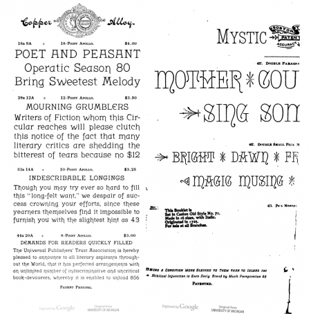
apollo and mystic.png
Try to get a copy of Mac McGrew’s American Metal Typefaces of the Twentieth Century — one of the best references. I’m also partial to the A.T.A. Type Comparison Book, one line specimens arranged by styles and families — an easy way to find a typeface’s name and relatives. Two of my favorites.
Bob
Nothing matching on myfonts for either of those designs.
Typophile.com is probably your best choice when it comes to serious type fixation.
Deleted.
LTG,
Welcome to the world of type nerds. Announcing typefaces you see on billboards is one of the signs of this ailment.
First, there were so many 19th century typefaces made that it is unlikely that many will be reproduced digitally. It is difficult, often impossible, to find the original metal type for these faces, and the complete alphabet was rarely shown in the specimen books and advertisements. There are matrices for some of the faces scattered around the country (Skyline probably has the most), some are in storage at the Smithsonian, and others have disappeared. By the way, a font of the Mystic typeface you show was sold at the auction in Phoenix.
I have listed some books that I have enjoyed browsing through (or, in some cases, struggling through some dense reading) below for aspiring type geeks, mostly for the 19th century. There have been a number of new books on the 19th century types that have come out recently, so I listed them in the first group of IN PRINT books. Many of these are available in libraries, but beware, if you become a type geek, you will want to own them. (There are more, of course, but this is a good start).
IN PRINT:
Annenberg, Maurice, edited by Stephen O. Saxe, Type Foundries of America and Their Catalogs (19th and early 20th century)
Clouse, Doug, MacKellar, Smiths & Jordon: Typographic Tastemakers of the Nineteenth Century
Dowding, Geoffrey, An Introduction to the History of Printing Types (Oak Knoll reprint, originally published in 1961)
Loy, William E., edited by Alastair Johnston and Stephen O. Saxe, Nineteenth Century American Designers and Engravers of Type
McGrew, Mac, American Metal Typefaces of the Twentieth Century
Mullen, Robert, Recasting a Craft: St. Louis Typefounders Respond to Industrialization (a little self-promotion here, on my part)
Ruffa, Gregory, The Art of Wood Type
Updike, Daniel Berkeley, Printing Types: their History, Forms, and Use (Oak Knoll reprint, originally published in 1922—a hefty read of 2 volumes)
Any of Dave Peats reprints of 19th century catalogs.
OUT OF PRINT:
Annenberg, Maurice, A Typographical Journey Through the Inland Printer 1883-1900 (Maran Press, 1977—articles and advertisements from the Inland Printer)
Gray, Nicolette, XIXth Century ornamented Types and Title Pages (Faber and Faber, 1938 and 1951)
Kelly, Rob Roy, American Wood Type 1828-1900 (van Nostrand Reinhold, 1969—the wood type bible)
Lawson, Alexander, Anatomy of a Typeface (David R. Godine Pub., 1990, the story of 30 typefaces)
Liebermen, J. Ben, Types of Typefaces and How to Recognize Them (Sterling Publishing, 1968—my personal introduction to typeaholism)
Merriman, Frank, ATA Type Comparison Book (ATA, 1965)
Type specimen books from the type foundries and from publishers can be found at a variety of research libraries around the country. You can usually check the library catalog by typing in “type foundry” or “type founders” under “Author”.
—Bob M.
Hi Bob,
I should start here by noting that Rob Roy Kelly’s American Wood Type 1828-1900 has recently been made available as a reprint.
And…GUILTY AS CHARGED!!!!! It was I that was lucky enough to buy the font of Mystic at the APA Wayzgoose in Phoenix. I honestly did not even notice it during the auction preview. I thought the package was Sterling Type Foundry ornaments because it was wrapped in a paper print of those ornaments. When the auctioneer announced that it was a font of Mystic, I immediately knew what it looked like and just had to have it. Actually got it for much less than expected!
Anyway, my font is 24pt. and is a revival casting. None of the ornaments shown above are included with the font.
Does anyone know who actually did this revival casting??????? I am guessing it may have been a few decades ago. I think the auctioneer mentioned that fact, but it has slipped my mind. I did not expect to be the winning bidder.
Rick
Thank you all for your responses and recommendations. Bob Mullen - thank you for the extensive list you’ve provided.
I guess I have begun my pursuit already starting with The Art of Wood Type by Ruffa which I won at the auction in Phoenix and Typologia by Goudy which I obtained at the swap meet earlier that day (thanks to Rick pointing it out to me because of my love of Goudy). I was on a quest to get a start of wood type that day so I barely glanced at any metal type because I couldn’t afford both and I have several cabinets full of metal type that I thought I should begin to appreciate first before buying more. I really had no idea there was so much to learn about historical type.
I ordered the Rob Roy reprint a couple weeks ago but it hasn’t arrived yet. I didn’t get the ATF 1923 Specimen Book that was at the swap meet but a local friend ordered one that I have access to. I have a book called The Handy Book of Artistic Printing which I think has had a direct influence on how drawn I feel to the 19th century typefaces.
I remember now that there was some excitement about that font (mystic) when it was auctioned but I hadn’t seen a sample of it then and I wouldn’t have guessed that a month later I would think I need it. Lucky you, Rick!
I can see how this becomes an ongoing addiction. I only wish I had started earlier. :)
I just finished a book called “Just My Type: A Book about Fonts”, by Simon Garfield. It’s about the history and design of typefaces.(metal and digital). It’s very entertaining and informative!
I have learned that my revival casting of Mystic is actually 22pt. cast on a 24pt. body. The matrices used for the revival casting were created by Andy Dunker.
Mystic originated with the Boston Type Foundry c. 1885.
Just My Type by Simon Garfield is accurate enough to be a fun read.
Rick
Thanks for the update on Kelly’s wood type book. I didn’t know it was in print again.
By the way, the pdf of the 1892 specimen book you mentioned, Popular Designs for Artistic Printers, was NOT put out by ATF, but by the Central Type Foundry (St. Louis) and the Boston Type Foundry—the owners of Central had purchased the Boston company four years earlier. It was published the same year that those two foundries became a part of the newly formed American Type Founders Co., but had to have been put together well before the consolidation took place.
—Bob M.
L. T. G. Sir, Attended an exhibition Christmas last, here in London U.K. mounted by The Monotype Archives situate at the former Monotype factory in Redhill U.K. It was called “pencil to pixels” and was based around an amazing display of artefacts ranging from Tolbert Lanston and Otto Merganthalers, fist Hot Metal typesetting machines, right up to present day digitizing of all, or nearly all, hot metal typefaces, before they are lost forever, and of course, programming every new type face, for 21st century use. The speaker/narrator was one of your country men, but based in Redhill, U.K. If you call up Agfa, Monotype at www.agfamonotype.com or contact Agfa monotype in Wilmington Massachusetts and state your case, I am sure you will get very passionate/enthusiastic response! (if its anything like your man on the case here) Good Luck, Mick.
Wow. You guys are good! Sure enough. I went back to where I got the link for the PDF (on Circuitious Roots) and hadn’t even noticed the subtitle, “Popular Designs for Artistic Printers. ([unspecified]: American Type Founders Company, 1892.) Subtitle: “Selecting from the novelties manufactured by the Central Type Foundry, of St. Louis, and Boston Type Foundry, of Boston.”
The Rob Roy Kelly book arrived today. Oh man. It’s hard to look at these type books without wishing you could have most everything in them.
I have a lot to learn. I ordered your book this morning, Bob M. I figured it was also a good one to start with since I can write and ask you questions. ;)
Oh…and thanks, Mick. As much as I’m beginning to get a bit caught up in the allure of real metal and wood type, I’m enough of a ‘child’ of my times that i can’t help but wish that these typefaces could be purchased as digital fonts.
Laurie
Bob Mullen is of course correct, and the placement of the 1892 Central/Boston specimen under ATF on the CircuitousRoot site is in error. I put it there early on in my own study of type (I’m quite new at this, too!), under the assumption that if it was 1892 it must have just postdated the ATF merger (it took several years for the various foundries really to consolidate). But, checking Annenberg’s “Type Foundries of America and their Catalogs,” Carl Schraubstadter, Sr. and James A. St. John, the principals of the Central Type Foundry, purchased the Boston T.F. in 1888. Interestingly, Central had started out as a branch of the Boston in the 1870s. I’ve written myself a note to correct this error this weekend.
Bob’s book (Recasting a Craft) is also one I’d highly recommend - I keep going back to it over and over for details. If I were to excerpt a personal “short list” from his list, I’d do:
McGrew.
The Saxe/Johnston edition of Loy
Annenberg’s two books
the Liber Apertus reprint of Kelly for wood type
and if you can afford it, the 1976 edition of Nicolete Gray.
Ruffa’s book has many lovely illustrations, but please don’t try to use a composing stick in the manner he shows on p. 82.
My apologies again for my error in classifying the 1892 Boston/Central specimen and the confusion that it caused you. I’m happy to have learned from this.
Regards,
David M.
www.CircuitousRoot.com
Laurie. nice one buddy! I think your “wish” as above is already a fact, as long as you can navigate the minefield? A long time ago, within typesetting circles “mumping” was rife, whereby a lot of unscrupulous/wicked/cheating (so I heard)? typesetters/printers would “horse trade, swap, barter, diecases/mats to cast specific jobs and vice versa and rip the system OFF, absolutely wicked, of course “I” had no part in it, your Honour. But surprise, surprise, 30/40 years down the road, as fast as the modern computorised typesetting systems are hitting the streets, programmes are being pilfered, stolen, copied, almost faster than the companies can encrypt them. Actual example, not too long ago talking to a buddy and mentioned that I had 22 typefaces on hot metal, he fell about with laughter and said, on his typesetting computor he had metaphorically, 1,000s and could set me up with a programme of whatever I wanted, of course being the fine upstanding citizen that I am, I declined! but in truth I want/wanted to go backwards. Consequently Laurie, if you can pick the right route, obtaining digital/digitized type face fonts, from way back to the present, should be an obtainable goal. Not too keen on some of the modern efforts, that look like they have been drawn by oriental calligraphers/typographers on speed,! many of the older typefaces already digitized, yankee and limey still look good. Example, your original “wanted” posters, printed with judicious use of every configuration of type size and SAME face, but including expanded, condensed, light, bold, ultrabold, to many still look rerrific. To many (including Me) some of the modern efforts by supposed later day designers/typographers who are paid vast sums to throw completely mismatched type faces together, just looks like Savador Dali on Speed, or ming imperial in bed with times new roman, but “of course my dear” if it has X, Y, Zees name on it, it must be good.
An update (probably of little interest to anyone)… I’ve fixed the listing for the 1892 Central/Boston specimen on CircuitousRoot and The Internet Archive (archive.org). In the process, though, I realized something interesting (that I should have noticed earlier). While this specimen is indeed a Central and Boston specimen (published by the Boston T.F.), its very last page mentions ATF. This final page lists a number of type foundries (and branches) which were amalgamated into ATF, and notes specifically that two of them
(two branches of Palmer & Rey) were “Owned and Operated by the American Type Founders’ Company.”
The conclusion I would draw from this is that this specimen book was prepared by the Central and Boston foundries prior to the formation of ATF (probably in early 1892, to judge by the title page), but that this particular copy was printed by/for the Boston after ATF’s incorporation. Things were happening fast in 1892.
This required updates in five locations:
Central TF page:
http://www.circuitousroot.com/artifice/letters/press/noncomptype/typogra...
The Boston page:
http://www.circuitousroot.com/artifice/letters/press/noncomptype/typogra...
The ATF page:
http://www.circuitousroot.com/artifice/letters/press/noncomptype/typogra...
The old archive.org page:
http://archive.org/details/ATF1892CentralBostonSpecimen
The new archive.org page:
http://archive.org/details/CentralBoston1892Specimen
Web development is a proces which is halfway between herding cats and nailing jelly to a wall…
Regards,
David M.
www.CircuitousRoot.com
L.T.G. Sir, Watching and appreciating your new found quest, with others I am sure? Nice one!! Acquired a comprehensive archive/collection of books, all things letterpress and up to litho. Given many to new keen students here in U.K. donated several to our Museum Print Shop, (who have a fantastic archive in their own right, and as volunteers, with permission have access to, including photocopies) If you like to forward me an off line point of contact, I would be more than happy to help you in your endevours, if I am able! I use one such book as a DESK!>>”ATLAS OF TYPEFACES”<< but that would have to be transcriptions, because to freight it one would need, at least a Yankee Starlifter!, a Ruskie Ilyushin! Or a Ukrainian/Russian, (joint) Antanov freighter.! Regards and good luck Mick.
It’s my understanding that because the foundry catalogs were so large and so expensive to print, they would print large runs and assemble finished books as they needed them and sometimes with different sections included depending on the market — sometimes special gatherings for special customers. And of course new faces added would have a separate signature printed and collated into the existing signatures for later catalogs. Thus, the 1892 specimen could have been mostly printed in 1888, but the pages cited by David showing the affiliation with ATF could have been printed in 1892 and added to subsequent copies of the catalog.
Bob
Everyone is right! According to Henry L. Bullen, ATF was incorporated on February 8, 1892. So technically the Central TF was an ATF branch when the Central/Boston catalog of 1892 was issued.
The University of Michigan digital copy appends a 7-page insert “plugging” ATF and listing 17 branches: Central was the St. Louis branch; Dickinson was the Boston branch (the former Boston TF continued production until 1895).
Even so, ATF members remained independent (and as competitive as ever!) until Robert W. Nelson was elected General Manager at the stockholders’ meeting in October 1894. In his Discursion No. 12 (July 1907), Bullen praises Nelson for uniting them as corporate team members.
BTW I agree with David M. that Bullen’s info is sometimes “iffy” (here’s WHY). In this case—if he ever nailed it, he did so this time—he needed a job, and his dream for nearly 15 years was to become ATF’s Librarian/Historian.
His series of 16 Discursions (The Inland Printer, 1906-1908) was realistically an Application for Employment. Since Nelson did re-hire him, it’s a safe bet that the one about him was accurate!
Cheers, Anna
One additional detail to this discussion. Since the original posts, I have looked at the St. Louis Public Library copy of the specimen book in question and compared it to the University of Michigan copy that is on line. The St. Louis copy does not mention ATF in any its pages, so there is a good chance it was published either before the creation of ATF or before it was possible to make the change seen in the UM copy. The St. Louis copy was originally owned by Nicholas Werner who, among other things, was in charge of the publication of the Central Type Foundry specimen books. So, it certainly has the right provenance for being one of the first editions of the book.
AND…… getting back to the original query, I am happy to tell everyone that Bob Magill’s Monumental Type Foundry has recently recast Mystic so it is now available (24 pt. - I think) from him. This is the basic face itself and does not include the extra decorative material. It is a real beauty!!!!!!!
Rick
Digital revival of Mystic—take a peek!
http://forums.typeheritage.com/topic/mystic/
Mystic is one of 17 type designs acquired by John K. Rogers, Agent of the Boston Type Foundry, between 1877 and 1881. As Inventor of Record, he patented it in 1881–1882; it had been shown in the 1880 BTF catalog.
During this period, BTF employed no staff designer nor punch-cutter and so could not produce new faces. Probably the designer was an independent lettering artist residing in or visiting Boston (Ludvig S. Ipsen? a Prang consultant?).
The resourceful Mr. Rogers offset this loss by negotiating with the Caslon TF (London) production and/or distribution rights to five designs. Nicolette Gray reports that Mystic was advertised in the Caslon Circular of 1884:
http://forums.typeheritage.com/gray-chart/
http://typeheritage.com/jfc-00/part-vii/jfc-07c/
Cheers, Anna