Inking problem
Hi,
I’m a new to letterpress. I can’t get a perfect impression. The edges are not sharp enough and there are some spaces into a solids and also in my opinion the color is not saturated enough. I use Van Son rubber base ink Adana 8X5 press and KF 152 plates. I try many variants of roller heights and amount of ink but result is not perfect. I use a polyurethane rollers, maybe it is a problem? I hear the most people use rubber rollers. I don’t now. Please look at the photo
IMG_0417_1.jpg
The most important question unanswered is: What paper are you using?
You may want to try oil based ink and see if that lays down differently (I suspect it will). If you are cutting your ink with tack reducer or transparent white, you may be taking the body out of the ink, so you get the mottled appearance.
Sharpness of image is dependent on the amount of impression, the stock, and the degree/type of inking going on. If your rollers are smooth and without flat spots or other defects, I would not consider them the source of your problems.
Thanks for your answer! I use cotton paper, I tried Gmund Cotton and Savoy 300 and 600 gsm. The result is almost the same. I tried to print with different amount of impression. It didn’t help.
Sorry, what do you mean “degree/type of inking going on”?
turn the sheet over, take a picture, post it
Can you tell us the size of the image you are trying to print? 8X5 isn’t a very powerful press and might struggle with large solids.
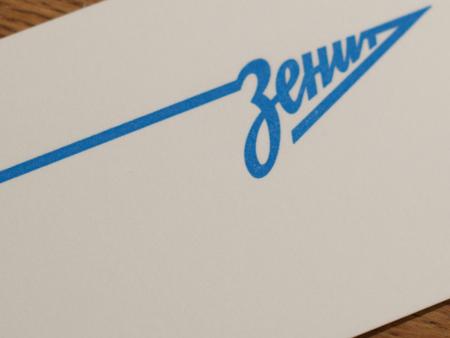
Oh, and Зенит-Чемпион!
I try to print business card 50X90 mm, and lines is not very heavy about 2mm. So i think the pressure is enough for Adana. I suppose that problem in something else.
I try to print another card, and the result is not good. Small and thin text looks good but bold is bad. Does anybody suppose what is my problem?
IDRP3wxWEvw.jpg
small and thin type takes less pressure to print, you might try a little makeready on the bolder type .
If you have a portable hotplate you could set up a steam kettle near the press and wave the sheets in the steam for a few seconds before printing them — that will dampen them slightly and printing damp is a good way to get the ink to transfer well and at the same time it softens the paper so the deeper impression may be more satisfactory.
Bob
-different paper will take inks differently. Try on regular photocopier paper and see the effect.
-Like DickG said, If thin text is fine, but larger text isn’t, its likely that you need to get your makeready right. Stick some additional packing paper underneath the bold text (ONLY the bold text!). This will increase the pressure ONLY for the bold text. See if this improves things.
Finally, do not expect DARK DARK coverage. When i started, I used to think that pure jet black was possible because all the photos online show super dark jet black ink coverage. However, in reality, it will always be a dark gray (as opposed to jet black). This is a limitation of printing on uncoated paper. Even if you look at a pantone color guide, you will see that black (on uncoated paper) is not truly jet black.
hope this helps!
Makeready, perhaps some reducer in your ink, and working in a decent shop climate (cold shops aggravate ink lay problems) are all part of the solution. Cotton papers are not good candidates for any sort of heavy coverage work—heavy impression maybe, but not for coverage.
All papers cotton or pulp are made of fibres some larger than others , ink is partially absorbed into porous materials ,unless it could be that every fibre would absorb the pigment evenly you will find it difficult to get it to look even . reducers will help get the colour to lay but wont even out the way it looks because of the varying fibres. take a pull on a sheet of hot colandered or cast coated material and the effect is remarkable in relation .
It isnt for no reason that wet proofs of colours on the job stock should always be a serious part of the job planning .
As mentioned above ink and cold dont go well together ,just think of butter from the dining table at the end of lunch as opposed to how it came from the fridge!
Ad libs point about dampening could well help as the damp will saturate the fibres sufficienly to make the lay of the ink more even as well as the softening of the material to help get a good evenness in the impression.
I have tried many different additional action such as dampening paper, try many different variants with rollers height and amount of ink, try to add a VanSon reducer Sonalith (V4116) a little bit, try many different ink mixes. So I work really hard.
I have noticed some strange effect. I could make a really good (almost perfect) result when mix RBP Warm Red and RBP Opaque white. Only these mix! The impression was perfect (I damped a paper a little bit), but when tried to print other mixes like only Green, Yellow+Process Blue+Opaque White and some other, impression is terrible, it seems like paper don’t absorb (take) an ink. The impression is not solid an there a lot of like not inked enough places, even if double print. I attach two photos, everything is the same (roller height, dampening paper, form) but good result only when print Red+White. But result is very different. Do you have any ideas? I don’t have at all, i tried so many variants. And please if you have some advices, please write it easier (if possible), my English is very bad and it is really hard for me two translate difficult phrases :)
ElUrYROAeZ4.jpg
n7AxiOpxyMU.jpg
oTVBzDDIrC4.jpg
It could be, because opaque white has a very high amount of pigment, it is for making a really “thick” layer on the paper so the paperfibres cannot shine through the ink like with the other colours you print.
Did you find a solution to your problem. I am very interested. Like you I have had similar problems with some ink colours?
I can see a bit of mottle in the green (its always the green!), but don’t forget Letterpress is low resolution. Its not like modern printing which compares itself to Photography. I can see though that small type needs to be crisp. You need lockable roller trucks on the Adana., not those ones that just roll around independant of the rollers. Also Poly rollers are brilliant, I find them much better than rubber. Very good choice.
Forgot to say Van Son rubber based is very good ink on uncoated stock. No problem there.
I have the same problems with inking on letterpress (adana 8x5). It’s just been serviced by Caslon but I still get weak coverage and what looks like mottling on small text, it almost seems as if the ink isn’t sticking properly and evenly to the type.
A real pain!
I’m using inks like vanson oil base, rubber base, sonagloss etc..
Wonder if I should try Caslon’s Adana ink in tubes - maybe this will work better?
The problem with small press, is the diameter of the rollers. The amount of ink on the roll is heavy at start, but once it goes around on the same image the amount of ink is less.
I would print the heavy type start and print it twice. And the fine type second with one passing. It will take longer to print the job, but you will get move ink coverage.