Typeface ID query
The attached type was found in an old ‘hellbox’. The cap U and J have distinctive feature. And no, the lockup is not that for a run, I simply took an inkpad proof. :o)
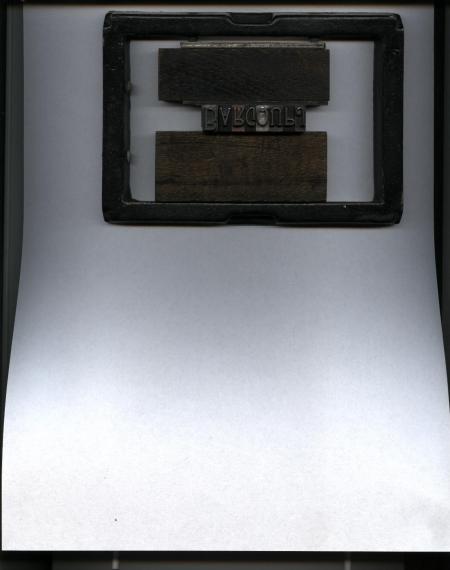
myst1.jpg
ffi |
fl |
5m |
4m |
’ |
k |
e |
1 |
2 |
3 |
4 |
5 |
6 |
7 |
8 |
$ |
@ |
# |
Æ |
Π|
æ |
œ |
|||||
j |
b |
c |
d |
i |
s |
f |
g |
ff |
9 |
A |
B |
C |
D |
E |
F |
G |
||||||||||
? |
fi |
0 |
||||||||||||||||||||||||
H |
I |
K |
L |
M |
N |
O |
||||||||||||||||||||
The attached type was found in an old ‘hellbox’. The cap U and J have distinctive feature. And no, the lockup is not that for a run, I simply took an inkpad proof. :o)
myst1.jpg
Hmmm. A tad distant. Try this. :o)
myst3.JPG
A really nice design. Unfortunately I have not found it yet after searching several of my reference books, I have not exhausted my search yet, but it would help immeasurably if folks would include a description of what the pin mark looks like (or says) of these unusual fonts. Even a lack of a pin mark would be nice to know. The pinmark information narrows the search down instead of having to troll the whole universe of sources.
My best guess at the moment is that this design originated around 1890.
Rick
My apology. :o) I made the sin of assumption; that being “Richard”, raised on the cap B, would be evident. In re-looking, even these old eyes have difficulty in discerning that mark. Other than the name, there are no pinmarks on any of the other pieces.
I tend to think it is from an English foundry, but having no access to books showing Brit faces, I remain stymied. (No pun, well, a bit) intended. :o)
The alignment grooves (2) on the types mate. It appears the different face size, cast on the same body (in the examples, 36pt.), were intended to present a ‘Copperplate Lining’ effect. Makes for easier head comp. and decorative reachings. Again, assumption on my part.
I do thank you for your searchings. :o)
Does anyone have a Miller & Richard specimen book?
DGM
The Miller & Richard pinmark is very helpful. Unfortunately I do not have any M&R catalogs in my library. M&R was located in Edinburgh, Scotland.
I do have a wonderful hardcover book of specimens from the Edinburgh printer Neill & Company, Ltd., dated January 1905. It displays a treasury of fonts in their shop and amazingly they also list the foundry of origin for each of their fonts. I checked it and your face is not shown there.
As an interesting side note on Miller & Richard, I also have an 1898 Pony Specimen Book from BB&S, and on the outside front cover it is stated “Sole Agents for Canada, Miller & Richard, Toronto, Ont.”
Rick
Your type is shown in my circa 1905 Miller and Richard catalog as Edina Condensed.
—Bob
This is what I have in 6 mm Brass type for Blocking Presses,
which i bought as part of a collection right after the Fall of the Berlin Wall from a Bindery in Leipzig
P1080502.JPG
P1080501.JPG
Ah. Thank you, Mr. Mullen. And thanks also to the other sleuths tracking this hitherto unknown typeface. Your searchings are much appreciated. Given its apparent age, I shall recover the font and tuck it away. :o)
Typenut,
Your brass type would be Edina, a wider version of the condensed Edina that Forme has. I’m curious, does your brass type appear to have been cast and the shaft milled fairly smooth (probably with some rough spots or small bubbles), or does the face appear to have been machine engraved (routed) and have smooth sides on the shaft? The former would be older than latter version. I can’t find the Edina face in any American or English brass type specimen books that I have access to, so it was likely made on the continent.
—Bob
This is clearly cast type, 3 sizes, I would say around 1880
This is clearly cast type, 3 sizes, I would say around 1880