Help identifying American Letterpress Typefaces
Does anyone know anything about the typefaces in the images attached. I purchased them from the states about ten years ago and would like to redraw the missing letters/characters with a view to printing them. Any help would be greatly appreciated.
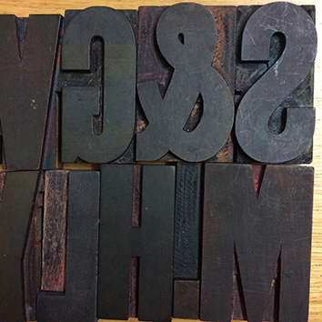
IMG_4279.jpg
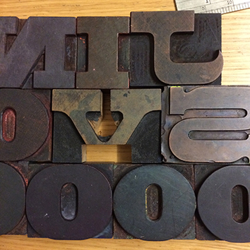
IMG_4280.jpg
The first image is called Gothic Condensed, though a good number of site members might be able to give it a more specific name. The second image is comprised of two different faces: The “N”, “I”, and “O” are called “Antique”, and the “J”, “S”, and what remains of a “V” are Aldine Expanded. Very nice type indeed.
Good luck in getting your replacements cut: I find that putting a partial font back into full, complete printing use a very rewarding undertaking.
Jim
For Aldine Expanded, it might be easier than you expected to complete your set. Depending on what size your sorts are:
https://www.virginwoodtype.com/shop/product/aldine-expanded/
Thank you very much, that’s great. I did some research last night and realised that this Aldine expanded is slightly thicker and more varied contrast than the Virgin Wood Type cut and slightly more extended. The Gothic is 4” and the Aldine Expanded and Antique are 2” in height. So I guess this worth preserving/renewing. Thanks again
Curiouser and curiouser! I have two fonts of Aldine Expanded and decided to pull them out and take a look at them. My 6-line font looks identicle to what is in your photo. This is a veneer-cut font with no identification stamped on the A.
My second 5-line font is also a veneer-cut font and is stamped as having come from Page. The stamp design indicates that it was cut 1857-1859. HOWEVER, this 5-line font is not the same exact design as some characters are wider and other characters are more condensed than the 6-line font. For example the A is a lot wider and the S is way more condensed. The width variation is very noticable.
This is the first time I have ever compared my two fonts side-by-side.
If you would like I could proof my font of 6-line that matches yours, but you would probably have to clean it up a bit (old & worn) and also have to increase it to twice the size of my font since mine is only 1” tall.
Rick
Rick,
Forgive me, I have only just seen your post. If you would be prepared to proof the 6 line that would be good. I’m currently investigating traditional methods of producing wood type and will give it go.
Hi Paul,
I am getting pretty busy right now, but will certainly pull a complete font proof for you as soon as I can find some time in the shop to get to it. You will need to send me an e-mail through Briar Press letting me know what your mailing address is.
Rick
Yes, no problem.