Century or Caledonia Identification
Greetings All. I recently picked up a large block of this lovely 18pt unidentified Roman, and wondered if anyone can help me with its identification. It seems to have affinities with the Benton’s Century typefaces, but I also see some Caledonia… and even Goudy in there. I haven’t cleaned or printed it yet, but just thought I’d put it up here for the Briar wisdom. Thanks for your time!
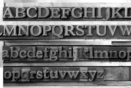
CenturyCaledoniaBriarpress.jpg
Not a “Century.” Not a Caledonia (a Linotype face - not handset). And certainly not a Goudy design. I suspect this might be a 19th century design and won’t be found in McGrew’s American Metal Typefaces of the Twentieth Century.
Concentrate on the A, Q, a , g, and f in your search for this design.
Rick
Thanks Rick. Is there an authoritative reference for 19th century metal type design that you could point me to, or other means of moving forward? I’m planning to set and print a paragraph someday soon, which might make some things clearer. I also realized as I looked closer at the image, that the E and F seem to be from another font, as the baseline and cap height differ.
Jeremy
Sure looks a whole lot like the version of Bookman Oldstyle (p.30, line 23) shown in the ATA Type Comparison Book, unfortunately my only remaining type reference. It was undoubtedly issued by a number of foundries, each with slight variations of some characters, but all in this showing match the book pretty well except the cap C.
Bob
Yes, the E and F are wrong font characters. It somewhat resembles Bookman but there are too many variations in the characters. Bookman was derived from an Antique Oldstyle, so perhaps this might come from that direction.
There is NO comprehensive book of 19th-Century metal typefaces (sigh). Only lots and lots of period catalogs and a few fairly decent books with lots of specimens from different sources. A Typographical Journey through the Inland Printer, 1883-1900, from Maran Publishing (1997) is one of my favorites.
Is there a pin mark on the type? That usually can indicate the foundry of origin and make the search much much easier. I am guessing that your font is 18 pt.
Rick
It is indeed 18pt. And… I’m pretty sure I’ve figured it out (with the help of an old friend and excellent typographer, Misha Beletsky). He found this image of Monotype 38-E Roman, designed by Goudy in 1908, which seemed extraordinarily close in structure to mine… which led me to find that Sol Hess (who succeeded Goudy at Monotype) made a bold version as a companion to Monotype 38 in 1922, which was called Hess Bold. So… I think that’s what I have! Incidentally, Les Usherwood made a digital version, and expanded the family of weights for Linotype, under the name Goudy 38: http://www.myfonts.com/fonts/redrooster/goudy-38-rr/ I’ll post an image when I get a paragraph set and printed.
Monotype38E.jpg
Here are links to PDFs of the pages from a Lanston Monotype specimen book showing Series 38 (Goudy Light Old Style), 381 (Goudy Light Old Style Italic, in display sizes), 159 (Hess Bold), and 1591 (Hess Bold Italic):
http://www.galleyrack.com/images/artifice/letters/press/comptype/monotyp...
http://www.galleyrack.com/images/artifice/letters/press/comptype/monotyp...
My apologies for the very long URLs. Each PDF is two pages long and about 14 Megabytes in size.
Attached as inline images here on Briarpress (I hope) are the “Characters in Fonts” sections from each of these.
Goudy discussed these faces in volume 1 of his “A Half-Century of Type Design and Typography” (pp. 70-72). This is online in a crude-but-effective scan (I can say that - I’m responsible for the crudeness) at The Internet Archive:
https://archive.org/details/GoudyHalfCentury1946V1
BTW, even though Goudy himself calls these “38-E”, I think that it is best to leave the ‘E’ out of it. It’s a part of the rather peculiar system Lanston used for classifying types. It is not necessary to use it in order to identify the type, and it is not correct (and/or insufficient) to use it in certain circumstances.
In the Lanston system, ‘E’ signified an “Old Style Roman,” ‘F’ signified “Old Style Roman Small Caps,” ‘G’ signified “Old Style Italic,” ‘J’ signified “Boldface Roman,” and ‘K’ signified “Boldface Italic” (there were other letters used, but these are the only ones relevant here). The letters were used only in text sizes. In display sizes, the series number had a ‘1’ appended to it (usually - there are several exceptions).
So if you look at the specimens, they call out series 38 in text sizes as “38EFG” (because it was supplied in those variants). In display sizes, the Roman was just 38 (no letter suffix), and the Italic was 381. For series 159, text-size Roman was 159J, display size was just 159, text-size Italic was 159K, and display italic was 1591.
That having been said, I’ve got quite a few boxes of display matrices from a well-known former type foundry all of which are marked with the series plus ‘K’ for italic - even though Lanston never used this designation for display mats.
Sorry for a longwinded posting. I hope that the images and PDFs are useful.
Regards,
David M.
www.CircuitousRoot.com
lanston-series-1591-sm.jpg
lanston-series-159-sm.jpg
lanston-series-381-displaysize-sm.jpg
lanston-series-38-textsize-sm.jpg
lanston-series-38-displaysize-sm.jpg
Marvelous David! Thank you for all this. I am already really enjoying the Goudy “Half-Century of Type Design and Typography.”
Jeremy
Jeremy writes:
>I am already really enjoying the Goudy “Half-Century of Type Design and Typography.”
Don’t miss Volume 2, at:
https://archive.org/details/GoudyHalfCentury1946V2
and he also asks:
>Is there an authoritative reference for 19th century metal type design
No, unfortunately there’s no “19th century McGrew.” But until there is I would highly recommend the book edited by Stephen Saxe and Alastair Johnston under the title “Nineteenth Century American Designers and Engravers of Type.” Nominally, it’s a reprint of a series of articles written by William E. Loy at the close of the 19th century on American type engravers. But the Saxe/Johnston edition goes much further and illustrates every type mentioned in the text (from Steve’s extensive collection of specimen books). It’s published by Oak Knoll. Their page on it is at:
http://www.oakknoll.com/pages/books/96679/william-e-loy-alastair-m-johns...
It’s a joy to read.
Regards,
David M.
www.CircuitousRoot.com
The closest thing that I see above is Hess Bold (#159), BUT I still don’t think that is it. Many subtle variations. Look at the shape of the lower bowl on the “a and stare at the “f”.
Of coarse a printed sample would be MUCH better to use for comparison than the photo of the type itself.
Rick
David, thanks for the Goudy Light Old Style pdf’s. I have the face in roman 8,10, 12, 14 & 36 pkt. and italic in 6, 8, 10, 12, 14 & 36 pkt. As I understand your post and the pdf’s the correct names for the small sizes is 38 & 38 Italic and for the display sizes in 14 and 36 pkt. - 38 for the roman and 381 for the italic. What a strange system, and I do now understand why the previous owner of the fonts called the typeface: American Antikva (roman) and American Kursiv (italic).
Gott grüß die Kunst
Jens