Source for Fabritius typeface?
I have a font or two of new Fabritius, and I’d love to get more for a class I’m teaching next semester on early printing.
Does anyone know of a current source for it? It seems to have been cut for English Monotype, and I somehow (eBay?) ended up with some a few years ago. Online census suggest that the late Harold Berliner had Fabritius matrices.
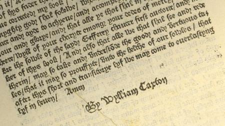
Alternatively, if you have a lead on a source for a rounded and less angular blackletter, one that could approximate the kind used in English incunabula, I’m open to suggestions. Washington Text, maybe. As close to this as I can get (which won’t be very close):

William Caxton's blackletter (1485)
You might try the Bixler Foundry. I recall seeing a proofed font of Fabritus in a galley when I was there this past summer but I’m not sure they have mats for it. It’s not on their specimen list, but I’m also not sure when that list was last updated.
Berliner’s mats went to Switzerland. See
https://www.parnassia.org/English.html
Don Black Linecasting lists a used font of 10 pt Fabritius.
http://www.donblack.ca/Handset/type-used.aspx
His inventory is over a year old but he could very well still have it. They recently had a death in the family, so I don’t know what the status of the business is.
Fabritius is an interesting face, and was cut to order for Norwegian printing and publishing empire Fabritius. It was drawn by Ole T. Ystenes and is the only original typeface from Norway to have been published in hot metal.
Its design is based on Norwegian painter, illustrator and designer Gerhard Munthe’s hand-lettering for a book called “Draumkvæde” published in 1904.
This lettering was also the basis for a Klingspor typeface, “Muntheschrift”, which was sadly never published and for which matrices are believed to have been lost during WW2 when Klingspor’s factory was bombed.
The fact that the typeface is an oddity for its day, it was released in the early 60s, when these types of blackletter’ish faces were way out of fashion meant it was not in demand, and there were probably very few matrices made.
The company that paid for its design and manufacture, Fabritius, only used it for a single printed object as far as is known, and that was a thank-you-card.
I hope you are able to identify a source, and let us know, as many would love to own a font of this face.
The late Norris Whitbeck had a font of 14-point Fabritius. I inherited that font, and gave it to Alan Waring, to sell. You might want to contact him and ask if he still has it. I believe that it had been cast by Harold Berliner, so someone might know where his mats are located. Here is my old 3 x 5 card, that displays the complete face, in case some might want to know what it looks like:
https://www.flickr.com/photos/39182740@N04/49005370046/in/dateposted/
Dave Greer
When you check the list of those guys in Switzerland, you’ll notice that they hold Parnassia matrices in 10 and 14 pt Didot.
Here is a shot of the Monotype specimen, showing all the alts. Note that the 10pt is on 11pt body and the 14 on 16.
fabritius.jpg
Gabriel: Have you tried to find any fonts of Caxton Black, a 19th-century face, which approximates the original Caxton, that you showed? I know that it is a long-shot, but there may be someone, other than a collector, who has this, and might sell it. The MS&J face has a few of the quaint characters from the original, too. See:
https://www.flickr.com/photos/39182740@N04/49012358492/in/dateposted/
You wrote: “Alternatively, if you have a lead on a source for a rounded and less angular blackletter, one that could approximate the kind used in English incunabula, I’m open to suggestions.”
Dave Greer
Thanks, everyone! I followed up on Tom’s early suggestion to check with Bixler, and they indeed cast Fabritius. I expect that’s what my students will be setting their imitation incunabula/pamphlets in next spring.
Dave: Thanks for the photos and the suggestion on Caxton Black. I’ve long kept an eye out for that one. Am I right in thinking it wasn’t cast into the 20th century? I seem to remember that it’s not in McGrew. We need an something like 30 pounds of type for our project, so I’m not holding out a lot of hope on the Caxton Black.
That particular font of Caxton Black, shown on the card, actually has, what looks like, an early ATF pin-mark. I am not sure if the mats survived, or what was in ATF’s vaults when they were sold.
Dave
If anyone needs I have a font of Fabritius 14PT and a font marked Fabritius small cap in 14PT.
If you need pics or more details please call or text me at
516-633-5107 or email [email protected]
Larry Lionetti
American Graphic