Mystery outline typeface
Dear all,
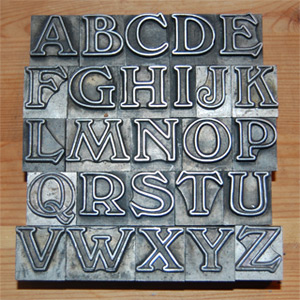
Is anyone able to identify the typface shown in the attached photograph ? Despite browsing several font catalogues, I am still none the wiser !
All help gratefully received.
Regards,
Ian.
mysterytype.jpg
ffi |
fl |
5m |
4m |
’ |
k |
e |
1 |
2 |
3 |
4 |
5 |
6 |
7 |
8 |
$ |
@ |
# |
Æ |
Π|
æ |
œ |
|||||
j |
b |
c |
d |
i |
s |
f |
g |
ff |
9 |
A |
B |
C |
D |
E |
F |
G |
||||||||||
? |
fi |
0 |
||||||||||||||||||||||||
H |
I |
K |
L |
M |
N |
O |
||||||||||||||||||||
Dear all,
Is anyone able to identify the typface shown in the attached photograph ? Despite browsing several font catalogues, I am still none the wiser !
All help gratefully received.
Regards,
Ian.
mysterytype.jpg
Although it may have appeared under other names, the face pictured seems to be Windsor Bold Outline.
Maybe someone else can give you some information about the particular foundry. I don’t have any references at hand right ast this minute.
Fonts designed by Eleisha Pechey for Linotype, 1905. Identifont.
Mike
It is shown as Windsor Outline in my 1959 Stephenson Blake catalog from Sheffield, England. Probably why you are having a hard time trying to find it in any American catalogs.
I believe that Pechey designed the basic Windsor font, but not sure if he was also responsible for the many variations that came after that.
A very cool font by the way.
Living in the UK, I remember this font from the early 1940s when I first became addicted to letterpress and started my career as an apprentice machine-minder (as operators were called in those days).
It was indeed Windsor cast by Stephenson Blake and was in fact a two-colour font, and if kept very clean, would register perfectly for a solid face in one colour with the outline in another colour.
If that is an unedited image, can you tell me how you print using letterpress from that type?
Many thanks for all of the information relating to the typeface, designer and foundry.
Bern, as you can guess, I did a horizontal-flip on the photo prior to upload.
I bought the type on Ebay and it prints really well. It is 60pt and appears to be cast from harder and heavier metal than usual. Some of the blocks have sets of four horizonal holes drilled though them (I assume to reduce weight).
My local postman was very glad to offload this particular parcel, although now he knows what these parcels are, he appears to be developing an interest in letterpress !
Regards,
Ian.
I pulled out the Encyclopedia of Type Faces after making my last comment. It shows a lighter weight as Windsor (with a condensed version named Windsor Condensed), a heavier weight as Windsor Bold (although my SB catalog names this heavier weight simply as Windsor) with a condensed version of the heavier weight named Windsor Elongated. It also shows your Windsor Outline as the outline version of what they show as Windsor Bold. So… John Henry was not off the mark in calling your font Windsor Bold Outline. Somewhat confusing, but that it what the books show.