Please help ID this typeface
Hi,
Does anyone recognize this? The case I found it in is labeled “Rosa 18 point”. There is a single nick on the type body and a pin mark that just says “18”.
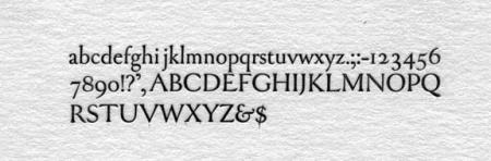
rosa.jpg
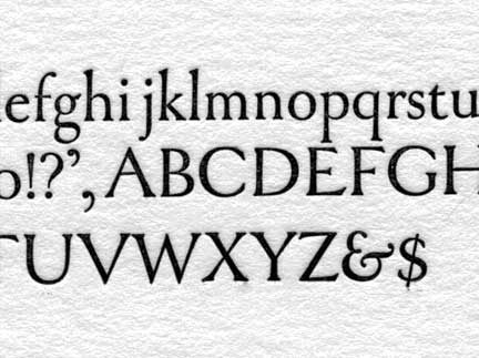
rosa2.jpg
ffi |
fl |
5m |
4m |
’ |
k |
e |
1 |
2 |
3 |
4 |
5 |
6 |
7 |
8 |
$ |
@ |
# |
Æ |
Π|
æ |
œ |
|||||
j |
b |
c |
d |
i |
s |
f |
g |
ff |
9 |
A |
B |
C |
D |
E |
F |
G |
||||||||||
? |
fi |
0 |
||||||||||||||||||||||||
H |
I |
K |
L |
M |
N |
O |
||||||||||||||||||||
Hi,
Does anyone recognize this? The case I found it in is labeled “Rosa 18 point”. There is a single nick on the type body and a pin mark that just says “18”.
rosa.jpg
rosa2.jpg
some sort of Goudy, perhaps? Try posting on the type id board over at typophile.
Thanks Gillyfish. Pretty sure it’s not a Goudy face. I posted it on Typofile. Nice site, thanks for the tip.
I looked for it in Goudy’s autobiographical “Goudy’s Type Designs”. It has many characteristics of his designs but doesn’t precisely match any I found. Is it possibly a Jim Rimmer or Paul Hayden Duensing design? It’s a very handsome book face.
Bob,
This appears to be a very elegant and classy text face. It has a relatively short x-height due to the long ascenders and descenders. I thought that it might be a “quick find” in my reference books, but I have come up empty. The name “Rosa” also doesn’t ring any bells at all with me.
I wonder if this isn’t a fairly new design/casting? I don’t believe it is a Duensing design, but I would not rule out Jim Rimmer. I’ll do some more digging when I get a chance.
For those also looking, the “E” is a good character to concentrate on for this face, as the foot if fairly wide.
I just took a look at the case again and I noticed that someone had written “A.T.F. - 2/#33 - cast to order” on it. I can’t find a listing for Rosa in any ATF list I’ve found though.
Also the type itself doesn’t look like ATF. No ATF pinmark and a single nick that looks more like a monotype casting to me. But there’s lots I don’t know about type. Has anyone ever written anything about identifying the kind of caster type was made on based on things like nicks, pinmarks, the foot, etc? It would make interesting reading.
rosa3.jpg
Bob,
This is a very intriguing question. I looked through McGrew twice and checked out my favorite book on Goudy to try to identify this. It is very close to Saks, a face Goudy designed for the department store and some letters look like Village but the font doesn’t match any of his faces exactly.
If it has a pin mark, I believe that indicates it is an ATF font, not Monotype, and the foot groove matches that too. The pin mark is a standard ATF for 18 point. I looked through two old type books (1906 & 1915) but did not see this font so I am guessing it was later, in the 1920-30. I do hope someone solves this mystery. It is a very distinctive and attractive face.
I know the typeface, but can’t think of it’s name. Haven’t had it in the shop for a few years. It is in one of my type catalogs, I believe in the catalog of McKenzie and Harris out of San Francisco. I am certain I know it, and will look it up this weekend. The ampersand is one of the pieces that identify it, plus the slight tapering of the various letters.
I think … it could be a display face of Centaur, probably 36 pt. or larger. I’ll try to confirm that for you this weekend.
- Barry
n/a
Definitely an ATF casting. ATF’s #33 was Bookman Italic so the 2/#33 remains a mystery. This is NOT Centaur nor is it a Goudy design, lost or otherwise. I also looked at Jim Rimmer’s casting and it is not one of his designs either.
It is rather lovely and has very classical proportions. I simply cannot nail it down though.
The A, E, 2, and the long descenders of g,j,p.q.and y are good characters to concentrate on when trying to identify this face.
Hopefully this thread will stay alive until the mystery is resolved.
I wonder if it was not meant as “# 33” but as “33 #” or 33 pounds of type that were cast to order — wouldn’t that be a reasonable amount for filling a case with a book face, and wasn’t type sold by the pound? On the other hand, it IS 18 point, which is awfully large for much text, so maybe that shoots down that theory…
Foolproof, I concur with you. This one has really caught my interest. It seems we have both looked in the same places. I checked out Jim Rimmer too. The lower case g is not like any other I have ever seen. Very intriguing. The long decenders made me look at all of Lucien Bernard’s and also Koch’s but it isn’t by either of them.
n/a
I have been collecting handset type for over three decades, and have a great many of Goudy design’s in my collection, including a few of the “lost” faces. I have greatly admired Goudy and have quite a lot of books, booklets and materials about him and his designs, the most comprehensive of which is the book Goudy’s Type Designs (complete), originally printed in 1946.
I suppose I could be considered a Goudyphile, and I simply do not see Fred’s hand at all in this font.
This font really has a very European flavor to it and longdaypress is on the right trail looking at Koch and Bernhard. I would also suggest possibly Gill. It very much has a stone-carvers influence to it in my opinion.
No one has mentioned it and perhaps it’s not significant, but there are no ligatures in this casting.
n/a
More…
I should have thought of this before. I also have a case marked “18pt Rosa Italic” which I hadn’t examined closely before. This font has no pin mark, the nick is different than the roman, the drive appears to be deeper, and the upper case H has “659” stamped at the base of the H. The roman H has no number. The deeper drive is making me think European foundry. Might that be right?
In the second photo the italic is on the left.
rosa4.jpg
rosa3.jpg
n/a
It’s my understanding (somebody correct me if I’m wrong) that the European foundries usually cast to Didot height unless the type was made specifically for the North American market. Since your type seems to have a caster-made foot with normal centered foot groove it makes attributing it to a European foundry suspect in my view, though if it was special ordered for an American shop the foundry probably would have cast on an American body. I’ve had European type with the foot machined off to American height.
Several things to talk about here.
First of all, Bob, thank you so much for the additional info on Rosa Italic, ATF #659. A proof of that font would be extremely helpful. #659 and #660 are indeed missing in the ATF series listing in McGrew’s book. The sequential numbering system would indicate that those fonts were cut in 1936-1937.
In Goudy’s writtings about his faces, he indicates that his drawings and sketches for his designs #87, 88, 95, 96, 99, 102, 103 and 104 (from around that time) were destroyed in the 1939 fire. He could not recall the specific details of the designs eight or nine years later, but tentatively named them Goudy Book, Hudson, Textbook Old Style, Hasbrouck, Atlantis, Millvale, Mercury and sketches for two “unnamed.”
I can see a definite resemblance to Goudy’s figures in this design, but those characteristics are not exclusive to Goudy. See Caslon 471 for the unique zero and faces like Janson have the other features that were pointed out.
I also find it hard to conceive that Goudy would allow ATF to cut/cast a design of his, considering the rift that had developed between them and his association with Monotype.
I should note (while I’m thinking about it) that the specimen of Goudy Bible shown in McGrew’s book displays a wrong font “e”. The “e” shown is from Goudy Thirty. Cliff Helbert had supplied Mac McGrew with that specimen. I ended up with Cliff’s case of Goudy Bible after his death, and there were many sorts of wrong font characters from Goudy Thirty in that case. Cliff had simply pulled out a w.f. “e” when he proofed that specimen.
“Lost” or fairly rare Goudy fonts in my own collection include Mediaeval, Ornate Title, Friar, Goudy Lanston, and Theo’s recasting of Village No.1.
I should also note that the recasting of Village No.1 does not have the same “i” and “j” shown in Goudy’s original design. The dots in both characters are somewhat subdued compared to the original.
I would also like to reiterate once again that the quality of the characters (especially the caps) in Rosa seem to have a very strong stone-cut quality or flavor to them.
The “design” could still be of European origin. The #659 on Rosa Italic indicates that the matrices were in ATF’s possession. Bob can you look and see if there is a number on the shoulder of the “m” in the roman font?
The deeper we go, the more intriguing this becomes.
n/a
Foolproof and Devil’s Tail,
I don’t have the collection to match either of you nor the first hand knowledge of Goudy fonts.
I went through McGrew again. One thing I noticed was the similarity of some of the letters to those cut by Morris Benton, who you both know worked for ATF.
I am not saying this is one of his for many of the letters are similar to Goudy designs. If this is a Goudy it almost certainly is from the early 1930s when he designed several custom faces that are very similar.
The thing that bothers me about this one is the center point of the cap W and the conservative swash at the botom of the cap Q. Both very un-Goudy. I do hope this font gets idnetified.
n/a
Today I heard back from the person I bought it from who said it once belonged to Claire Van Vliet. I just spoke to Claire who remembered that it came from “some guy who used to buy up old type shops around here - I can’t remember his name”. Claire looked it up in The American Advertising Type Comparison Catalog (?) but didn’t find it there.
She also suggested asking Theo Rehak. Anyone know how to contact him?
I’ll run a proof of the italic and post it soon.
This is really an interesting mystery.
n/a
Devil’s Tail,
I also have the font of 36 Goudy Open Text and it is indeed beautiful. To bad that was the only size ever cut.
Your fonts of Goudy Lanston retrieved from Heagy’s warehouse were obtained by Jim at an auction of all the handset type from the typography shop of Reardon & Krebs in San Francisco in the late 70’s. R&K was the largest and perhaps best typography shop in the city.
And yes, this should be a place to share and learn above all else. Sorry to stay on the “European” theory track, but my gut feeling tells me it is likely to be from there.
Bob,
The Van Vliet/other guy story is how so many of these tales often unfold. Still a conundrum wrapped in an enigma! A proof of Rosa Italic may help us all or only further muddy the waters. But I’d love to see it to add to the discussion.
n/a
WOW!! Thank you Paul. You have truly sluethed-out a great footnote to printing history that would probably faded into oblivion otherwise. I am truly amazed.
It is things like this that truly make this forum worth its weight in gold.
I think we would all like to see a proof of the two faces so we could print them out and add them to our McGrew books.
Rick von Holdt
Great work Paul. Thank you. I agree with Rick that only through a forum such as this could this mystery have been solved.
I will pull proofs soon and post them on my website at a high enough resolution for printing. If anyone would like an original proof let me know. I’d be happy to mail you one.
Bob Walp
Bob,
I would be thrilled and honored to get an original proof of both fonts from you.
Mac McGrew’s book is hands-down the very best single reference book on 20th century American metal typefaces. I hope to someday possibly publish a “Supplement” to that book, and have been collecting data about additions, errors, omissions, incomplete specimens, etc. I have 73 entries so far, and your proofs and the story behind these fonts would make a wonderful addition to my information.
I certainly hope that you realize the full scope of the truly rare typographical treasures that you possess. The closest I come to this is that I possess the only fonts and the original matrices (cut by Robert Weibking in 1903) for the private Seymour type shown in McGrew’s book. I have all three sizes, 10, 12, and 16 pt. The 10 and 12 pt. fonts are significantly different than the 16 pt. font shown, so there were really two distinct designs done by Ralph Fletcher Seymour. The two smaller fonts I now designate with the name Alderbrink. Seymour NEVER named his type and only referred to them by their sizes!
Please send your proofs to me at:
Rick von Holdt
The Foolproof Press
20793 J Avenue
Minburn, IA 50167
Thanks in advance.
I too have a well used copy of McGrew’s book. A supplement to it would make it an even better resource. I’ll definitely mail you a proof.
I’ve posted a scan of Rosa italic and roman at: http://www.chestercreekpress.com/ccpimages/rosa.gif
Unfortunately the 2 is missing from the italic font. I have several galley trays of type that came from the same source as the Rosa and I’m hopeful that I will find at least one when I get a chance to sort through them.
Thanks again to all those who helped solve this mystery.
Bob Walp
http://www.chestercreekpress.com
I just read through this thread…what a neat thing! Congrats, Bob! How cool. rh
n/a
Update:
After 5 years I finally got around to going through the galley trays I mentioned earlier and found many Rosa Italic sorts including the missing figure 2’s! The font is now complete.
I also noticed that Devil Tail Press’s comments have been removed. Since the relevant historic information Paul found about the Rosa type is now missing from this thread, I thought I would supply a condensed version. To wit, according to the Book of Oz Cooper the type was likely designed by the brothers Guido and Lawrence Rosa. The design was purchased by ATF in 1923. A trial casting was produced but it was never put into production. Somehow the trial casting, or part of it, survived.
Does anyone know what has become of Paul?
Bob Walp
Chester Creek Press
http://www.chestercreekpress.com
after years of rehab they gave up on paul, he can’t be cured, he will always be a typoholic. Seriously he is alive and well and still posting here.
Here I is.
Rick’s comments about the missing material from MacGrew’s book reminds me of two items I have. Mac was unable to locate any specimens for the private type face Daily News Gothic and here is what it looks like:
https://www.flickr.com/photos/53177163@N00/14407515991/
And then he doesn’t go much into borders, ornaments or initial letter fonts, but he does mention that BB&S cut Trenholm Capitals but assumed they were never issued and that ATF dropped them after taking over BB&S. I surprised Mac with repro proofs of the 18, 24, 30, and 36 sizes of this face that are in my collection. He said he never saw anything other than the brief showing in the 1925 BB&S specimen book. Mac was nearing the end by that time, so no additional material was ever published. He did an amazing amount of research, but some material eluded him.