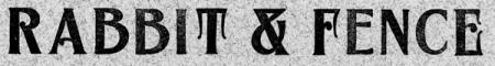
Wood type id?
Could anyone identify this wood type face? It was given to me recently. It is all caps, and some characters have alternates (see image). I looked it up in Rob Roy Kelly’s book, and a Page specimen book replica, but didn’t find a match. I looked for identifying marks on the type itself but found none. The size I have is small- 30 picas.
Thank you,
Martha
Mystery wood type face
Before I even go to my catalogues to look for it, I can tell you that it doesn’t ring any bells at all off hand. I am curious as to your comment about “small” 30 picas size.
Wood type is measured in lines and a line equals 12 pt. (or one pica). 30 line (pica) wood type would be 5 inches tall!!!!! Fairly large, not small. Do you mean it is 30 pt., w3hich would make it less than 1/2” tall??????
Yes, of course you are correct! My mistake.
I did *not* mean 30 picas. The box the type came in is labeled ‘36 point maple wood type.’
So, quite small for wood type, yes?
36 point would mean the letters are about 1/2 inch high top to bottom of the letter (not the body) as measured on your proof — in other words the proof as shown above is life size. Is that about right? That’s very small wood type.
Bob
Bob, yes that is correct.
I have several fonts of three-line wood type and even some two-line (24 pt. tall) wood type. Why anyone would go to the trouble of handcutting each character at that size instead of simply casting the type in metal is beyond my comprehension.
Still haven’t found the face in question, but I do note that there is at least an alternate E and that counter in the ampersand must have been a real mother to carve-out - unless this font was punched-out with steal dies (?) and not routed/carved.
Rick
Rick, thank you for looking into this. I think you must be right about the stamping, I know Hamilton Wood Type Museum has a machine that was once used for stamping out wood borders. And in case you are interested, here’s a photo of the ampersand-
ampersandv2.jpg
Thanks for the photo. The counters within the ampersand are not cut as deeply as the outside areas. I also not the the character is not flush with the bottom of the body (as almost all other wood type fonts are), which is a little curious. Generall anything hanging below the baseline - like the tail of the Q or the tail of a comma, is cut on a body slightly larger than the other characters. This had everything to do with saving wood and making maximum efficient use of the wood.
Rick
The tail of the Q and the comma do hang below the baseline for this face, and all the characters are on the same size body. Also, I can see some other characters, the M for example, with small areas not cut as deeply, which look like hand finishing. Would another photo or photos help? The G and C have alternate characters as well as the E.
Thanks,
Martha