Chicago & BBS Font Idenification
Need help with identifying these Fonts
1. 48 Pt. Chicago Type Foundry
2. 60 Pt. B, B, & S. I Think this is Cadillac Condensed?
3. 36 Pt. B, B, & S
4. 28 Pt. Chicago Type Foundry
Thanks
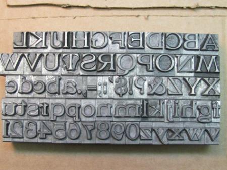
IMG_8015.jpg
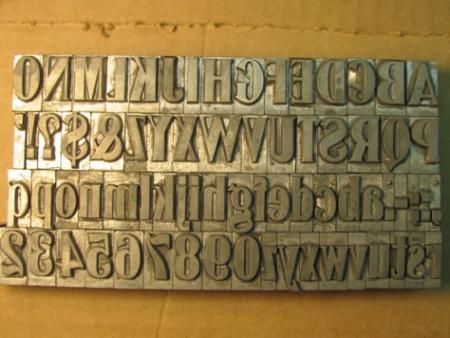
IMG_8017.jpg
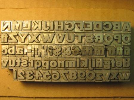
IMG_8019.jpg
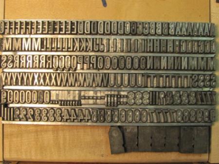
IMG_8022.jpg
1. Not found.
2. I think that you are correct; Cadillac Condensed.
3. Not found.
4. I believe that this is Marder, Luse’s 28 pt. Gothic Cond., No. 7.
Dave Greer
Thanks Dave. # 4 does have “Chicago Type Foundry” Pin Mark
Reading in Annenberg’s Type Foundries of America and their Catalogs, “… when the name became Marder, Luse & Co., trading as the Chicago Type Foundry, until it became part of the consolidation making up the American Type Foundry in 1892….” It seems confusing, since the pin-mark on the type reads: Chicago Type Foundry. In any case, thank you for stating the size and pin-mark when you need identification; it makes searching so-much easier!
Dave Greer
Marder, Luse Gothic Condensed No. 7 is shown on image 112 of the scan of their 1881 specimen at:
http://www.circuitousroot.com/artifice/letters/press/noncomptype/typogra...
While in this Specimen they introduce the American Point System, this particular face is at this time still identified by named sizes. 28 point would be about Double (= Two-Line) English by their reckoning. It’s also shown on pp. 295-297 of their 1890 Price List and Printers Purchasing Guide (PDF 303-305), Hathi/Google scans of which are linked from the page noted above.
Regards,
David M.
www.CircuitousRoot.com
No. 1 shows up in my copy of ATF’s 1898 catgalogue as French Old Style Extended.
Rick
I have a nearly complete collection of BB&S catalogs and design No. 3 does not show up in any of them. Are you sure this is from BB&S?
It would have to be very early because of the crudely modeled characters. The Q and 5 are fairly distinct (and strange) and the ? looks way too condensed when compared with the other punctuation next to it. Also note that there is a ‘pound sterling’ character included.
Rick
First, Thanks T. J. & David. Rick, 95% of the characters do have BBS Chicago 36 Pt. Pin mark. All nicks align, even on the letters with no Pin Mark. Two of the 3 Q’s have pin mark the 3rd does not but the nicks align and the groove is a little narrower. The 5’s have the Pin mark and grooves and nicks align. All Punctuations have pin mark and nicks and grooves align including the ? The “Pound Sterling” does not have a pin mark but the nicks align and the groove is narrower The only other info I have is that these 4 fonts along with others including 1885 Peerless font came from a shed in Southern Iowa along with a 1880’s Peerles printing press. There was newsprint and other material as early as 1870’s in the shed.
I have watched you and others solve many mysteries in the past. Thanks very much
I went back and looked harder for your third showing in my 1898 catalog. It shows a Gothic No. 5 that looks pretty darned close in the 36pt. size. This is one of those pre-pantagraph designs that the matrices for each sized were cut by hand and therefore there are sometimes substantial differences in characters from size to size. Gothic No. 5 did not survive long because it was dropped by the time the 1907 catalog was issued.
Rick
I have a chance to get an Asbern proof press it is a model R2 The bed is 30 1/2 and 17 1/2deep. Any literature or info?
Image 1.jpg
That’s either a Vandercook 320 series press or a clone of it. Does it have the roller parts not shown in the photos? What is the little platen press hiding underneath?
Daniel Morris
The Arm Letterpress
Brooklyn, NY
It is a 320 Vandercook which we have, sorry about that wrong picture…