Can you name this font please?
Hello, please see my photo of a lovely font I was given by a friend, This is my first attempt at letter press so I know it is not the best in composition. My dad was a letterpress printer and he is throwing his hands up beyond the grave I know!
I would love to know the name of the font, it does not appear to be a common typeface but maybe you know better. I have lots of questions for you all to answer in the next few weeks I suspect but I am already totally hooked it has to be said!
1902800_1439113292992335_599722317_n.jpg
I think I would call it Phyllis.
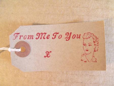
Thanks, it is certainly a relation to Phyllis, cannot find a foundry mark on the face but it does have a little round dimple on the left side of the face edge
The round dimple was originally the mark made the ejector pin of the mould pushing the freshly cast type out. Foundries quickly realized they could easily have the ends of these pins milled to include identifying info and the “pin mark” was born. Later casting machines like the Thompson used the entire side-wall of the mould as an ejector, but you could still get that piece manufactured to include what looked like a pin mark for foundry identification purposes.
As to the face itself, it looks like a bolder, slanted form of Monotype’s French Script.
—
Michael Hurley
Titivilus Press
Memphis, TN
It is certainly not Phyllis, nor is it Pisa, Livermore or Cosmoplitan - which are all fairly similar in feel. It is 19th century, now it is just a matter of finding the right catalog to find it in.
Rick
I eventually got around to trollingthrough all my 19th century American specimen catalogues and did not find this design. I don’t have them all, but a decent enough collection that I usually find most things.
The “little round dimple on the left side of the face edge” sounds like it might be what would normally be a groove that nowadays goes across the entire front. Am I correct in assuming that this only goes about 1/16” or so? This could be found on some of the older foundry’s castings (Johnson, and later McKS&J for example).
Rick
Rick, didn’t the short nick still fall on the lower face of the body, not the side? A round dimple on the left face of the body sounds like a pin mark to me.
—
Michael Hurley
Titivilus Press
Memphis, TN
Hi Michael,
I agree, other than it stated “that the little round dimple is on the left side of THE FACE EDGE”. That is why I wonder if they are describing the short groove. Of course a picture would be wonderful.
I am still puzzled by the “resemblence” to Phyllis. Am I missing something here? I have fonts of Phyliss in my shop and it is very elegant and look nothing like the sample. My Phyllis was designed by Heinrich Wieynck for the Bauer Foundry in 1911.
Rick
Thanks so much for you diligence. I have a full set of this font upper and lower case and when I get a minute I will print out all the characters for you. It certainly is a bold typeface and has some similarities to Phyllis, possibly a rare set so I will look after them. Love using them and think the smell of the oil based inks I am using is taking me back in time to my dad print works. I have 2 adanas, an HS1 that I used to make this tag and a 8 x 5 I was very kindly given along with cases of amazing typeface spacers leads quions, a real jigsaw puzzle that I have finally sorted out!
I am based in Britain so possibly not in American specimen catalogues