wood type ID
Greetings!
I am currently trying to identify this wood type. With my resources I have at hand, the closest I can come is from R.R. Kelly’s book: Wm. Page No. 510 (RRK page 325). This face is more condensed and lighter. By examining the type itself I know it is one of Wm. Page’s die cut sets. I will sleep better if I can find out a more specific name/number. Any help appreciated!
Jim
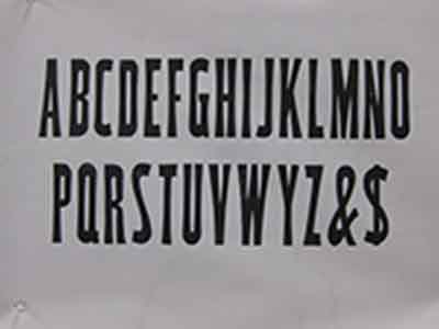
woodtype4.jpg
Hi Jim,
What you have there is Page’s No. 512. I have both 510 and 512 in my shop. Since they don’t have a “real” name, I have designated them as Gothic Concave and Gothic Concave Extra Condensed in my shop.
Rick
Hi Rick,
Thank you very much for the quick ID: No. 512. Great!
Jim
Jim
I concur on the Page 512. I have attached a photo of the specimen and the book that it is from… Pages New Process Wood Type.
Hope I am not confusing the issue but I have also attached a specimen “N” from an 1890 Pages Wood Type Book. This seems to be the production list of Page type given over to Hamilton when they incorporated the Page type into Hamilton’s manufacturing.
The name there is Gothic Tuscan X Condensed. In this older book there is no reference to any Page #s as high as 512.
Larry
PA4.JPG
PA3.JPG
PA2.JPG
PA1.JPG
Ah, the plot thickens.
The 36 line N indeed that is Gothic Tuscan Extra Condensed, BUT the Gothic Tuscan family of faces is very similar to No.s 510, 511 and 512 in many characters, but COMPLETELY different for others. Look at the D in Gothic Tuscan on page 85 of pages 1888 catalog (your PA2JPG)and this will become evident.
I stand by my own original name of Gothic Concave as a closer designation.
Rick
The 17-styles of die-cut types are shown in Kelly, starting with No. 500, on page 146, and also in the ca. 1890 New Process Book. I have some difficulty discerning the different widths of some of this style, as shown in the original post, but I am inclined to view this as Page’s No. 513, and not No. 512. See page 85, in the New Process book and compare it to the specimen shown. Notice the error on page 84, where that width was named, 15-Line 513, when it should have been 512, in my opinion. Also, I have never seen die-cut types larger than 15-Line, so any showing larger than that was probably cut with a router and had a different name, or number.
Dave Greer
All this input and information is very compelling: thank you for the time and research put in on this identification. I do have the lower case and numerals and could post a proof of that, if it might help in looking for the finer points? The set I have here is 15 line.
Sincerely,
Jim
Hi Jim,
A photo of the lower case would go a long way in determining whether your font is No. 512 or 513.
Rick
Since we’re on the topic of the die-cut types, does anyone know where I could obtain a scanned copy of the Page’s New Process specimen? It’s often referenced, but I’ve not been able to locate an accessible copy.
Mike
Hello Briar Press members.
To help out with the specific ID of this Wm. Page die cut font (15 line) here is a proof of the lower case. Unfortunately, I it is missing some characters. (j, p, q, w).
woodlc.jpg
Hi Jim,
Thanks for the l.c. specimen. It is indeed Page’s No. 512. No. 513 is slightly more condensed.
Rick
Thanks Rick and others who have written in on this font ID. Sleeping good tonight!
I am caught up with other projects for now, but will cut sorts to fill in for the missing letters. That, after I find a visual source of what those missing letters look like. I will try some on-line sources for now…
Thanks again!!
Jim
I guess we will have to agree to disagree, as to which cutting it is. If you have a copy of Page’s New Process type, it clearly shows the difference in the counters of the lower-cases, on pages 83 and 85. So, my vote is still Die-cut No. 513. One of the problems seems to be that there is some distortion when the sizes, shown, are reduced, or letter-spaced.
Dave Greer
Hmmm. Distortion from the repro. process: that could be, as I am shooting with a crummy little Canon Power Shot. If anyone would like an actual proof of the uppers and/or lowers, email me your address and I will send out a copy!
Thanks,
Jim
Hi Dave and Jim
I do not have a copy of Page’s New Process Type and was strictly relying on the brief samples in Rob Roy Kelley’s book. I was focusing on the lowercase e and in particular looking at the shape of the bowl. 512 looked much more like Jim’s specimen than did 513 - in my opinion.
What I find extremely fascinating is the distortion problem that Dave brings up.
To resolve this, Jim you need to pack and ship that font to me and I promise I will spend the next several years analyzing this situation for you. The type will be returned in due time after I am absolutely sure I am satisfied with my research.
Rick
Rick,
A good proposition! If you could, during your research, have the missing sorts replaced, both in the upper and lower cases, I would be happy to let you print with them to your satisfaction.
Jim
This is a late response to Mike’s question, on 4/11. I only have a reprint of the New Process book, which was obtained many years ago from the following address:
American Life Books, Box 349, Watkins Glen, NY 14891
No price was given, and they may not still exist, but it might be worth a try to send them a snail-mail and ask. There is an ISBN number listed, as: 0-89257-056-3
I should add that the title on the front-cover is:
“Late Victorian Wood Types, Borders, and Ornaments.”
Dave Greer
Dave,
Thanks for the ISBN number, I would have never found that book on the basis of the title. I found a copy online - the only problem is that the seller wants $219 and that’s more than I paid for the type! Still I will keep my eye out.
Jim,
I have a complete lowercase set of No. 513 (or more specifically - type that matches yours). I’ll pull a proof and will post when done - would be happy to send you a copy. Perhaps you could return the favor as my uppercase is incomplete.
Mike
I think I have some of this as well, in 15 line. Would anyone be willing to share a scan of 512 and 513 for identification?
Hi Mike,
I would be happy to send you a proof of the 15 line No. 513 upper case. Mine is the missing the “X”, though. Otherwise complete!
Jim
Jim,
Great! Mine is 15-line as well.
I have it locked up, awaiting the time to print it. Turns out I am missing the lowercase k, but have an uppercase X so between us we have a complete font.
Definitely would be happy to scan once I have it proofed.
Mike
Finally got the time to print the proof. Everything but the lowercase k. And please forgive me for the h and i being out of order. Let’s say that was intentional.
IMG_8273.jpg