Font Size
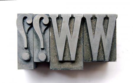
I would like to know how to size this font. The shorter blocks are 1 inch or 72 point. The longer is 1 & 5/32 inches even though the character faces are the same as on the 1 inch blocks. Are they also classified as 72 point?
Thank you.
Font - 06.jpg
Wood type is specified by pica lines, so one-inch type is six-line, and 1-5/32” type would be seven-line.
The space below is for descenders (gjpqy). What you have here is a single seven-line font (Cheltenham?) where somebody has sawn off the descender area for display work. It happens in a working shop.
I failed to mention this is lead type and not wood. What size would this be in points before the pieces were cut? Is lead type size classified by the character face or by the length from the ascender to the descender?
As P.I. implies, the lesser depth character trimmed down, on a Precision Printers power saw, quick inspection of the bottom/front face should reveal the absence of the *nick* present in the full depth character.
Actual example from a long way back, when the main full size poster was printed on (for example) Wharfedale!!, the handbills, small posters/flyers etc were just scaled down versions, so all (for example) Artists on the big poster expected Pro Rata billing,? so the comps pulled many such strokes to achieve parity!!!. . penny pinching on the depth, Oh! and a little extra on the time sheet and maybe a few pennies more in the pay packet, so we believe.
Another, related by product was, to trim down, Set Wise/ across the body, cap characters that would otherwise appear letter-spaced.
Example, Quad Crown Publicity poster off the Wharfedale with, The, AVA Gardener set in 144 line, Without *adjustments* would probably have got the printer/comp locked up.*
Type, Lead and Wood, (individual characters and whole fonts,) still appearing with, such cut outs, care needed in locking up.
Have computer Type setting programs cracked that YET??
To answer your question in a concise manner. Lead type is measured in points, wood type is measured in lines (picas). Your font is all 72 pt., but it is also obvious that some of the pieces have been sawed-off at the baseline. The FACE is still 72 pt. When setting your font you will simply need to add spacing below the cut-off characters.
Rick
Would the point size of this font be the measurement of the uncut character: 1 & 5/32”?
No, you measure from the bottom to the top of the cap height, so 72 pt, or 1”.
The point size of foundry type is measured by the height (from nick side to opposite side) of the body on which the letter is cast, in points, of which there are 72 to slightly less than 1 inch. Without a pica pole at hand I am going to say that your type is actually 84 point size (72 points plus 12 points — 12 points is about 1/6 of an inch and 5/32 is about 1/6 of an inch). I am pretty sure that what you have is 84 point foundry-cast Cheltenham Bold Condensed, but it might be Extra Condensed. Do the letters with the extra space at the bottom have a nick on the bottom edge of the body?
Bob
Bob,
Yes the type that is uncut has a nick at the bottom.
Bossard
As AdLibPress notes, type body size is defined by the size of the type body (that sounds a bit tautological, but I’m not quite sure how else to say it), not by the size of the printing face. This is particularly clear when you look at, for example, various lining plate gothics, which were often made with as many as four different face sizes on the same body. There is, btw, another BriarPress thread running presently which now has several drawings of types with their dimensions and features called out:
http://www.briarpress.org/35927
A “titling” typeface or variant of a typeface (which is uppercase-only) is typically cast such that the printing face fills most of the type body. By way of contrast, just the uppercase sorts of an upper-and-lower-case typeface will have more space below the baseline of the capitals (to accommodate the descenders of the lowercase sorts, of course).
Some types were cut and cast first as titling faces and then were recast when a lower case was added. The 19th century typeface which became known as “Belgian” in the 20th century was an example of this. Other types which were developed with both upper- and lower-case had titling variants. ATF’s Cheltenham Bold Extra Condensed was an example of this.
So if in fact your type is a Cheltenham (it looks a lot like it, but I’m not very good at identification), and if I interpret your last posting correctly to mean that all of types are as-cast with nicks, then it may be that you have a mix of 84 point Chelt. Bold Extra Condensed and 72 point Chelt. Bold Ext. Cond. Title. See pages 118 and 120 of the 1923 ATF specimen book.
Regards,
David M.
www.CircuitousRoot.com
Lead type sizes are determined by the size of the body that they are cast on.
Wood type is also determined that way, BUT in almost all cases the body height ends at the baseline of the uppercase characters. If there are any descenders (as in a some lowercase characters or the tail on the Q) those are cut on a larger body. The font however is sized by the height of the uppercase characters.
Sooooo….. The face on a font of 72 pt. Cheltenham will be smaller than a font of 6-line Cheltenham because the uppercase characters will fill the whole height in the wood font, but fall short of filling the body height in the metal font because of the space allowed for the descenders.
A font of 72 pt. Cheltenham will not be the equivalent of a font of 6-line Cheltenham.
Hope this makes sense.
Rick
I think the whole font is 84 point, with some of the capitals having the part below the baseline cut off. This may have been done so those capitals could be used as cut-in initials at the beginning of a paragraph, or to fit the lines containing them closer together than the “shoulder/beard” would permit. I don’t see how a discussion of wood type fits here except, as Rick points out, wood type caps are typically cut with the appearance of the shortened caps in this font. But since this is clearly metal type, which on the uncut letters still has its nick, it’s clear to me what has been done. It only remains to measure the height of the body of an uncut letter (nick side to opposite or top side) carefully with a pica ruler to determine the actual type size.
Bob
Where you have a fount cast on a larger body you specify both sizes i.e. 72/84 (72pt on 84 point).
Your type is from two cases. one 72pt and the other 72/84pt.
Why would you classify 84 point with 12 points sawed off the body as 72 point? It wasn’t manufactured that way. In that case the characters of 16 point type on which I have filed away the top 4 points or so to make room for an accent are now 12 point? If this type was 72 point on an 84 point body you would be correct but it’s 84 point on a body modified by the user to be about 72 points high and is still 84 point type.
Bob
platenprinter,
The logic here escapes me. Assuming that the uncut font is 84 pt. the cut characters have now become 84/72. I know that this sound ass-backwards, but in reality you have 84 pt. caps on a 72pt. body. Its as simple as that.
Rick
This is lead type not wood, you could gets founts as 72pt only 72pt on 84 and 72 point on 96 cast, no sawing involved.
One last time. The type shown in the photograph is 84pt. Some of the capital characters have been sawn down to 72 pt. The actual size of the characters themselves were not altered so they are still 84 pt. although they are now on a 72 pt. body, thus 84/72 pt.
And yes, one can cast lead type on a larger body, but it is rarely done. One cannot however cast a 72 pt. face on a 12 pt. body.
Rick
Except on a Ludlow! :-)
Bob
Might I ask Bossard to please either post a photograph showing the sides of these pieces of type on the bottom-of-the-character side or to indicate whether the 72-point pieces have nicks or are smooth where the nick should be (as would be the case if they had been sawn). You’ve indicated that the 84-point types do have nicks, but haven’t clarified the state of the 72-point ones. It matters.
Regards,
David M.
www.CircuitousRoot.com
Yes, that is 84 point type.
“Book of American Types: Standard Faces” is a reprint of the 1934 American Type Founders catalog.
•ISBN-10: 0764327704
•ISBN-13: 978-0764327704
Available at Amazon
In the above catalog ATF shows several large faces cast on a smaller body size than that of the font, except for descending characters, such as: , ; g j p q y which were cast on the full body size.
Example: Bodoni Bold, 144/120, 120/96, 96/84, 84/72
In the Stymie Series some other sizes were: 72/60, 66/60.
Bernhard Gothic was available in light, heavy and medium.
Cheltenham Bold Condensed was not shown as one of these faces in 1934, though it might have been done this way at some later time.
The 1934 ATF “Book of American Types” is also available for free online at:
http://archive.org/details/ATFBookOfAmericanTypes1934
Regards,
David M.
www.CircuitousRoot.com
I have attached 3 photographs of 3 characters from the type that are uncut and span different parts of the body.
Photographs should come through this time!
84 Point Type - 03.jpg
84 Point Type - 02.jpg
84 Point Type - 01.jpg
Bossard:
Are those caps actually cut down from 84 point body, or were they cast on 72 point.and have a nick. A photo would answer that question.
Thank You!
All 3 characters in the photographs are 84 point or 1 & 5/32” in length. They are uncut with nicks. All the characters that are in this set that are 1” in length don’t have nicks which I assume means they were cut down.
Usually the types, especially large sizes like this, have bubbles internally in the metal which don’t show up until you cut unto the piece of type for some reason. I would expect the short sides of the pieces of type that are on a 1 inch body to show the bubbles if they were sawed off — but the bubbles should not be visible if the type were cast on a 72 point body.
Bob
The main rule is that the point size of a typeface is the size of the block on which it was originally cast. The size of the face itself has no influence on the point size. The size of the type here is 84 point. That someone in the past has cut some of the beard doesn’t matter - they are still 84 pt.
Regarding casting on a smaller body. It was common to cast large sizes, titlings and display types on a smaller body to give the typesetters some freedom in the composition and to save expensive type metal - as same reason that wood types usual is cut on a reduced body matching the cap size and with the descenders etc. cut on a “full” body.
To an example: In my collection I have a 16/14 pkt. Michelangelo cast by D. Stempel AG. All the characters, except for J, alternative Q, Ç and comma are cast on 14 pkt. The 4 mentioned characters are cast on 16 pkt. It’s a bit annoying to work with! Opposite that I have an early “Amsterdam” casting of 66 pkt. ATF Garamond - cast on a 72 pkt. body. Here the correct description is 66/72 pkt. Later “Amsterdam” cast the fount on a 60 pkt. body, with the descenders cast on 66 pkt., and described it correct as 66/60 pkt. The size of the typeface in the two versions is identical although they could be described as 72 and 66/60 pkt. :-)
Gott grüß die Kunst
Jens